Ancient Box
 HLDM
HLDM
Ancient Box
by
hlife_hotdog
Posted 16 years ago2008-02-05 20:54:06 UTC •
Completed •
Half-Life: Deathmatch
- Name
- Ancient Box
- By
-
 hlife_hotdog
 - Type
- Map
- Engine
- Goldsource
- Game
- Half-Life: Deathmatch
- Category
- Completed
- Included
- BSP
- Created
- 16 years ago2008-02-05 20:54:06 UTC
- Updated
- 16 years ago2008-02-05 20:54:06 UTC
- Views
- 2909
- Downloads
- 1052
- Comments
- 3
- Rating
- 4.33 (3)
- Reviews
- 0
Ancient Box
A map by hlife_hotdog
Thanks to:
Counter-Strike Source for most textures and some sounds
Half-Life 2 for other sounds
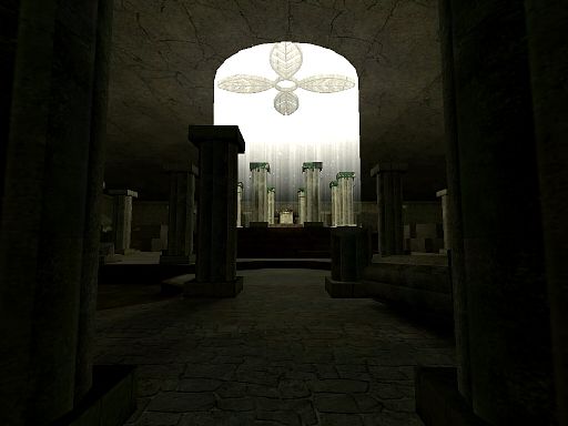
This was my first attempt at creating a nice looking "killbox" map as they are called. Basically one room for a handful of players to slug it out together in a violent and messy game of deathmatch.
Set in an ancient temple somewhere in the world (South America perhaps?), the room is dominated by a single opening in the roof letting in just enough light to illuminate the entire room. Some parts are crumbling but overall the temple is in fairly good condition but some areas of the outer area have suffered some flooding.
3 Comments
You must log in to post a comment. You can login or register a new account.


- The textures on the columns should be a bit more aligned to the edges of the cylinder
- You can see thin black lines on the end of those plants on the top of the columns...probably needs better aligning, or you didn't apply a transparent texture to the edges
- Huge r_speeds, peaking around 2700 wpolys, which I can understand with all those cylinders and sharp textures all around the map, but I think you can chop them down a little bit
Besides these minor problems, the map is a quite solid piece of work. The light beams, sprites and ambient sounds fit in the theme perfectly. As for the gameplay, I can't say much, since I didn't playtest it, but yeah, it pretty much looks like a killboxAs you put, a nice looking killbox. Well done.
A simply beautiful killbox or in cs FY style map.
Unprecedented, beautiful detailing for this type of map ans well some beautiful effects like the fading sunlight texture and sprites in the center. (the only thing i could think of to make that better was if you made the top center part a world brush with the light above it, so it casts a shadow of that on the floor. you could also fake it by making a brushed approximation on the floor and make it almost completely transparent)
I love the doorways and the little ruins around the nade cache. The broken pillars and bits are nice, and the main pillars look great, but would look better with something other than the rectangular boxes on top and bottom, which make them look plain; i can understand why they're not more elaborate tho from a wpoly perspective, which your wpolys are already pretty high imo for a MP map.
The only thing i really didn't like was the watery bits. i would change the color underneath it or make the water itself more opaque or a different color. I'm not good at doing watery bits, but the water parts in your map pale in comparison to the high level of quality of the rest of the map.
Also no sounds but whatevs, most people leave them out... but something, anything would be nice. Even if you had a fire in the corner and all you could here was the the fire burning or maybe have water running or dripping sound by a grate... you get the idea!
5 stars for supberb detailing and atmosphere!
= )