Edge of Death - Series 1
 HL
HL

Edge of Death - Series 1
by
Moaby
Posted 16 years ago2008-06-08 14:08:22 UTC •
Completed •
Half-Life
Loading...
- Name
- Edge of Death - Series 1
- By
-
 Moaby
Moaby - Type
- Map
- Engine
- Goldsource
- Game
- Half-Life
- Category
- Completed
- Included
- BSP
- Created
- 16 years ago2008-06-08 14:08:22 UTC
- Updated
- 16 years ago2008-06-08 14:08:22 UTC
- Views
- 7244
- Downloads
- 1975
- Comments
- 17
- Rating
- 4.67 (3)
- Reviews
- 0

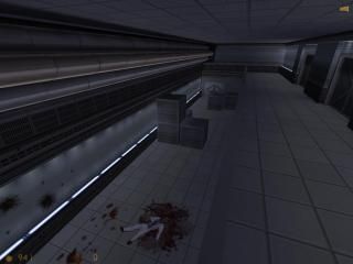
I have finished my map series, Edge of Death.
Enjoy!
Enjoy!
17 Comments
You must log in to post a comment. You can login or register a new account.
+The puzzles where you have to sneak past the sentryguns are the best puzzle I've ever seen for the HL engine. Doesn't quite beat Portal, but it's still impressive. I'm glad you used your own textures on the boxes instead of the annoying wooden crates that came with Half-Life.
+The action is great. I especially like the last map where you get to fight all the grunts. I like the fact that you decided to put in a lot of cover instead of making it a Deathmatch-like bloodbath.
+Good thing you made some of your own textures. Halflife.wad gets boring very quickly.
+The horror theme in the second map is amazing. You only meet about five zombies and two headcrabs, but it still has an amazing feel to it.
+I like the placement of items and medkits in the map. You get just enough ammo to fight through everything, which adds to the challenge. Also, the health chargers were always in just the right places.
-I'm not quite sure what the story is. However, it doesn't really need one. You put action, horror, and brainwork in a game and it's a great game.
-The skybox seems to change between the three maps in an unusual way. It's broad daylight in the first map, dusk in the second, and broad daylight in the third! Why?
Overall, an amazing game. It's challenging enough even on the Easy skill level. I will probably find myself playing through it a few times in the next few weeks. You should expand this into a full mod. It looks like it's going to be amazing. If you ever feel a bit busy, I would be quite willing to come along and help you out if you would like. The world of Half-Life needs more mods like this.
I will proberly make the series longer or even start a new version of it later on.
Did you actually made use of my advise (why was it deleted anyway?)?
Lights still look dot-ish, and the doors still dissappear in the walls. I told you to use the lip property of the doors. At least you've added a stop sound for the doors.
And one final piece of advise: WADINCLUDE!
@computergod666: he didn't made the textures.
Wadincluded on a sp map?
Lip?
It's hard to light up a huge hallway using small lights :S
Open the properties of all your doors and find the lip property. Enter a value between 1 and 8. Compile and see what it does ingame. Much more realistic eh?
As for the lights, let me make some lighting examples for you to use as an example.
Just give me some time to put it together.
//!!I think a tribute map may be coming ;)!!\\
EDIT:
I tried the lip value and it's awesome!
Ok, have a look at these shots. Its a combination of detail and different light sources:
http://www.themightyatom.nl/screenshots/moab_examples1.jpg
http://www.themightyatom.nl/screenshots/moab_examples2.jpg
http://www.themightyatom.nl/screenshots/moab_examples3.jpg
Here's the rmf so you can take a closer look: http://www.themightyatom.nl/stuff/moab_examples.rmf
If you have more questions, feel free to contact me.
Good luck on your future maps.
Very nice looking series, textures were applied suitably.
Entity Placement 8/10
All inside areas were superb and zombie placement was effective but not overdone. The outside area with the grunts tucked well away was perhaps a bit heavy but was able to be done. Cutscenes were passable.
Design 7/10
Aside from being quite linear, the concept was good although you don't feel it enough at the beginning.
Ambience 9/10
Lighting was a bit bland outside because of the simple architecture but I really loved the second map and there was plenty of ambience, music was cool too.
Map Skill 7/10
Frankly average, especially the outdoor areas. Inside was more appealing but still a bit dull with the long hallways that lack features. The doors also had no 'lip' setting on them so the edge would flicker with the wall which was a bit of a drawback.
Total 8/10 (4 stars)
While it doesn't look like the Next Big Thing, it's an appealing little series and I look forward to part 2.
P.S. Sorry for taking so long to rate!!!
I must admit most SP games are boring and tedious to me, but this one was alright. I liked the idea of having the crates to move to shield yourself from the turrets(reminded me of portal sort of), but i think you could have implemented it a little more creatively and/or made it a touch more difficult. Gameplay was fine, not too hard, not too easy, not too boring.
The hallways which were the main structue of the map were nicely structured and texttured, but their use was a bit too repetative imo. I understand about keeping a common theme, but you can do that without reproducing too much of the same stuff.
Excellent cutscenes. Nicely implemented and aptly timed. The cutscenes and intro were probably my most favorite part of the map, second being the crates/turrets scenario.
I think this is a great start with good potential, (i agree with Hotdog on many points) but i think it's still worth 5 stars for a good deal of work and time put into it.
Nice maps! = )
5 stars
or
http://www.mediafire.com/?h5dzo36o9ld8ave