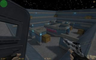
Deagle_Nightyard
 CS
CS
Deagle_Nightyard
by
Bruce
Posted 16 years ago2008-06-18 08:00:58 UTC •
Completed •
Counter-Strike
- Name
- Deagle_Nightyard
- By
-
 Bruce
Bruce - Type
- Map
- Engine
- Goldsource
- Game
- Counter-Strike
- Category
- Completed
- Included
- BSP
- Created
- 16 years ago2008-06-18 08:00:58 UTC
- Updated
- 16 years ago2008-06-18 08:04:08 UTC
- Views
- 3040
- Downloads
- 1111
- Comments
- 6
- Rating
- 3.67 (3)
- Reviews
- 0
It's my newest map which creating takes me about 1 hour.
There are 16x16 spawns, but recommended 4x4.
CT and T equip :
1.Knife
2.Deagle (Full clip)
3.Shield
4.Smoke Grenade
Also helmet and armor (100)
Map is small, but there are a lot of crates which you can you use to behind for... I add shield, because map is very small, so the game is very fast. Shield makes game longer. Smoke grenade is also very helpful.
It's night, but map is not dark, because in this map are a lot of lights.
No other files, only .bsp (.wad included).
More photos at Egir.Dk :
http://www.egir.dk/phpBB3/viewtopic.php?f=3&t=4365
6 Comments
You must log in to post a comment. You can login or register a new account.


Anyway , I like the combination of textures and lights. That's very...interesting. And for some reason , it reminds me of open arena ( a quake 3 arena copy ) . Maybe because of the skybox .... dunno ...
I see you have a great mind . I think your imagination doesn't have limits , and that's good . Use your imagination . ( to be honest , sometimes I lack of it and I'm very upset for that .... I had plenty of imagination when I started mapping , but I didn't know how to use it ...)
= (
A very effective use of blues and greys, looks absolutely great.
Team Balance 8/10
I felt that there wasn't enough cover for players up on the higher level so that kind of discourages it's use, otherwise a very even-steven map.
Design 4/10
Pretty basic and common design but it was still done properly.
Ambience 6/10
No sounds but the lighting was well done and added some life into the map.
Map Skill 8/10
While there are no errors that I could spot, the shapes were really basic and uninspired.
Total 7/10 (4 stars)
While lacking in originality, this is definately a well-playable little arena.
A pretty neat map with some up and down points.
Errorless and clean, the layout seems pretty good for a map of this type. I like how you do the auto reequip for the deagle ammo so you can go balls out without worrying about running out. Those little lights everywhere are nice from a style perspective and they have a nice haze to them--sprite or just the lighting?--, and give the map a nice ambience. Architecture is pretty standard, not bad but pretty plain except you had some interestingly-shaped doorways in the middle part.
The only dislike i can think of for right now is while that hallway texture is nice, it's highly repetative imo. I mean it's pretty much the only texture besides the roof, crate, light, and floor texture. Still looks nice, i just think the upper level and other things should have been a little different.
I'm going three stars, not because there is really anything wrong, there just isn't a lot to these types of maps, and they have to be extra nice to get a 4 or above rating imo.
***