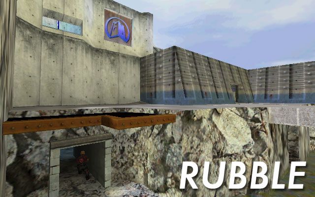
Rubble
 TFC
TFC
Rubble
by
theblackturnip
Posted 16 years ago2008-10-15 10:58:58 UTC •
Completed •
Team Fortress Classic
- Name
- Rubble
- By
-
 theblackturnip
 - Type
- Map
- Engine
- Goldsource
- Game
- Team Fortress Classic
- Category
- Completed
- Included
- BSP
- Created
- 16 years ago2008-10-15 10:58:58 UTC
- Updated
- 16 years ago2008-10-15 10:58:58 UTC
- Views
- 1663
- Downloads
- 543
- Comments
- 9
- Rating
- 4.67 (3)
- Reviews
- 0
League style Capture the Flag for Team Fortress Classic.
Made this in four days on a whim. Fast paced gameplay
with a lot of action in the middle but plenty of areas to
defend in each base.
Enjoy
The Black Turnip
Made this in four days on a whim. Fast paced gameplay
with a lot of action in the middle but plenty of areas to
defend in each base.
Enjoy
The Black Turnip
9 Comments
You must log in to post a comment. You can login or register a new account.


As a mediocre mapper , I can only rate this map 5 stars . From my point of view , this is great work for only four days . I can't really tell a negative aspect besides maybe too many routes , but thr attention to detail is a great proof that you're a proffesional .
5 stars from a mediocre mapper . Let's see other members how they will rate the map
Very lacking in terms of ambience, it wasn't anything too special. A nice simple TFC map. What I didn't like was the obvious copy-paste action in the bases of both teams. Now I'm not saying that you shouldn't make them different layout-wise, though keeping the smallest details, like cracks or dents identical on both sides really makes the setting much less believable.
Texturing was alright, same with lighting. Architecture, apart from obvious copy-pasting was also neat and did the job right.
4*