Stalkx_agm
 HLDM
HLDM
Stalkx_agm
by
Sajo
Posted 16 years ago2008-12-31 15:14:35 UTC •
Completed •
Half-Life: Deathmatch
- Name
- Stalkx_agm
- By
-
 Sajo
Sajo - Type
- Map
- Engine
- Goldsource
- Game
- Half-Life: Deathmatch
- Category
- Completed
- Included
- BSP
- Created
- 16 years ago2008-12-31 15:14:35 UTC
- Updated
- 16 years ago2009-01-01 19:03:17 UTC
- Views
- 3030
- Downloads
- 1076
- Comments
- 3
- Rating
- 5.00 (1)
- Reviews
- 0
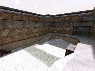
The real author of stalkx is tommyd. So I did not exactly created the map from scratch. I just edited the map for the celebration of 2009. So I had to decompile and fix most of the brushes but there are still some little mistakes, so I kind of rushed it. Edited in 1 day.
Read the readme file for more info.
Happy new year everyone!
edit: Map updated. Fixed the missing wad and couple of lighting issues.
Read the readme file for more info.
Happy new year everyone!
edit: Map updated. Fixed the missing wad and couple of lighting issues.
3 Comments
You must log in to post a comment. You can login or register a new account.


Texturing 9/10 =>Although your map has nice textures, I think you could have done better. Maybe combine them better or something like that. Or just use more textures, you used few textures from halflife.wad.
Ambience 2/10 =>Sorry, I'm not an experienced mapper(or I am, but I'm not very good at it even though I like it) but this map is so dead. Besides the snowing, and some randomly appearing wind sound there's nothing in this map.And the sky was white. Not a one damn single machine or a moving thing or even a small fan or something. Nothing.
Gameplay 10/10 =>Here's the part I'm not very used to it so I will give you 10 out of 10. Weapons are placed relatively good, with the exception of the RPG. It's too easy to get it. The suit charger is placed at an important point of the map, making the player to watch in 3 directions at once because there's no cover. I think the layout is quite good.
Light ambience 7/10 => Honestly, I don't like white lighting at all. The light coming from the sky is too powerful and the few point-lights you added do nothing.
Architecture 10/10 => I have nothing to comment here. The map looks pretty realistic.
Well, at least I did a review ... I haven't done one for months. I'm going to give you 5 stars and vote this map in the map of the month, but please update this map and add some dynamics in the map and also some sounds.
I'll also give it a 5 stars.