Rooms: Tantive IV
 HL
HL
Rooms: Tantive IV
by
Alabastor_Twob
Posted 15 years ago2009-01-24 22:23:10 UTC •
Unfinished •
Half-Life
- Name
- Rooms: Tantive IV
- By
-
 Alabastor_Twob
 - Type
- Map
- Engine
- Goldsource
- Game
- Half-Life
- Category
- Unfinished
- Included
- BSP, RMF/VMF
- Created
- 15 years ago2009-01-24 22:23:10 UTC
- Updated
- 15 years ago2009-01-28 14:53:46 UTC
- Views
- 4596
- Downloads
- 1305
- Comments
- 5
- Rating
- 5.00 (1)
At the time of making this, I'm incredibly tired, and not at my mapping best (I'll probably end up modifying it later), so if it works first time, tell me, so I can eat my hat.
[EDIT] Now with info_texlights.
[EDIT] Now with info_texlights.
5 Comments
You must log in to post a comment. You can login or register a new account.


At least now I don't have to eat my hat, which is convenient considering the fact that I don't have one.
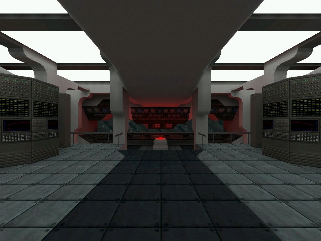
Your map has some very carefully designed and very pretty architecture likthe column trims, those cool looming ceiling structures, and everything comes together nicely at the big cockpit area--which is also done REALLY well. (there are also no brushwork errors.) Brushing and strong attention to detail are the strongest points of this map. That said i think there is a lot of room for improvement in the other areas.
I know you mentioned you were tired when you made it so i'll be brief; you probably already know all the suggestions i will make:
-lighting is super-bleh. i would try a very very light blue and have some nice contrast areas of light and dark on the edges of the bridge, with bright lights at the doors, middle bridge, and cockpit. (that's what i would do)
-no sounds. Starwars was known as a franchise to have amazing sound work and effects. not using those sounds--ripped from battlefront, the movies, or any number of spinoffs--, would be a crime to humanity! = )
-texturing is very bleh/generic but i'm sure you are aware of this.
-add sprites and animated textures to the consoles and computers to make them stand out the way they should...
-those big, blocky "fifties-style" computers in the center of the bridge area really detract form the pretty trims and detail on the walls and up on the ceiling. I would modify or eliminate them altogether. (even in the screenshot those blocky things are covering up all your nice stuff, which to say the least the screenshot does not do the map justice.)
I know i had more concerns but i'm tired and can't think straight anymore. Just wanted you to know i really like this map but i hope you continue to work on it... it could be SO much better! = )
5 stars for pwn starwars and pwn brushwork. win.
*****
I know of several problems, such as the lack of detail on the computers, or a lack of seats in the cockpit. That was mostly because I was getting a lot of the short ### faces error. When I get my laptop on the weekend I might increase the size of some of the less noticeable textures, so I can add more detail to the computers. I'll better the lighting and sound as well.