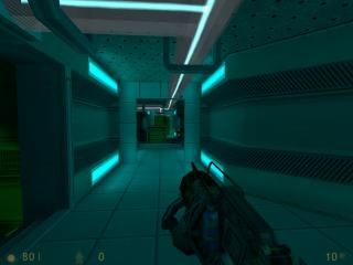
bdaw_shockstorage
 HLDM
HLDM
bdaw_shockstorage
by
Skals
Posted 15 years ago2009-06-06 14:30:28 UTC •
Completed •
Half-Life: Deathmatch
- Name
- bdaw_shockstorage
- By
-
 Skals
Skals - Type
- Map
- Engine
- Goldsource
- Game
- Half-Life: Deathmatch
- Category
- Completed
- Included
- BSP
- Created
- 15 years ago2009-06-06 14:30:28 UTC
- Updated
- 12 years ago2012-01-21 08:57:23 UTC
- Views
- 3333
- Downloads
- 1018
- Comments
- 16
- Rating
- 5.00 (2)
- Reviews
- 0
update2: no more annoying beams. removed black spaces.
update: fixed wierd bug on a corner, better and less doors, some placement of entities adjusted, some textures fixed. (small fix) also ran a full compile which i didnt before.
map: bdaw_shockstorage ; by skals.
this map is a hl1 dm map based on a
svencoop campaigne / hl1 mod called "bad day at work"
im currently working on.
This map contains the following:
2 shotguns, 1 gauss, 1 egon, 1 granade,
1 trip mine, 1 satchel charge, 1 crossbow,
alot of machineguns, 4 killer beams
and probably more stuff i forgot of.
the objectives:
this is deathmatch, kill eachother as mutch as you can,
the person with the most kills wins.
[ additional files used: submerged.wad ]
16 Comments
You must log in to post a comment. You can login or register a new account.


About the map:
Not bad at all. Very decent mapping there, however, there are a couple of issues:
1. Having doors that open/close in deathmatch isn't really a good idea, it slows down gameplay a lot. I'd say keep them open, or make them open up faster.
2. If you decide to keep the doors, at least add a lip value for the sliding doors, they will dissapear in the wall if you leave the lip value 0, which is weird and unrealistic.
Doors that swing open open too slow. Give them some more speed.
Doors in a DM is a bad idea. IF you still do, add sliding doors and make them FASTER. Jexus
edit: added a few changes and fixes. should improve the gameplay.
In this map getting the most powerful weapons is what defines fun. The weapons are intelligently disposed around the map. Very fun indeed.
There are some problems here and there, near a vent there is a "hall of mirros" error, but the map seems pretty "alive" to me and that's what makes a map.
Lighting ? Excellent !
The architecture of this map doesn;t let you eyes tell you "it's boring ...", so that's a major plus. A minor problem was that it's kinda ... claustrophobic around some places. There are few open spaces and when the server would get filled of players this can be a real problem. Otherwise, it's good.
I'm a modest mapper, so from my opinion this map gets 5 stars.
It looks very good and it's the best Skals map I've played, however, the lasers you have to jump over are really annoying. I would prefer there was only one laser you had to jump over or if there was a way to turn them off. Also, I expected the wooden crates to be breakable.
4.3... almost, almost 5.
And yeah, add some additional architecture behind that big door, creating the effect that the map is bigger.
however i do not agree with the crates. they are there as obstacles and objects to hide behind. its like that in most of the deathmatch maps. ill keep the crates the way they are.
edit: i will upload new one soon.
edit: ok its uploaded. good enough?
There needs to be a ladder or something to prevent that sort of thing.