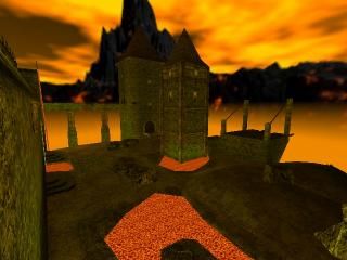
hlifehotdog_compo27
 HLDM
HLDM
hlifehotdog_compo27
by
hlife_hotdog
Posted 15 years ago2009-09-17 00:56:20 UTC •
Completed •
Half-Life: Deathmatch
- Name
- hlifehotdog_compo27
- By
-
 hlife_hotdog
 - Type
- Map
- Engine
- Goldsource
- Game
- Half-Life: Deathmatch
- Category
- Completed
- Included
- BSP
- Created
- 15 years ago2009-09-17 00:56:20 UTC
- Updated
- 15 years ago2009-09-17 20:20:38 UTC
- Views
- 4648
- Downloads
- 1236
- Comments
- 10
- Rating
- 5.00 (3)
- Reviews
- 0
My entry for competition 27
EDIT: Sprite fixed. I'm sorry about that guys, I got someone to upload it for me and he forgot to include the sprite.
EDIT: Sprite fixed. I'm sorry about that guys, I got someone to upload it for me and he forgot to include the sprite.
10 Comments
You must log in to post a comment. You can login or register a new account.


Unfortunately I have to sleep now, then go to class tomorrow when I wake up.
I'll take a look later tomorrow.
Fix and reupload, please. I don't want to have to rename files.
And thanks zeeba-g, I appreciate it. I'd like to say it was an intentional bug, but hey, it's a little bit of fun I forgot to fix. Oh well...
++Ambience was fan-fucking-tastic.
++Geometry was fan-fucking-tastic, especially the terrain.
+Texture choices were prefect, through there were a few alignment issues.
+Subtle, swaying cloths were cool.
-lava texture alignment sucked. I don't think there was a single edge that lined up. The lavafalls were also very blocky, which surprised me considering how well you pulled of the rest of the brushwork.
I can't really dive into too many more specifics because everything is just plain awesome(aside from the lava). Totally worth 5 stars.
The brushwork has a lot of detail. Like awnings and window fixtures, to the board bridges to the little rings and hooks on some of the features of the map. The terrain as well was quite nice.
Lighting is clear and well light, yet exposed a dramatic sense when needed, and even some areas had lighting really dark. My favorite light was the windows in the spiral tower. The eerie yellow glow as the only light source worked well. Other areas almost seemed kinda bright, like parts that involved a lot of lava. The light in those areas seemed oversaturated. I would have settled on a deep and gentle orange glow but that's just me.
Texture choices were fitting. Not too much to say about that. Some of the flourishes were nice. I agree with WC, the waving banners were really cool. Only bad thing is that some of the textures could have been expanded a little to prevent repetition and leave more room for variety. Still, it wasn't a map killer so its not bad at all.
Overall I liked it. It was enjoyable and even a little inspiring. I really miss the dungeon deathmatch like levels of DM Classic with traps and illogical absurdities. I guess this made me like the map a little more.
This map deserves 5/5 because of the level of craftsmanship versus scale versus design. I couldn't find anything purely out of place, except a few lava textures.