Celestial_Temple

Half-Life: Deathmatch HLDM
Celestial_Temple by Skals
Posted 15 years ago2009-10-23 17:36:18 UTC • Completed • Half-Life: Deathmatch
Loading...
Screenshot Thumbnail
Name
Celestial_Temple
By
Skals Skals
Type
Map
Engine
Goldsource
Game
Half-Life: Deathmatch
Category
Completed
Included
BSP
Created
15 years ago2009-10-23 17:36:18 UTC
Updated
15 years ago2009-10-24 06:09:12 UTC
Views
3763
Downloads
1046
Comments
7
Rating
5.00 (1)
Reviews
0
full star full star full star full star full star Download (Hosted Externally)

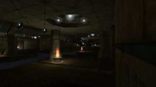
I created this map last month for hl1dm; sadly it has huge wpolys so i doubt anyone can play it online, but it would be cool if you tried. Enjoy.

7 Comments

Commented 15 years ago2009-10-23 17:46:52 UTC Comment #14839
I would play it if it was on the server, ask WC to upload it. It looks good from the screenshot.
Commented 15 years ago2009-10-24 03:52:26 UTC Comment #14840
I playtested this map with skals a while ago, and it's beautiful. The architecture, even though it's not so complex, it gives you the feeling that it is because of the well done lighting.
I can't critize the gameplay because I haven't played it yet on a server with more than 2 players.
Besides World Crafter can upload this on his server, it's a good candidate for MOTM :P

"ask WC to upload it"
Oh how I like this abbreviation :D

This map has ***** from me.
Commented 15 years ago2009-10-24 04:46:26 UTC Comment #14835
Thanx!
Commented 15 years ago2009-10-26 16:49:09 UTC Comment #10307
Wheres the ambienece? No fire sounds. No water sounds, not even an echo. The lighting was pretty interesting but in my opinion needed to be quite a bit brighter. The entire map was pretty neat and clean but was a little too symmetrical for my taste. The hallways were pretty cool while plain, the pots with fire made them really cool though you used the ugliest fire sprite. You should have probably used I think its called xffloor.spr. Also the hallways didn't really get the player around the map much. As for a gameplay approach it seems like it would be a pretty fun map but there wasn't much vertical gameplay. And there aren't too many ways to get around the map. It seemed like the hall ways could have used secret paths and ways. The entire map sorta felta like I was in a sewer rather than an aztec structure besides the textures. The bright glowing sprites were nice and gave the map a hint of lost technology. This map is actually pretty inspirational for me because I am going to remake a new map that exposes some sort of forgotten technology. The floating sprites in the dark area with the stairs and pots that didn't have fire in them was really cool. The only glitch I noticed was when you get the crossbow you fall out of the water and can walk around under it. As for architecture, the ceiling domes could have used some trim around them. And the columns could have used something at the tops of them. It just needs to be drug down a little bit. Overall a neat clean map.
Commented 15 years ago2009-10-26 18:06:24 UTC Comment #10367
heh thanks. yeah i admit that the hallways werent properly placed. i wanted to make the map bigger but my r_speeds fucked up so i just turned them into safe spots for players and weapons.

with the fire sprite, i couldnt find the other one i fail :(

about the brightness, i think it atcually came out well, for if i make the blue light brighter, it will flood in with the fire and it will not have the same affect as before, it will become worse.
Commented 13 years ago2011-04-05 05:14:59 UTC Comment #18940
Download link is throwing an error :/.
Commented 13 years ago2011-04-05 16:04:26 UTC Comment #18947
Old map is old, I don't even have it myself so I cant give you a new link, sorry.

You must log in to post a comment. You can login or register a new account.