Hotdog's Cubicle
 HL
HL
Hotdog's Cubicle
by
hlife_hotdog
Posted 14 years ago2010-02-28 10:43:15 UTC •
Completed •
Half-Life
- Name
- Hotdog's Cubicle
- By
-
 hlife_hotdog
 - Type
- Map
- Engine
- Goldsource
- Game
- Half-Life
- Category
- Completed
- Included
- BSP, RMF/VMF
- Created
- 14 years ago2010-02-28 10:43:15 UTC
- Updated
- 14 years ago2010-02-28 10:44:25 UTC
- Views
- 3441
- Downloads
- 885
- Comments
- 11
- Rating
- 4.80 (5)
- Reviews
- 0
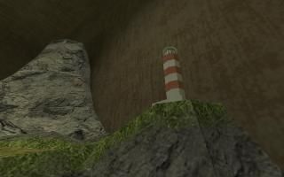
My contribution to the TWHL Cubicles project. Sorry to all for killing the engine, oh, and the crappy trees.
This is a view only map. You spawn on a catwalk because walking around is not recommended.
This is a view only map. You spawn on a catwalk because walking around is not recommended.
11 Comments
You must log in to post a comment. You can login or register a new account.


I really liked the brushwork on this- the little town made me smile.
At first, I thought you had recreated the coast maps for HL2, but then I realized that there weren't enough buildings or any tunnels!
A few minor things, like texturing and invalid faces that dissapeared, so I have to deduct a star, but all in all it's great.
It is a very nice map. I'd love to see this blown up bigger for a DM map or something. The VM is elite.
I think the balcony you stand on could be a little higher to see more of the stuff in the map. Also, the light on the ceiling aren't bright like lights are. Put sprites on them or a light to brighten them up a bit.
As far as I can see, this map meets the requirements entirely for the cubicle challenge. Well done.
5 stars but I recommend an update just once with a few minor things.
Combine func_illusionaries instead of having a billion individual ones.
Absolutely nothing is nulled off and you could probably null off almost half of the map. At least null the back of those little trees.
Edit: Dick Fries.
(screenie simply does no justice at all...)
just zomg, one of the coolest things i've ever seen for HL. do you think you could do a quasi-3d skybox for HL doing something like this? We should have a whole "train set" miniature competition... would be great fun. = )
I noticed NONE of the visual errors that jeffmod mentioned. I kinda agree with zeeba about the trees, except maybe scaling some tree models down instead of scaling up the map might work. All in all it still looks passable imo considering what it is, but maybe even just using a less "bushlike" trasparent tree might help as well.
Don't foget too the scale tool is your friend for something like this (did you use it at all, or is everything 1-unit based? Like take the brige for example: it looks great, but the black steel supports wires look "chunky". building the bridge in say 2x or 2.5 scale with the proper proportions (to get the proper cable thinness) and scaling the whole thing down with the hammer scale tool would look much better. you shouldn't get any errors, visual or otherwise by doing this as long as you:
a. don't scale it too small
b. don't try to edit vm it further once it's been scaled (you actually can, just be careful).
Anyway, really, really coool. this map deserves nothing less than 5 in my book, first and foremost for originality/creativity, but also Highly-skilled implementation a very close second.
Awesome!
= )