JeffMOD's Cubicle
My entry for the Cubicle project.
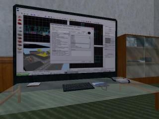
This is an example of my perfect office- Bookshelves, supercomputers, huge TV hooked up the the computers for playing maps and classic consoles...
This is an example of my perfect office- Bookshelves, supercomputers, huge TV hooked up the the computers for playing maps and classic consoles...
3 Comments
You must log in to post a comment. You can login or register a new account.

 HL
HL


Nice use of texlights and nice small details. As cheesy as they look, wires made from brushes are always nice to see.
You should probably do something about the the wall near the ceiling. It looks awfully boring. A simple trim can make it look ten times better.
Sound is always better than no sound, but that wind sounds out of place. It's too loud for an indoor area. Maybe tone it down a bit and throw in some buzzing to accompany your wall-o-computers.
Your pillars are also casting shadows on the floor above them, by the way.
You should probably get rid of that trigger placeholder outside of the door, since we were told that our respective maps would be self-contained.
Oh, and nice rig
that said the rest of the room is a 512-cubed box and very blandly lit. Like in all your goldsource maps, you highly overuse the original prefabs like the pop/candy machines and furniture. I don't know if you're doing this in some kind of sentimentality to the original game, but i'm here to tell you it's generally not appreciated to use those things! =)
anyway, decent entry young lad! also, the textures behind the glass at the front door show up as aaa texture to me. If i were u for something this small, i'd just wadinclude the textures...
= )