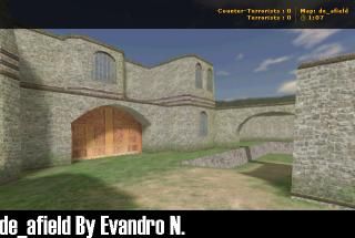
de_afield
- Name
- de_afield
- By
-
 Evan. N.
 - Type
- Map
- Engine
- Goldsource
- Game
- Counter-Strike
- Category
- Completed
- Created
- 14 years ago2010-05-19 16:15:48 UTC
- Updated
- 14 years ago2010-06-06 21:19:49 UTC
- Views
- 2058
- Downloads
- 687
- Comments
- 2
- Rating
- 3.50 (2)
- Reviews
- 0
A simple map (bomd defuse), that I tried to keep the basics of a level:
A road that leads the player and other texture that fits with it. (In this map is a sand road texture and a grass texture.)
Some crates to cover.
A room with rounded stairs that takes the player in diferents places of the map.
Balance.
Snipers and campers points.
A simple architecture.
A road that leads the player and other texture that fits with it. (In this map is a sand road texture and a grass texture.)
Some crates to cover.
A room with rounded stairs that takes the player in diferents places of the map.
Balance.
Snipers and campers points.
A simple architecture.
2 Comments
You must log in to post a comment. You can login or register a new account.

 CS
CS


I want to rate this like a 3.4 for the effort and solid mapping.
Keep up the excellent work!
Also, if you want your maps to be played on a server, try mapping for Half-Life Deathmatch. We have a server new maps are uploaded often.
++Skillfull construction
+very nice layout
-no small detail. theme it out like an old fort! add cannons and small outbuildings inside the fort instead of those stupide crates =). add rubble and debris like an older-but-preserved area of the fort in ruins. Go aztech a little bit and put in archeological dig trenches here and there and fence them off . SO much potential for this map!
-some of your arch door textures are stretched, otherwise the texturing looks pretty damn nice!
-sound?
-enormous crates are ridiculous, a joke i guess but a very unfunny one imo... =P
i want to round 3.5 to 4 becuse it looks so nice, flaws be damned. Nice work man1