SpaceBox
 HLDM
HLDM
SpaceBox
by
username
Posted 14 years ago2010-05-31 20:36:44 UTC •
Completed •
Half-Life: Deathmatch
- Name
- SpaceBox
- By
-
 username
 - Type
- Map
- Engine
- Goldsource
- Game
- Half-Life: Deathmatch
- Category
- Completed
- Included
- BSP
- Created
- 14 years ago2010-05-31 20:36:44 UTC
- Updated
- 14 years ago2010-06-01 01:42:04 UTC
- Views
- 1533
- Downloads
- 513
- Comments
- 4
- Rating
- 4.00 (1)
- Reviews
- 0
spacebox.bsp
Size: 872KB
Players: 2-8
Game: Half-Life
Files: stand alone BSP
Map and all components are original creations
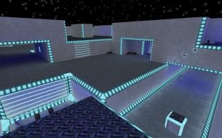
A small to medium sized deathmatch map created using cubic architecture. Features include super stair technology, wide hallways, and well connected paths without dead ends. Map includes one longjump and one gauss. Please download, comment, rate and enjoy.
4 Comments
You must log in to post a comment. You can login or register a new account.


+ Rapid ladders for fast altitude changes.
+ Geometry and construction of the map is excellent.
+ The layout. 'tis good.
± The very top of the walls where it meets the sky could use some kind of trim. It looks bland.
± I think the lighting could be more interesting somehow.
± Perhaps too small.
- RPG and Gauss are too close to each other.
- Gauss isn't that necessary or useful on this map.
- Walls seem very plain.
Overall this map is server-worthy and would be a nice addition to the rotation. I know I would enjoy playing around on it. I'll give you a chance to revise this map before I rate it.
Sound?
would be nice to see a better textrue for the "neon" than that dam stock texture. i would also use a more interesting. texture for the "hologram" texture you use for ladders.
Add sprites around the neon or ladders to make it look cooler if you want
Neat stuff. You could re-theme the map and add props/doors to fit any genre, which might be neat and warrant a v2..
4 stars.