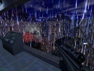
Satellite
- Name
- Satellite
- By
-
 Suparsonik
 - Type
- Map
- Engine
- Goldsource
- Game
- Opposing Force
- Category
- Completed
- Included
- BSP
- Created
- 14 years ago2010-07-07 20:07:13 UTC
- Updated
- 10 years ago2014-08-06 22:26:01 UTC
- Views
- 3267
- Downloads
- 772
- Comments
- 3
- Rating
- 3.50 (2)
- Reviews
- 0
IT MAY BE OP4, BUT IT STILL WORKS IN HL!
Old description:
Anyways, I was wanting for a long time to make a Black Mesa Type map Valve would be somewhat proud of. I added grunt sprays like the occasional "you die" and "Die, Freeman", Tank through the wall, Destroyed computer, Choke points where the military was holding out, and other stuff that you'll have to see for yourself.
Enjoy.
EDIT: Fixed fan room, actually looks like a fan room now. New rain. No more forcing to go through vent.
3 Comments
You must log in to post a comment. You can login or register a new account.

 OP4
OP4


+Thoughtfully constructed
+thoughtfully detailed - i thought the recharge kits looked great!
+good ambiance (at least the rain and thunder sounded fine)
-i agree some of the props looked a little weird, but that is nitpick more than anything. PM me if you want some advice to improve, but my main suggestion for ANY PROP is to USE REFERENCE PICS =)
-i kinda agree with skals about some of the ambience. some of the sounds from the pak file are utter shit and should not be used.
-i agree that there should be some sort of light in the vents. just a little bit leaking in from somewhere at a joint, or use some little texlights.
-rain conveyor is still too slow
-rain conveyor brushes should be in a grid pattern afaik, so you cant "see" down the rows of rain. also, i dont think you need so many conveyors either.
-There are Still stuck points on the sandbags =(. For god sakes cut them into triangles or put a clip brush around them. VM causes weird clipping and/or stuck points sometimes... VERY annoying
I am not judging the merit of the map as a DM map since i don't feel qualified to do so, but i give it a 4 for aesthetics, very nice!
=)
But since this is a multiplayer map, you want to light everything up because there's nothing more frustating than having an opponent chasing your ass and the only way out is going through a vent but you can't see when you're supposed to go left or right because its pitchblack dark in there.
So i hate to say it, but skals has a point. Pitchblack dark area's: A no go.
-I think the vent should be higher and more larger, in a way you could walk there normally withouth crouching, and also add some red lights, it may seem like a stupid idea, but it will make the map more enjoyable.
-Into the other entry to then vents, you could change the func_ladder position to the opposite side, i can't get access to the vents because of that.
-Make the engine area more detailed, maybe some computers and a little more brushwork there.
-Remove some of the rain brushes, there are too much of them.
-Add some places were you can grab with the barnacle gun in the outside area.
That's all, for now i give you 3 out of 5!