Resonance Error
 HLDM
HLDM
Resonance Error
by
hlife_hotdog
Posted 14 years ago2010-11-19 10:30:36 UTC •
Completed •
Half-Life: Deathmatch
- Name
- Resonance Error
- By
-
 hlife_hotdog
 - Type
- Map
- Engine
- Goldsource
- Game
- Half-Life: Deathmatch
- Category
- Completed
- Included
- BSP
- Created
- 14 years ago2010-11-19 10:30:36 UTC
- Updated
- 14 years ago2010-11-19 10:30:36 UTC
- Views
- 4206
- Downloads
- 1128
- Comments
- 4
- Rating
- 5.00 (1)
- Reviews
- 0
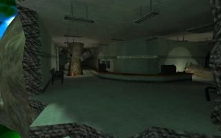
I suppose it's only fitting that I made a map for my Mesa Collection as my last map. I'd never done many Xen-style maps, most of which can only be found in my mod Xen Crystal. I'd always had an attachment to lab areas like in early Black Mesa before you accident. Making the first 2 levels in Half-Life: Static Friction were the most fun and combining them with my skill of terrain by including a Xen theme as well seemed like a nice idea for my final Half-Life map. It's been almost 8 years since I started mapping for Half-Life. Back then, it was the biggest thing to me and I just
couldn't put it down. So, after so many maps, it makes be sad to leave the old engine behind, but I know that I will have plenty of future mapping to do in new engines. So with that, I bid Goldsource farewell!
Enjoy
couldn't put it down. So, after so many maps, it makes be sad to leave the old engine behind, but I know that I will have plenty of future mapping to do in new engines. So with that, I bid Goldsource farewell!
Enjoy
4 Comments
You must log in to post a comment. You can login or register a new account.


Checking out now!!!
Edit:
Well what a great departing map. It may have been a bit too dark in areas especially where plant lights would leave the dark room completely dark. You could have lightly illuminated the room with the scren monitor while the plant light was out. The map in my opinion takes advantage of gauss and vertical movement "i'm assuming the gauss is somewhere in it". This is a great aspect I always tried to acheave in my maps.
When I left the interior lab area by the stairs I was pretty surprised to see so much open space. The cave with the healing water was really cool. The two things that hurt this map the most imo are the use of the old hl textures and ambience. And some variations in lighting with colors would have helped it become more appealing to the eye. I know you say this is your final map for the gold engine but I feel you even did better with your map for competition 27. "Just saying that im not sure you used your entire potential for this map". I do believe that it is a well crafted and layed out map with a good ammount of detail and ambience. I thought the various objects stuck into the walls looked pretty cool. And I liked the duct movement. This map is right inbetween 4 and five stars so I will not rate it but it is a great addition to the good old way out of date"hehe" game halflife and will add a great new level of gameplay for many years to come.
= )
I played it briefly and i must say it is very very nice!
Do you have a weaponstrip set up so you cAn only carry one gun at a time, or is my WON HL borked? I liked the light triggers 'twas a nice touch.
++architechture very nice! (as per always with you)
+good use of ambient_generics
++I LOVE the layout and all the interconnections into xen
+great use of original textures!
+Original HL theme nicely preserved except obviously yours looks better =)
I would love to see an elevator or 2 in there and a user-controllable func_tank in the ruins of the upper part of the map, as long as they don't make the gameplay unstable. I disagree with the map being too dark in the lowere levels, since i think it contrasts nicely with the bright upper parts. the only dark part i didn't like was whenever you try to explore the office with that big "arm" in it the lights die and you are forced to leave. =)
I've recently ported over to source too, and though i was reluctant at first, i can't see ever going back to GS except for small incidental projects/compos. I'll miss my familiarity with gs, but i won't miss all the leaf-saw errors, random-ass bugs, and mostly the size/render limits..
Great work and a great goldsource send-off map1
*****