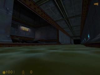
Corridor and ladder
 HL
HL
Corridor and ladder
by
Gottschalk
Posted 14 years ago2011-01-27 02:35:39 UTC •
Unfinished •
Half-Life
- Name
- Corridor and ladder
- By
-
 Gottschalk
 - Type
- Map
- Engine
- Goldsource
- Game
- Half-Life
- Category
- Unfinished
- Included
- BSP
- Created
- 14 years ago2011-01-27 02:35:39 UTC
- Updated
- 14 years ago2011-01-27 23:37:08 UTC
- Views
- 3253
- Downloads
- 755
- Comments
- 10
- Rating
- 3.50 (2)
Newbie here.
After reading a bunch of tutorials I've decided to try and mess around a little with entities and stuff.
And I came up with this.
What do you think?
Edit: The texture misalignment is now fixed.
After reading a bunch of tutorials I've decided to try and mess around a little with entities and stuff.
And I came up with this.
What do you think?
Edit: The texture misalignment is now fixed.
10 Comments
You must log in to post a comment. You can login or register a new account.


++The lighting - It gave the map a real spooky feeling.
++The Zombies - You did some good scripting, I really like the zombie part.
++The Architecture - You did good on the archeture, you mad it feel like the player's in a sewer, and it gaved the Maintinence Acess area Pizazz.
--The light textures- It looked like they were carved into the walls at some points, and the edges of it were stretched.
And yeah, the crooked corridor. I don't know why do half the lamps end up inside of the wall.
OKAY!
+Scripts - It's impressive to me that you're already doing this, because sadly, I've been mapping for a year now on GoldSource and I still do not know how to script things yet.
+Texture Lighting
+Architecture - Very well done for your first map.
-Texture stretching in some places
-Misaligned textures, as well
-Face splitting in the walls.
Overall, a great first map!
that's an example of face splitting.
Exactly.
map -> check for problems