30_skyknife
 HLDM
HLDM

30_skyknife
by
zeeba-G
Posted 13 years ago2011-04-07 07:22:12 UTC •
Completed •
Half-Life: Deathmatch
Loading...
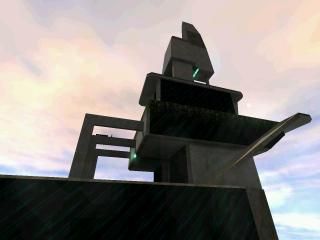


Entry for 30 brush competition.
Don't let the wind push you to your fall as you gauss around this skyscraper summit. Take the elevator to the gauss and conveniently teleport to helpful destinations. Scared of heights? Hold the lower level secure by blasting your enemy with the shotgun and rpg. Are you skillful enough to aquire the legendary bow "awp of halflife"?
Don't let the wind push you to your fall as you gauss around this skyscraper summit. Take the elevator to the gauss and conveniently teleport to helpful destinations. Scared of heights? Hold the lower level secure by blasting your enemy with the shotgun and rpg. Are you skillful enough to aquire the legendary bow "awp of halflife"?
7 Comments
You must log in to post a comment. You can login or register a new account.
lighting is also quite nice, and it's striking to noclip and "back off" a bit to look at the whole thing.
fsr, your custom sky does not come through for me, even though i copied the sky brushes to my valve/gfx/env folder (twice to make sure).
Great entry and i hope we get more of this quality before the end!
5 stars for an exceptional 30-brush entry.
Strange, did the sky work for you srojke?
With the glass texture I began with more building like textures with balconys and windows etc. Than I went to the glass theme but with lines dividing it into panes. After experimenting I realized it was too hard to properly allign the textures against the slanted edges without a few extra brushes so I had to go with a generic texture.
I also experimented with lighter glass at first but finally went with the dark. For goldsource I think it represents tinted glass okish.
PS: Please don't make a folder named to the map. It's annoying when you want to extract the files.
And yes I admit better textures should have been used in such a brush tight map. I disagree that it isn't "brilliant". It is a three level deathmatch map with an elevator shaft in the middle, teleports, feeling, A sense of realism, ambience and I only used 30 brushes.
And the rpg not being able to be used in this map isn't an opinion. Its either big enough or not and this case from the base level to the top it is. I think its more useable vertically than laterally. I mean yea it makes sense that this map is almost too small for it but you have to know how to use it to do so on this map.
Also I took your warm sky to cold structure bad contrast into consideration. I am studying architecture and everything we design is taken into consideration but you cannot control the sky and it changes everyday so would you really make a building to match it? And in real life it would reflect the sky as it dose in source so that would help.
And it may have been somewhat offensive to say "I don't think gameplay will work as implied" when your only point is that the rpg wouldn't work. It addresses the entire paragraph versus one point.
Edit: I've grown to agree with you on the sky Freshed. I guess I couldn't tell right after I made it but it along with many of the textures should have been different.