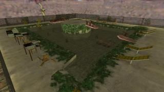
Abandoned Pool
My entry for Rimrook's pool compo. I didn't add a ladder though as I don't see it really fitting anywhere in this pool.
An abandoned pool, one that hasn't seen use in many years and is now long forgotten by most, except leeches.
An abandoned pool, one that hasn't seen use in many years and is now long forgotten by most, except leeches.
7 Comments
You must log in to post a comment. You can login or register a new account.

 HL
HL


Pros:
-Great job making it seem old, and used
-The theme of the map looks really good
Cons:
-Some of the textures look very odd. Especially the wood texture. I think you should've used the damaged wood texture.
-You should have added clip textures to block player movement
-A good idea would be, as mentioned, to add height to the floor.
3 Stars!
The only real let down is that horrible half-life desert sky, that doesn't match your map(or any map for that matter) well. Also as dexter said, it would have been nice to see some height and a border around the pool, giving it the illusion of more depth.
Still anyway, very nicely-constructed pool!
@Dexter Thanks, The thing about jumping the fences by getting up on the chairs I actually knew about but I guess I was too lazy to fix it and didn't want to do another compile which for some reason took forever for this map. I assume by "height" you mean make the pool deeper?
@zeeba I will definitely be checking out your map, I thought it looked pretty epic from the screens you gave.
=)
The pool was a cool idea to do it old and destroyed rather than the standard nice and pristine. The middle island seemed kind of strange and there was no exit etc. etc. but the idea is pretty much there. Just remember though, try to crank gold to its limit which is suprisingly deap.
This reminds me of a map I did before for map a machine competition. Also reminds me of Imu's mapping which i'm a big fan of.