narcosynthesis_test4
 HL
HL
narcosynthesis_test4
by
PrivateSnowball
Posted 13 years ago2011-07-10 16:26:59 UTC •
Unfinished •
Half-Life
- Name
- narcosynthesis_test4
- By
-
 PrivateSnowball
 - Type
- Map
- Engine
- Goldsource
- Game
- Half-Life
- Category
- Unfinished
- Included
- BSP, RMF/VMF
- Created
- 13 years ago2011-07-10 16:26:59 UTC
- Updated
- 13 years ago2011-07-10 16:33:35 UTC
- Views
- 1709
- Downloads
- 536
- Comments
- 14
- Rating
- 2.00 (1)
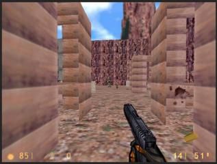
This is a test render for a portion of a much larger map I hope to create. This section takes place in a desert village.
Be sure to enable mp_allowmonsters 1 for some extra fun!
Be sure to enable mp_allowmonsters 1 for some extra fun!
14 Comments
You must log in to post a comment. You can login or register a new account.


Thats all I can say.
Mapping is all about using your imagination. Always try new ideas. If you think up something cool, see if you can make it. If something doesn't look great, think of how you can improve it.
The first thing the strikes me, as Dimbark said (even if it was kinda blunt and unhelpful), is the blockiness. This is a habit you'll get out of as you map, because not only do players dislike it, but as you get better you'll strive to fix it yourself. No-one can jump into mapping and create a masterpiece. It's all about practice.
Secondly, texturing. Try to vary your texturing as much as is practical. Textures can only repeat so many times before it becomes anti-eye-candy. Don't feel limited by only having a single face. By using multiple brushes, you can use several textures on what would seem to the player to be one face. Got a wide open, single texture grassy area? Think of how to switch it up. Break it up and stick a parking lot in there. Have some crude-looking paths break up the monotony. Whatever may fit in with what you're creating.
It's not just limited to the texture, either. Depending on your texture, you can spruce up a drab looking wall with brushes, too! Have a look: Link One & Link Two
Thirdly, variation in general. When you look at things in the real world, virtually nothing looks the same as anything else. Houses may be taller, paint may be greener, windows could have different designs. Trying to make everything unique in maps is something to aim for. Little differences can set similar areas apart, and prevent players from getting disorientated or getting bored by seeing the same thing over and over.
Hope that helps in one way or another.
EDIT: says:
WARNING: could not open gearbox.wad
when i try running the map.. i would recommend using Atom's Compilator which you can easily include the wad files you've used. Get it here