Unfinished Compo31
 EP2
EP2
Unfinished Compo31
by
Striker
Posted 12 years ago2011-11-24 18:12:47 UTC •
Unfinished •
Half-Life 2: Episode 2
- Name
- Unfinished Compo31
- By
-
 Striker
 - Type
- Map
- Engine
- Source
- Game
- Half-Life 2: Episode 2
- Category
- Unfinished
- Included
- BSP, RMF/VMF
- Created
- 12 years ago2011-11-24 18:12:47 UTC
- Updated
- 12 years ago2011-11-24 19:12:13 UTC
- Views
- 2400
- Downloads
- 782
- Comments
- 9
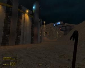
This archive includes the unfinished, but compiled map for Half Life 2: Episode 2. It also includes the link to the custom textures you need to play it, and a vmf file if you want to use, modify or build upon my map. Feel free to do whatever you want with it, I don't require credit( but I do appreciate if you give me credit :P).
If you want to play the map, or edit it in hammer without seeing texture errors, unpack the folder from the provided texture archive link(see below) in "you_steam_account_name\half-life 2 episode two\ep2\materials"
I couldn't finish the compo in time because school occupied a large portion of my time( why don't you guys make compos during holidays anyway?) and partly because of some technical problems. I'm talking about the persistent, annoying bug or crash or what it is when I compile bigger maps: vrad.exe just stops using any processing power. It simply halts. No error, no message. I also started having some framerate problems, and the map was intended to be almost twice as big.
I might come back at this and finish the project to something playable in the future.
Have a nice day!
TEXTURE PACK DOWNLOAD LINK:
http://www.gamefront.com/files/21020994/compo_031_source+textures.rar
9 Comments
You must log in to post a comment. You can login or register a new account.


I now start to comprehend the scale of how much of an asshole you are. My map is not terrible because it can't be: it was never finished. And even if it is terrible in the actual state, you should have described the negative points and give advice. Short, negative answers are not welcome.
And I wonder why I gave the attention and I praised one of your maps in the past...
Your good skills are in vain if you're such an awful person.
Terrible. But I did sorta like some of the work, wasn't 1-star worthy.
I uploaded this out of my benevolence(you know, it took time to put all the things together and upload them, I wanted to show that I wanted to participate but didn't make it) and words of negative criticism are thrown at me? How would you feel?
I actually got this to play fairly well in crafty, so i'll rate from that, since my ep2/l4d are uninstalld due to hdd space issues. =(
+some very good brushwork. it's obvious you took some time there.
++varied, interesting, and abundant lighting
+some good displacements
+/-packed with small detail in places{mostly nice trims), but barren in others.
+/-texturing looks fine, but could be more varied
+/-theme is a bit fuzzy, as i have no real idea what this setting is. a martian moon base? a desert power station? a clearer theme helps the player make sense of his surroundings.
-small. given the power of the source you could afford to go bigger, more complicated
-needs more small props inside besides crates(my entry had no small props, so how judgemental can i be?!)
Given this is unfinished, half these comments would be erased i'm sure if the map was complete.
In it's current state i'd rate 3/5, but i'll go 5 to average out the trollish ratings. Nice work sir, sorry you couldn't finish!
Dimbark and Bruce earn another strike against them in my little black book. :/