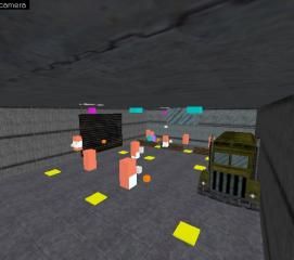
npc_war
- Name
- npc_war
- By
-
 kingcole436
 - Type
- Map
- Engine
- Goldsource
- Game
- Half-Life
- Category
- Problems
- Included
- RMF/VMF
- Created
- 12 years ago2012-04-21 22:09:24 UTC
- Updated
- 12 years ago2012-04-21 22:09:24 UTC
- Views
- 1590
- Downloads
- 489
- Comments
- 1
Hoping someone can find the leak in this map.
Here is the problem thread: http://twhl.info/forums.php?thread=17966
Here is the problem thread: http://twhl.info/forums.php?thread=17966
1 Comment
You must log in to post a comment. You can login or register a new account.

 HL
HL


Select Tool(Ctrl+s)
Select single objects and groups. While using this tool you can also resisze SINGLE retangular objects or groups that are the same size in at least one dimensions(trying to scale brush sides of different sizes this way will cause your objects to go off-grid and scale unevenly, causing leaks and other problems).
Vertex Manipulation Tool(Ctrl+v) (a.k.a. VM)
Use VM to "move" brushes to different angles--like the big ramp in your map--,and to evenly scale/resisze objects of different sizes, by ONLY SELECTING the applicable vertices.
Basically, i would recommend you rebuild the main 12-16 brushes that make up the bulk of your world walls, and try to make them look something more like the objects visgrouped in green and yellow below:
Each vertex from one brush should line up perfectly with the brush it's next to. This way is MUCH CLEANER to look at, will help prevent leaks, plus your brushes that seal your world from the void should not overlap. (it is impossible for hammer to properly render 2 faces occupying the same space, so overlap is easy to spot in the 3d window)
Also when building the main walls of your map, try a grid size of 16 or 32, and you will notices you 2d views look much cleaner, and easier to edit/debug
Hope this helps some! feel free to pm me if you need more help