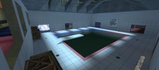
fy_tgpoolday
 CSS
CSS
fy_tgpoolday
by
ThatGuy4878
Posted 12 years ago2012-12-26 22:48:16 UTC •
Completed •
Counter-Strike: Source
- Name
- fy_tgpoolday
- By
-
 ThatGuy4878
 - Type
- Map
- Engine
- Source
- Game
- Counter-Strike: Source
- Category
- Completed
- Included
- BSP
- Created
- 12 years ago2012-12-26 22:48:16 UTC
- Updated
- 12 years ago2012-12-28 01:22:58 UTC
- Views
- 1425
- Downloads
- 532
- Comments
- 4
- Reviews
- 0
A small little tribute map to the good ol' fy_poolday map for CS 1.6 eons ago.
Look, I know I'm not the best mapper ever. There was a period I gave up which lasted like 1 1/2 years, so this is my come-back map - in the Source Engine, no less.
There might be a bug where people spawn on top on one-another, because of the presence of the gun entities so close to the spawn points. I've tried fiddling around with it, and I've got it where I have not seen it happen again. Just putting that out there.
I hope this will build my confidence enough to keep doing stuff in the Source Engine, because I did not use all of the stuffs to make the map 100%, like a 3d skybox. I did however compile the map in HDR, because it looks cool and stuff.
I tried focusing on map layout rather than functionality of an actual pool facility. I'm pretty sure the original poolday didn't care
I hope it's cool and I did a good job, despite me not using all the tools to make it really cool. I might go back to this map and make it pretty later... MAP-RELOAD #2 - STUFF THAT WAS CHANGED
Look, I know I'm not the best mapper ever. There was a period I gave up which lasted like 1 1/2 years, so this is my come-back map - in the Source Engine, no less.
There might be a bug where people spawn on top on one-another, because of the presence of the gun entities so close to the spawn points. I've tried fiddling around with it, and I've got it where I have not seen it happen again. Just putting that out there.
I hope this will build my confidence enough to keep doing stuff in the Source Engine, because I did not use all of the stuffs to make the map 100%, like a 3d skybox. I did however compile the map in HDR, because it looks cool and stuff.
I tried focusing on map layout rather than functionality of an actual pool facility. I'm pretty sure the original poolday didn't care

I hope it's cool and I did a good job, despite me not using all the tools to make it really cool. I might go back to this map and make it pretty later... MAP-RELOAD #2 - STUFF THAT WAS CHANGED
- Two spawn points were too close to the wall for each team, preventing them from spawning peoples. Fixed that.
- Couple of brush and textures errors that looked weird. Fixed that.
- Made the halls connecting the shower rooms to the locker rooms taller, preventing, making a glitch where rag dolls flying into the ceiling history (I hope)
- I did not re-compile the map in HDR, because the light was REALLY bright, and didn't fit the map well. I think it looks better without it, anyways :/
- Added crates, so you can climb though the windows pool-side.
- Put in some indoor lighting, so the map does not rely too much on environment lights. I enjoy the contrast achieved between the cold, blue outdoor lighting and the warm yellow indoor lights.
- AMBIANCE

- Fixed the steam from the hot-tubs a little (more spread out).
- And a bunch of other things I forgot about.
4 Comments
You must log in to post a comment. You can login or register a new account.


...maybe later :/
...I thought it was done -_-
Except for maybe the crates, which look very out of place, but at least bots can jump on them and use them :/