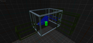
Me stuffing around with the wireframe style. Due to stupid, the "lines" are twice as thick as they should be. I have no intention of fixing it, because this was just a test.
Commented 9 years ago2015-09-19 10:31:19 UTCComment #20942
Always wanted to do a proper Hammeworld map.
This concept would go a lot further in Source engine, terms of brush resources, 3D sky(for a crazy gridspace), & displacements. One downside being source aliases small brushes weirldly--or maybe this doesn't happen any more?
I'll check this out properly soon as I can, nice work doe
Commented 9 years ago2015-09-28 06:36:57 UTCComment #18044
Just that it seems Source renders small brushes like a 1-unit-thick railing weirdly/buggily, i.e., it flashes/disappears as you move & rotate the camera. If that's the "microbrush warning", then yes
Commented 9 years ago2015-10-08 17:21:57 UTCComment #18033
Interesting. I tested it.
This would go well with a concept map where teams have a limited amount of time available to "see through" walls. Actually these would be toggled func_walls with a solid(bsp) transparent brush in their middle.
This concept would go a lot further in Source engine, terms of brush resources, 3D sky(for a crazy gridspace), & displacements. One downside being source aliases small brushes weirldly--or maybe this doesn't happen any more?
I'll check this out properly soon as I can, nice work doe
Silly CS:GO SDK...
This would go well with a concept map where teams have a limited amount of time available to "see through" walls. Actually these would be toggled func_walls with a solid(bsp) transparent brush in their middle.