Crossedwire

Half-Life: Deathmatch HLDM
Crossedwire by Archie
Posted 7 years ago2017-03-02 15:09:27 UTC • Completed • Half-Life: Deathmatch
Loading...
Screenshot Thumbnail
Name
Crossedwire
By
Archie Archie
Type
Map
Engine
Goldsource
Game
Half-Life: Deathmatch
Category
Completed
Included
BSP
Created
7 years ago2017-03-02 15:09:27 UTC
Updated
6 years ago2018-06-12 13:33:24 UTC
Views
4149
Downloads
1228
Comments
13
Rating
4.71 (7)
Reviews
0
full star full star full star full star full star Download (11.01mb)

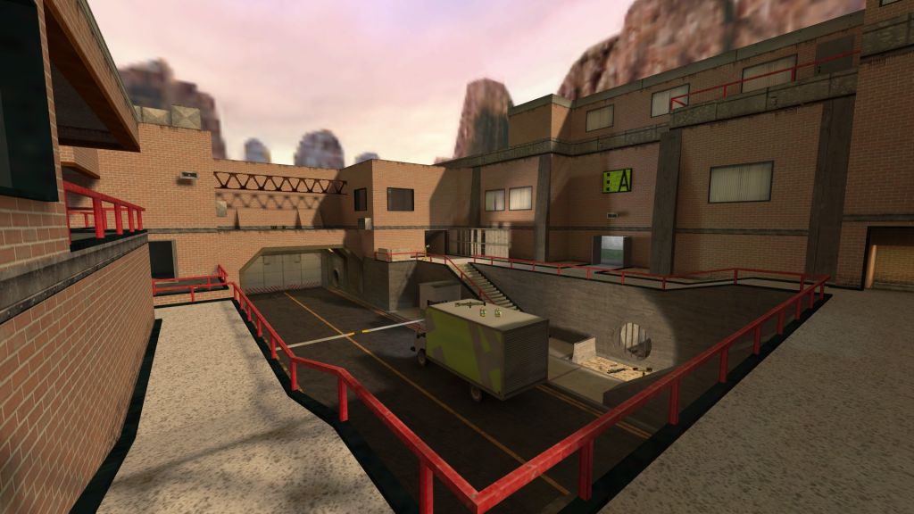
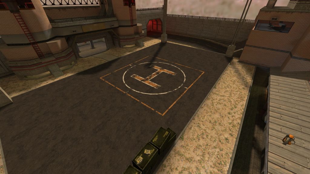
My entry for competition 34. See if you can guess which map it's a subtle re-imagining of!

Currently playing on:

62.104.168.193:27015

13 Comments

Commented 7 years ago2017-03-03 09:53:50 UTC Comment #18467
Oh I get it, it's Datacore!
Commented 7 years ago2017-03-03 17:28:22 UTC Comment #18468
Can't wait to check out this version this weekend!
Commented 7 years ago2017-03-04 00:55:01 UTC Comment #18469
Just played the map for the first time.

Stunning work!
Commented 7 years ago2017-03-18 17:24:10 UTC Comment #12164
An excellent remake of HLDM's most-played map. Much more room to run around in, added verticality, and additional rooms boost the gameplay possibilities. Replacing the nuke with an airstrike (and the addition of radio chatter when it's activated) give the sometimes-maligned mechanic a sense of story and logic.
The visuals of the map are very impressive for goldsource, with nothing seeming more blocky than it should, or low-resolution. (Well, okay, I can't read the brand names on the vending machines, but they look so good that I also can't make myself care)

I didn't get a chance to try out the old version, so I don't know what changes were made, but since nothing seemed odd or out of place, I figure they must have been for the better.
Commented 7 years ago2017-03-18 17:57:17 UTC Comment #12158
Excellent map with very natural lighting. A more reasonable (although at times slightly confusing) layout that plays well and great attention to detail. I expected no less of you.

Well done except I couldn't find the snarks tap.
Commented 7 years ago2017-03-18 20:17:21 UTC Comment #12156
Let's take a look at this framerate nightmare again: (well, if 6fps is a nightmare xD)
User posted image
Thank God, and thank you, Archie!
Finally, my frames are back at 20fps to 30fps instead of my GPU struggling to handle the flickering lights. :D
User posted image
The same thing here, although it doesn't change much. :/
My frames are OK, seems playable here. Nice details there and there, and I like the overall feel and taste for textures. ;)
User posted image
Ah, one of those rare spots where I get 60fps. :D
Lots of TWHL references scattered around the map. That's what makes these maps so special: wisely putting (not too many) references of things/people we know.
User posted image
Looks like you listened to my advice. xD
Or someone else told you?
User posted image
So the minimum framerate I get in the whole map is 9fps. Perfect, compared to the previous version's 4fps which was present a lot, in fact.
User posted image
Uhh... what. Ah well, not everything has to be perfect. :)
User posted image
This is a very very nostalgic pipe...
Reminds me of the Half-Life 2 sewers! :D
Also, nice use of the Glow Render Mode with sprites in the tunnel afterwards.

So yeah, I can say that, with much better framerates, this map is optimised sufficiently for older hardware, and is able to run acceptably on my almost-10-year-old laptop. You basically gave me a performance boost (and thank you for that).
If we were to rate on a scale of 10, I'd give a 9.
So, that's basically 5 out of 5 stars here.
Commented 7 years ago2017-03-19 02:14:21 UTC Comment #12148
Cheers for the reviews, guys! Thankyou!

Admer, I really appreciate the in-depth review but you really gotta sort your gamma out. It makes the lighting look terrible! xD
Commented 7 years ago2017-03-19 05:04:21 UTC Comment #12123
actually the way his gamma makes the lighting look so bright kinda suits the map better since its set in a desert?! anyway the lighting in this map is great, sometimes hard to tell apart from Source and also reminded me of Mirror's Edge. It's kind of a massive version of crossfire and would probably play interestingly but one sad truth is that these days it's really hard to get players in HLDM and even if you do, few would wait the 20MB download, the reality is that players gather from all around with the shittiest connections, I look after one server for years so talking from experience... And yeah fps isn't the greatest, on my linux craptop sometimes it drops to 10fps but I guess it runs fine on an average modern PC. Either way, since HL is such an unpredictable creature with a life of it's own, don't worry, players will see what this map is worth, either sooner or 20 more years later. Good work!
Commented 7 years ago2017-03-19 07:36:14 UTC Comment #12114
@Archie
While I was making ts_untergrund and showing the screenshots, everyone said they were too dark. The same thing goes for de_kobbl.

And now, you're saying it's too bright!
Well, guess what, they're actually my monitor's colour settings.

Essentially, contrast is high, brightness compensates the contrast (so br. also gets a bit high) and I also turn on "vivid colours". So yeah, the lighting looks great on my end. I don't know what's the big deal with my gamma setup. In fact, I will show you a screenshot of my colour settings, and the video settings in GoldSrc.
Commented 7 years ago2017-03-19 13:41:49 UTC Comment #12104
That's a really nice review, Bruce! Thankyou! We've managed to get pretty regular 12-man meetups on the TWHL/SnC server, but that's probably because we're in the midst of a competition period.

As for Admer's gamma, it's taking all of the colours out of the highlights, neutralising the blacks and causing pretty extreme banding wherever the lighting blends. Here's a comparison against default gamma settings:
User posted image
Look at where the worklight blends, for example. That banding is really nasty :o
Commented 7 years ago2017-03-19 21:52:19 UTC Comment #12100
What the heck...
So, by trying to fix one end (darkness), I broke the other end. (brightness)
Uhh... come on...

Looks like I'll have to default it all and re-configure it. :P
Commented 7 years ago2017-03-28 00:21:58 UTC Comment #20945
Loving this rendition of the classic crossfire. I'd give it a solid four stars, but the sexy ass voice acting during the bombing run pushes it up by another point.

In all seriousness though, it's quite tits.
Commented 4 years ago2019-11-28 20:51:04 UTC Comment #102456
I have to echo mostly everyone's sentiments here regarding the visuals, but gameplay-wise, the map feels a little awkward. There's a few places that feel a bit too cramped or that are easy to get stuck on. The aforementioned HL2-esque pipe is one of those. Some of the layout changes make things a little bit more complicated than they were in the original, like the the main area with the parked Archie truck. Right where the I-Beam is on the top left, something that used to require just one jump before now requires two. Maybe I'm just a little too used to the old crossfire, but I'm not sure. Either way, this map is a real treat visually, and my chances of actually playing it in HLDM are very low anyhow! If I could rate 4.5 stars I would, but alas, it's going to be 4.

You must log in to post a comment. You can login or register a new account.