Competition: Remake a Game!
Closed
View Results
- Open Date
- 16 years ago2008-03-04 00:00:00 UTC
- Close Date
- 16 years ago2008-04-26 23:59:59 UTC
- Type
- Full Map
- Allowed Engines
- Goldsource, Source
- Judging Type
- Judged (each engine separate)
- Judges
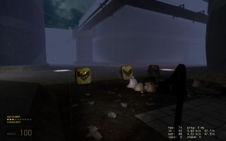
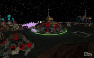
We here at TWHL are sick of seeing the same old maps. Instead, we want to see maps from other games! Your task is to recreate a level from any game for Half-Life 1 or Half-Life 2. You can choose any game you want, but you MUST provide at least two screenshots of the game you're recreating, as well as the game's details.
We will be judging how well you establish the original level in the Goldsource or Source engine. We will also be judging how well you 'refresh' the content: think about the Black Mesa modification for Source for an idea of what we mean. The more creative you are, the better!
There are prizes on the line this time round as well. Check the thread for further details.
Results
Judged By:
 AJ
•
AJ
•
 Penguinboy
After lots of delays, here are the results for competition 25. Besides the standout entries, I was fairly disappointed with the quality of the entries this time around.
Ant, being the genius he is, decided to delete all his steam games, and therefore couldn't judge. (he has dialup, so it'd take him a year to redownload everything).
I decided to drop the sugar coating this time around and offer some real criticism. Please don't kill me.
Ant, being the genius he is, decided to delete all his steam games, and therefore couldn't judge. (he has dialup, so it'd take him a year to redownload everything).
I decided to drop the sugar coating this time around and offer some real criticism. Please don't kill me.
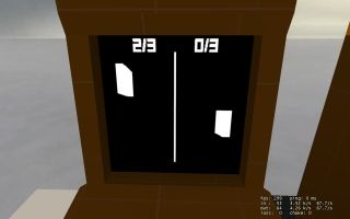
Yes, pong. While this entry doesn't look the best (hell, it doesn't look at all), the entity work is outstanding. Clearly a lot of work has gone into getting this to work as well as it does, even though it has some bugs. There's even two machines so you can play with someone else, of you can switch control of the paddles by clicking the mouse, and play against yourself.
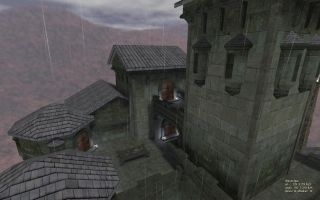
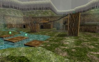
Tetsu0 has put a lot of effort into this, and it shows. The village is well done, if a bit boring, and the little bit of gameplay to find the suit is a nice touch. I managed to kill myself in the Deku Tree by jumping onto the spiderweb from the top level. Isn't that how you get past it in the real game? D:
Goldsource
Docrock - Mario Brawl
Docrock submitted another deathmatch map, after the success of his last one. Unfortunately it's not as good. The teleporters don't seem to have any indicated place to go, and it is rather random. The brushwork is mediocre at best, and the skybox is bure black with corny pictures of Mario on it. Overall, it looks nothing like the game it was supposed to represent (mario bros), besides having a pitch black background and having some pipes.
hlife_hotdog - ReReal
I was expecting more from this Unreal remake, but it's rather dull. I think this is the first part of the game, as it seems to be some sort of escape sequence. It consists of walking through unimpressive hallways, then ends suddenly. I think a better part of the game would have been more appropriate to remake.
Rimrook - Link's House
This map wouldn't run on Steam Half-Life, so I cannot judge it. It was disqualified anyway, for use of illegal models.
zeeba-G - Metroid Yellow Planet
While the brushwork is good, this map is very confusing. The ship didn't open until about the tenth try, and the ride in the ship was boring and long. It crashed on a planet of some sort, where I proceeded to die slowly in toxic water with no apparent escape. I didn't want to try again.
N0_Named_Guy - Castlevania SOTN Prologue
This looked roughly like the screenshots, but is so unbelivably short that it could not get any awards. You walk up stairs, theres a room, and that's it. Theres a ramp thing that you can go up (via invisible ladder) to a dead end. Textures and details are minimal.
trooperdx3117 - Operation Pandora-Trigger
Crashed on startup.
Skals
Skals was banned during the competition, and was disqualified.
Source
LCP - Hangar
This remake of the first level of DOOM had a decent layout, but the texturing, weapon, and prop placement is horrible. I think that 90% of the map is one texture. Nice to see the secrets included, but I think that DOOM actually looks better than this map.
Muzzleflash - Lower Vortiville
This is a remake of a level from a Commander Keen game. While I'm sure it's similar to the game, the level of skill needed to do this map would be minimal. It's blocky, linear, and consists of two textures. One thing I can say is that the score counter is a nice addition.
IndianGordy - aim_aztec_source
Ignoring the fact that this is an aim map, the texturing on this map is pretty bad. Tip: turn texture lock on before you rotate your crates! The displacements are really pointy and unrealistic, and rough in general.

