Competition: Texture Pack - Industrial
Closed
View Results
- Open Date
- 13 years ago2011-09-24 00:00:00 UTC
- Close Date
- 13 years ago2011-11-25 23:59:59 UTC
- Type
- Full Map
- Allowed Engines
- Goldsource, Source
- Judging Type
- Judged (all engines combined)
Yes, it's time for the texture pack competition! The rules are simple: make a functional map using only the texture pack we've provided. It can be a singleplayer or multiplayer map, it simply must have gameplay of some kind. You have two months to use these textures as uniquely as you can! The theme for the textures is industrial, but don't feel like you must create a simple warehouse, as we want you to blow our feeble minds with your creativity!
The Goldsource textures are available here.
And the Source textures are here.
There is no limit to map size or complexity. You also don't have to use all the textures, but those who do find a use for them all might just impress the judges more. The textures are also larger than most of the engine standards, so they will need to be scaled down a bit further than usual. Don't worry though, our computers can handle it!
Good luck!
Results
We had a good turnout this time around, though with all the people reporting that they ran out of time, looks like we could have had even more! Some impressive use of brushwork in many of these entries, which complement the provided textures quite well. We would have loved to see some more entries with gameplay, though - only two of the singleplayer maps provided had any sort of gameplay.
Both Strider and myself have lovingly crafted some critique on all entries. For all entries, the first paragraph is Strider's comments, and the second paragraph are my comments.
Enjoy!
Both Strider and myself have lovingly crafted some critique on all entries. For all entries, the first paragraph is Strider's comments, and the second paragraph are my comments.
Enjoy!
- Penguinboy

Captain Terror's entry is an amazingly detailed recreation of a Battlestar Galactica set that pushes Goldsource to it's limits. His brushwork is incredible, and he makes excellent use of a texture pack that isn't exactly suited to the theme. Sadly there's no gameplay included, meaning there's little more to do then walk around and admire the work. And I'm okay with that, because it looks fantastic.
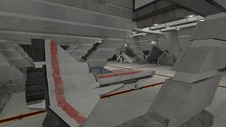
Captain Terror gives us another purely visual entry with a rather stunning spaceship hanger. Some fancy brushwork and attention to detail, as well as excellent use of the textures, makes this an amazing entry. Unfortunately it is incomplete, with some areas that have obviously been set up for extra content simply cutting off. There are a number of clipping errors, and the lighting comes off as a bit bland. However, with a little more work, this could be made into an excellent single player map, or even just a simple showcase that Captain Terror can put in his portfolio.
Captain Terror gives us another purely visual entry with a rather stunning spaceship hanger. Some fancy brushwork and attention to detail, as well as excellent use of the textures, makes this an amazing entry. Unfortunately it is incomplete, with some areas that have obviously been set up for extra content simply cutting off. There are a number of clipping errors, and the lighting comes off as a bit bland. However, with a little more work, this could be made into an excellent single player map, or even just a simple showcase that Captain Terror can put in his portfolio.

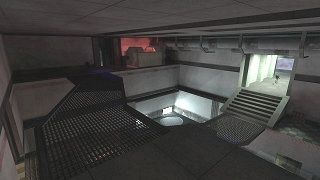
One of the more interesting entries of this particular competition. Skals' entry is a very open-ended mission, that while is perhaps a little vague in it's execution, let's the player tackle it from a manner of angles. Visually, I found it's the most distinct Goldsource entry, being set in some sort of modern, open desert installation. Unfortunately, it's very incomplete in areas, with terrain cutting off unexpectantly, and a number of dead ends that felt like he may have ran out of time. Nonetheless a great entry from Skals.
Skals gives us the only Goldsource entry with some single player gameplay - and it's reasonably difficult, too. Not much ammo is spread around the map, so if you're not careful you'll find yourself with no bullets and plenty of soldiers shooting at you. The story of the map does the job, and the layout of the level is quite good, even if it is a bit incomplete. Use of some coloured lighting, glass floors and corridors, and laser effects set the mood quite nicely. This map is very unfinished - I got stuck a number of times due to lack of clipping, there are a number of NULL textures visible, some hallways lead nowhere at all, and the level of detail is quite low. Some extra time spent on this map could make it shine. I also found the map to be quite dark - some additional lighting would be more than welcome.
Skals gives us the only Goldsource entry with some single player gameplay - and it's reasonably difficult, too. Not much ammo is spread around the map, so if you're not careful you'll find yourself with no bullets and plenty of soldiers shooting at you. The story of the map does the job, and the layout of the level is quite good, even if it is a bit incomplete. Use of some coloured lighting, glass floors and corridors, and laser effects set the mood quite nicely. This map is very unfinished - I got stuck a number of times due to lack of clipping, there are a number of NULL textures visible, some hallways lead nowhere at all, and the level of detail is quite low. Some extra time spent on this map could make it shine. I also found the map to be quite dark - some additional lighting would be more than welcome.

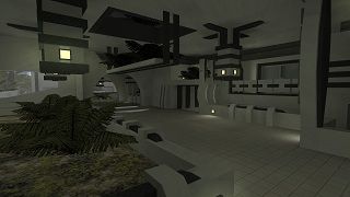
Like Rimrook's and Captain Terror's entry, Ninja Defuse's entry is a gorgeous entry completely lacking gameplay! Come on people, all these wonderfully detailed entries and nothing to do in them! Even so, it's a great accomplishment. The brushwork is inventive and packed with detail, the texture work is tidy, and the arty theme was very well established given how unsuitable the texture pack would be considered. Another short, but impressive piece of work.
Ninja defuse shows off his artistic talent with this impressive display of modern-looking architecture. The contrast provided by the black and white textures, as well as the green of the plants, makes this level quite lovely to look at. However, it is quite a small map, and some extra rooms would be nice. Because of how simple the layout is, this map as it is now wouldn't be good to actually play Counter-Strike in, but if some extra rooms and paths were added, it would work quite easily.
Ninja defuse shows off his artistic talent with this impressive display of modern-looking architecture. The contrast provided by the black and white textures, as well as the green of the plants, makes this level quite lovely to look at. However, it is quite a small map, and some extra rooms would be nice. Because of how simple the layout is, this map as it is now wouldn't be good to actually play Counter-Strike in, but if some extra rooms and paths were added, it would work quite easily.
Special mention goes to Rimrook who would have gotten fourth place if it existed. All the other entries below are in no particular order.
Anvus - Rimrook (HL1SP)
Rimrook's entry is a wonderfully atmospheric and detailed entry that makes excellent use of the textures. We've come to expect no less from Rimrook, so it was a little sad to see no actual gameplay included, and that it didn't take me long at all to run through it. I would love to see a complete SP map made out of this theme. But again, the lack of anything to do is pretty much outweighed by the visuals, so I can't really complain about that.
Rimrooks makes excellent use of the provided textures in his small showcase map. While lighting is a bit bland, use of some simple laser effects adds a lot to this map. Clever use of brushwork and textures helps this entry look very nice. It'd be cool to see this turned into a small mod with some backstory and gameplay.
Deathan's Entry - Deathan (HL1DM)
A multi-story deathmatch map with a nice modern style. The brushwork is solid, and the texturing too, but the layout's a little basic, and perhaps too open for deathmatch. I can imagine a lot of hectic spawn kills, and not a lot of people using the upper levels because of it. It looks nice though, Deathan managed to get something pretty unique out of the textures, and actually included gameplay, which sadly a lot of entries didn't!
Dethan's HLDM map certainly has a nice look to it - the cool blue lighting inside the two towers in the map and the use of the contrasting textures in the floor and walkways adds some very nice touches to the map. The layout, however, doesn't seem very practical - every floor above the ground is only accessable from a single central elevator, and it is quite a slow ride to the top. If some modifications were made to provide players with more opportunities for vertical gameplay (stairs, ladders, more elevators, etc), the deathmatch gameplay would probably be quite a bit better.
The Incinerator Complex - Quartz (HL1DM)
A heavy industry map from Quartz, with a nice mix of traps, secrets and straight out killing fields. It's pretty blocky in places, and pretty scarcely detailed, but it's functional and the theme comes across well. I found the layout a little confusing in places particularly the indoor segments, but I suppose part of the deathmatch experience is learning the map's tricks. A solid entry.
This is another HLDM entry, with some interesting use of conveyors and moving parts to provide additional routes through the map. Unfortunately, all these routes are one-way, which means the deathmatch gameplay would only flow in one direction. Some paths that work back in the other direction (from the bottom to the top) would improve on this layout. The corridors are a bit small and cramped, and there are a lot of tight spaces and corners - adding some more space would help as well. While the texture work and lighting in this entry could be improved upon, they are still pretty good, and with a bit of extra work, this could make a good deathmatch map.
de_minestorm - doggybag71 (CS1.6)
Doggybag's entry is a solid defusal map for Counter-Strike with a nicely realised mining theme. It's a bit large and sparcely detailed in places, but a pretty great entry overall. Doggybag made good use of the textures, working them into a distinctive mining facility. The layout feels right for some good old fashioned CS action, and each area is different enough making it easy to learn, so no complaints there!
Doggybag's entry is quite large - I wasn't expecting it to be as big as it is. The layout of the map seems reasonably appropriate for a Counter-Strike map, and the size of the map would easily accomodate for a large number of players. Use of rain effects makes the ambiance quite nice. Attention to detail is a little lacking, probably due to the sheer size of the map. The layout of the map is all there, it just needs the extra touches added in. Use of props, models, and attention to lighting would improve this map.
Commieman's Entry - commieman (HL2DM)
Unfortunately the only thing really notable about this entry is how incomplete it is. I'm not sure if the intention was to make a deathmatch map or a full singleplayer adventure, as it's pretty hard to tell what the goal behind the map was with it in the amount of pieces it is. A train yard was maybe not the best choice given the textures, but Commieman deserves points for trying, even if he didn't make it to the end.
Commieman submitted his very incomplete entry of a train station. While it does look quite promising, there's not really much to say - it just needs more time and work to complete. Though, I would love to see this map completed and posted in the map vault!
Moaby's Entry - Moaby (HL2EP2)
Moaby's entry is a simple little action level the feels like it's styled after the corridor shooters of old. I'm not exactly sure where I'm supposed to be in this map, but it's well mapped and consistently detailed, and uses the pack well. While the gameplay amounts to little more than just shooting your way through a small army, it was challenging and fun enough to keep me going. A sound entry.
Moaby created our only Source entry with single-player gameplay, and he certainly injected a hell of a lot of combine soldiers into it! Fortunately, ammo is easy to come across, and most soldiers drop health canisters, meaning that you shouldn't have too much trouble with this map (though I was on 1HP for a while when I played it!). There's plenty of content in this map, and the textures are used reasonably well to create a nice environment to shoot people in. The "main" room of the map has some good use of lighting, as well - as you make your way past the soldiers, the well-lit room goes dark, and some emergency warning lights come on instead. It's quite a nice effect. Texture use could improve in some areas where it seemed a bit out-of-place or repetitive, and the ending of the map was quite sudden and random.
CrAzY's Entry - CrAzY (HL2EP2)
I don't think I have the words to describe this entry. An incredibly zany entry set in a human testing facility that makes Aperture look safe. You'll fling yourself across rooftops, and through tunnels with the most impractical equipment imaginable. Regrettably, I got stuck more than once, and figuring I had maybe broken the scripting somewhere, had to cheat my way through some sections. Despite that, it was a fun and inventive way to make use of the texture pack.
CrAzY certainly lives up to his name with this entry. It starts in a few small rooms with some basic jumping puzzles, but after that, it starts to turn into something very strange. Unfortunately, I was unable to figure out what should be done due to a complete lack of direction in the map, as well as a reliance on obscure puzzles based on physics glitches in the source engine. I had to noclip to see the second and third maps, which both had simular issues with obscure glitches and lack of direction. Texture use in the first few rooms is okay, but it gets progressively worse as the entry goes on.