Competition: Half-Life 20th Anniversary: Vanilla Half-Life
Closed
View Results
- Open Date
- 6 years ago2018-08-13 00:00:00 UTC
- Close Date
- 6 years ago2018-11-19 23:59:59 UTC
- Type
- Full Map
- Allowed Engines
- Goldsource
- Judging Type
- Judged (each engine separate)
- Judges
To celebrate the 20th anniversary of Half-Life, this competition has a single, simple goal: Make a map set within Black Mesa, using only standard assets. The map should look like it belongs in the Black Mesa complex and could fit into the Half-Life campaign without looking out of place. Xen is allowed too, if you're that way inclined.
Your level can contain gameplay, but doesn't have to. Judging will be based on how well your design matches the original game in addition to the standard measures such as lighting, architecture, ambience and texturing. Size isn't too important, but just making a single small room is probably not going to score too well.
For this competition your entry must consist of BSP files only. That means custom textures (wadincluded) are allowed, but you can't use any other custom content. Remember that the goal is to make something as "vanilla" as possible, so if you do make custom textures, they should fit in with the other textures of the main campaign.
Entries close on the day of the 20th anniversary, November 19th. Good luck!
Post any questions, comments, or screenshots to the official forum thread.
Prizes
Because TWHL doesn't run ads or ask for donations, our prizes are somewhat modest as they come from our own pockets. I have a rather large list of unredeemed Steam keys that will be used as prizes for this competition.- First prize: US$25 Steam gift card, or equal value on an alternative store (must be purchasable from Australia) + choose 2 games from the list
- Second prize: US$10 Steam gift card (or alternative store) + choose 2 games from the list
- Third prize: Choose 2 games from the list
Results
Judged By:
 Penguinboy
•
 Strider
Merry Christmas from TWHL! The competition got some stellar entries this time around, all evoking that feeling of nostalgia from the game we all fell in love with 20 years ago. I would absolutely love to see these entries get expanded and turned into larger mods! These entries are proof that you don't need to spend years making perfectly polished and detailed maps (cough Urby cough The Core cough) to make a quality and highly enjoyable Half-Life mod.
For the winners: please send me a PM with your Steam account details (and add me as a Steam friend) and let me know which 2 games you would like from the list of unredeemed Steam keys. First place gets first pick of games, so if one you choose is selected by another person, you might have to choose a different one. Please also let me know if Steam vouchers are ok or if you would like something else of equal value. Also please get in contact with Satchmo who has generously volunteered to donate some additional prizes to our winners. Thank you, Satchmo! (Please be patient for a response, this time of year is busy for everybody and we may take a while to respond)
As always, we wish you all the best from us at TWHL. Have a good holiday and new year, and then get back to mapping! Here's to 20 more years of Half-Life!
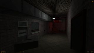
This entry was such a surprising, herculean effort that it just had to take first place. Dr. Orange turned in not one, or two, but seven maps that run almost the complete gamut of Black Mesa environments. I just don't know how Dr. Orange found the time to build all this! It's a little plain here and there, but such a distilled Black Mesa experience that it's damn hard not to like. I spent the majority of my time playing this getting so nostalgia blasted that I'm not entirely sure it's not actually still 1998.
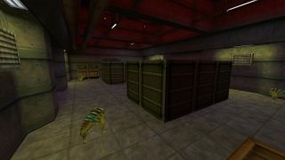
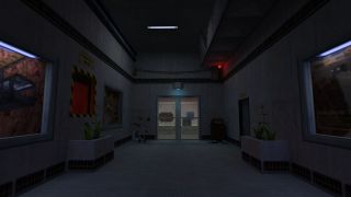
If we had a special award for atmosphere, it would have to go to Moaby. This was an incredibly moody entry, with easily the most realised location of them all. It felt like you were discovering some long forgotten section of Black Mesa, every inch of which felt like it had a story (with the possible exception of the crate room). It felt like the start of a really high quality mod, but more importantly, like Black Mesa, in all it's antiquated glory. I really want to know more about this place!
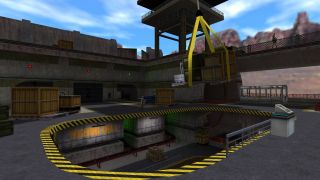
DocRock's entry is perhaps the most detailed, and certainly the most lively. Placing you in a busy little cargo centre, with everybody hard at work (except for a certain doughnut-loving Barney). It's really impressive how many little details DocRock packed into this one! There are things to discover in every inch of this map, but the cargo-carrying chopper definitely makes for a nice centrepiece. There's some decidedly more modern looking architecture here and there that doesn't exactly scream Black Mesa, but for the most part this feels like a place I would love to have visited somewhere in the middle of Half-Life.
Other Entries
Sirlion packed a lot of range into this entry, even if it shifts themes fairly abruptly. It takes you through industrial, lab, cargo tunnel and finally topside environments. It's a little rough in places, feeling a little more like the Half-Life beta to me than the final game, but that's fine too! The large depot section at the end is easily it's most interesting part, even if the HECU AI couldn't quite comprehend our crossbow bolts picking off their friends. There's also a secret Tekken arcade room, which doesn't seem very Black Mesa-ish to me, but hey, maybe Kleiner's a fan?
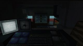
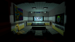
While incomplete, this was an admirable effort from Rokin1 that places you in a gaudy lemon yellow wing of the Lambda Complex. There's not a whole lot to see, being little more than a control room and some adjacent corridors. There's some pretty boxy stuff here, with some harsh, square lighting, but it shows a lot of promise! It's not hard to imagine somewhere like this buried away in the depths of the Lambda Complex. I hope to see it completed someday.
It's no suprise that Urby turned in a fantastic entry for this competition. It flows well, looks gorgeous and was so well done that we spent some time debating giving this a higher place. The thing that edged this out was that it was just a little too slick for Half-Life, and I mean that in the nicest possible way! This feels like Half-Life made through the eyes of 20-years-wiser mapper, because it was! It's just a too sharp, too modern compared to Half-Life's arguably more ramshackle style. That doesn't mean we didn't enjoy the hell out of it, of course.

