Post your screenshots! WIP thread Created 16 years ago2007-12-16 00:58:58 UTC by doodle doodle

Created 16 years ago2007-12-16 00:58:58 UTC by doodle doodle

Posted 16 years ago2008-05-12 19:19:29 UTC Post #249907
Looks nice, DocRock. :)

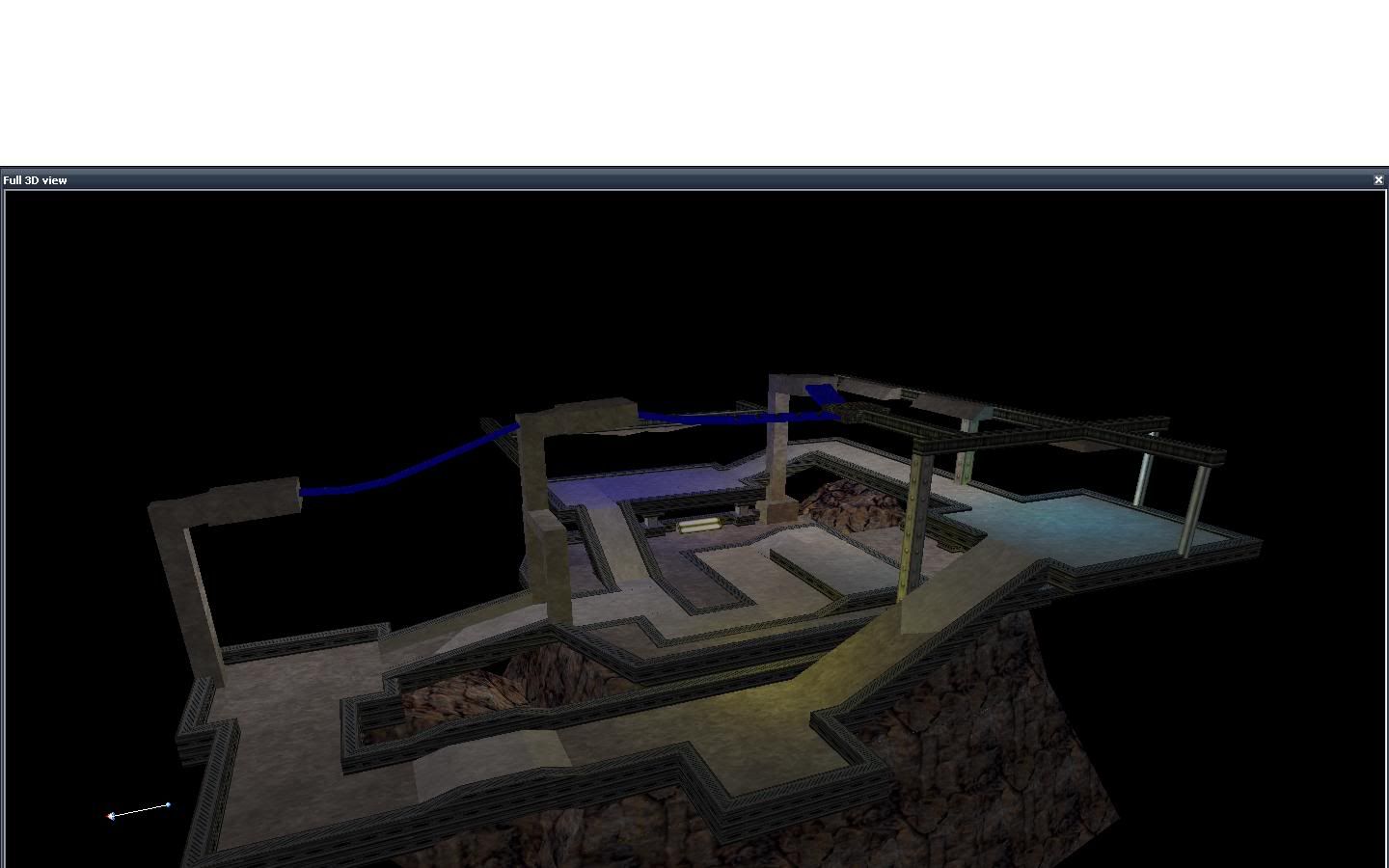
And yes, I'm mapping again. The following shots are from an early alpha version, as I'm still trying to get a good layout and gameplay going in this map, but they should give a good impression of the style and theme already:
User posted image
User posted image
User posted image
For those who are interested, you can check out the map too (v06): download (1.1 MB). Please tell me what you think about the layout. Suggestions are welcome. :)
Posted 16 years ago2008-05-12 20:16:34 UTC Post #249909
Very interesting style. I assume that the texturing isn't final?
Glad to see you back!
Penguinboy PenguinboyHaha, I died again!
Posted 16 years ago2008-05-13 04:03:29 UTC Post #249911
is the top sloped? i can't actually tell.
Archie ArchieGoodbye Moonmen
Posted 16 years ago2008-05-13 07:56:48 UTC Post #249915
The visual may not be amazing but you've got a unique building there. Might work well on DM...Hardly anyone plays that anymore.
Habboi HabboiSticky White Love Glue
Posted 16 years ago2008-05-13 10:03:49 UTC Post #249921
ROFL, CP maps again. Win. :D

Cool name too, as long as you don't name it Launchpad 39A or B.
Posted 16 years ago2008-05-13 14:48:44 UTC Post #249929
I had 38C in mind, do you think that's distinct enough? :P

Well, the visuals are very early, they merely show some of the colors and lighting that I'm going with. I've got some placeholder props in there too already, but haven't skinned them properly yet. It's the gameplay I want to get right first - did anyone give it a try already?
Posted 16 years ago2008-05-13 14:50:28 UTC Post #249930
Get on MSN and ill host a game. :)
Posted 16 years ago2008-05-13 17:13:58 UTC Post #249935
DocRock: Yup you were right. I reinstalled and all is well.

Very nice map, especially the textures. Could have used some moar sounds, like the theme from the Mummy or something would have been great for the lulz.

Layout seems pretty neat too, and brushwork is simple yet entirely effective.

Good work! = )

edit: btw, whtat does "no. of rats: 1" mean in the readme?
Captain Terror Captain Terrorwhen a man loves a woman
Posted 16 years ago2008-05-14 17:23:53 UTC Post #249966
edit: btw, whtat does "no. of rats: 1" mean in the readme?

it means there is one rat in the map...kinda a trademark for my maps. I try to put at least one rat in all of my maps. See if you can find them.
Posted 16 years ago2008-05-14 22:20:44 UTC Post #249977
To a handful that care: Black-and-white minimod died. It was a spur of the moment thing without any real planning outside of a few initial areas and a basic combat system. But at least I'm more familiar with the HL SDK now, and if you play The Specialists, expect some new katana animations by me; as I did some sword animations for the minimod with the TS arms.

Captain, what exactly is that building?
Posted 16 years ago2008-05-15 17:30:17 UTC Post #249999
@The Hunter: the top is flat, it would be hard for aircraft to land otherwise I suppose.

@Habboi: visuals are very, very early. Once the layout is finalized, I'll start churning out custom models and materials.

@World Crafter: too bad, those screenshots did look interesting. Perhaps you can still use this map as style inspiration, while planning the gameplay and other aspects ahead?

Anyway, that building is an outpost, a watchtower and aircraft launchpad in one. It's for vtol's.

I've gotten some feedback on the layout on the Snarkpit and I'm reworking that a bit now. Visually, I still want to go for the same style, but the layout should change quite a bit. Less geometric, more naturally shaped and flowing.
Posted 16 years ago2008-05-19 03:25:15 UTC Post #250156
Imo, should have more of a space-age texture variation Captain P. Though the flowyness you're talking about may help it out a bit too :P.

Anyway, back to prison map, skren from like 2 days ago, needs some height variation still but yeh take a look:
User posted image
Posted 16 years ago2008-05-19 11:32:46 UTC Post #250160
Looks nice 'n moody, doodle. :) It's a singleplayer map I assume?

I get what you mean about the texture variation. This is a very early stage though, the final result should look something like this (rough sketch :P):
User posted image
I also have an updated version that contains a new layout, for anyone that wants to check it, here's a download (.rar, 0.5 MB).
Posted 16 years ago2008-05-20 03:28:58 UTC Post #250183
Ah right, sketch lets me see what you're getting at, should be great.
Yeh, mine's singleplayer, ep2 at the moment
Posted 16 years ago2008-05-20 05:33:10 UTC Post #250188
Lots of awesome stuff being made at the moment. I should join in.
monster_urby monster_urbyGoldsourcerer
Posted 16 years ago2008-05-20 05:33:38 UTC Post #250189
Lots of awesome stuff being made at the moment. I should join in.

GAH! WTF DUBBLE POAST!?
monster_urby monster_urbyGoldsourcerer
Posted 16 years ago2008-05-20 05:50:58 UTC Post #250190
WOW that is really cool Captain P! = O
Captain Terror Captain Terrorwhen a man loves a woman
Posted 16 years ago2008-05-20 20:49:47 UTC Post #250206
New screenies. :) Visually not very attractive yet, but the layout has been redone from scratch after I got some feedback on it:
User posted image
User posted image
You can download the latest version here (.rar, 1.2 MB)
Posted 16 years ago2008-05-21 20:05:35 UTC Post #250225
Hmm, Been testing out the new version of quark. Only crashed 4 times on me :P
User posted image
Horrible image sorry its all fubered for some reason
Posted 16 years ago2008-05-25 14:44:05 UTC Post #250465
Looks interesting so far, S3IZURE. :)

I wonder, since I never used Quark, how would you compare it to Hammer?
Posted 16 years ago2008-05-25 17:14:28 UTC Post #250471
***ng complicated but it has more options and more basic shapes .
Striker StrikerI forgot to check the oil pressure
Posted 16 years ago2008-05-25 23:36:08 UTC Post #250491
Does it have invalid brush protection like GTK Radiant?
I fell in love with that while mapping for Nexiuz.
Unfortunately... i stopped mapping for it. Lost interest :-P
Tetsu0 Tetsu0Positive Chaos
Posted 16 years ago2008-05-26 02:52:51 UTC Post #250498
Ive used Hammer and Radiant before. I'll make a quick comparison.

Quark has tons and tons of features and to me I feel like I can get things done a bit quicker but there are a few things that cripple it.

Bugs too many to list it is much better than it was. the last time i used it I couldn't do anything without it crashing and reverted to an earlier release they've fixed a lot in this one.

Shape's almost are never correctly aligned to the grid if you move them around or spin them this gets annoying quick and really screws up the maps. texture window crashes a lot on me. when cutting brushes it messes up regularly. You can search for invalid brushes but its not automatic.

Hammer and Radiant would probably be better for the hardcore level designer
Posted 16 years ago2008-06-01 07:22:39 UTC Post #250793
User posted image
Striker StrikerI forgot to check the oil pressure
Posted 16 years ago2008-06-01 07:42:31 UTC Post #250798
This is a WIP mapping thread for showing off work. Pics like this don't really deserve to be here, or have a new thread dedicated to them. You can always chuck 'em in the shoutbox or a journal post.
Strider StriderTuned to a dead channel.
Posted 16 years ago2008-06-01 07:48:43 UTC Post #250800
oh , I'm sorry
Striker StrikerI forgot to check the oil pressure
Posted 16 years ago2008-06-18 14:04:45 UTC Post #251484
My first post on TWHL. :D

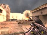
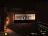
Trying to make a defend point map. It's a small map but I'm hoping to make this small map into a suitable close quarter combat between the Resistances and the Synths. I'm not even sure if I'll finish the maps at all. Heh..

Any C&C? I've noticed a hole in a displacement on the fourth screenshot and the breakable glasses not fit in the window frame in the last screenshot. Will fix that.

User posted image
User posted image
User posted image
User posted image
User posted image
Posted 16 years ago2008-06-25 16:28:12 UTC Post #251824
Protostar: for firsts outside area is way way to bright It does not match the sky at all.
Posted 16 years ago2008-06-26 18:08:57 UTC Post #251857
I forgot to change the skybox and there aren't any good sky textures to match it. :(
Posted 16 years ago2008-06-26 18:13:30 UTC Post #251858
A bit too heavy on HDR for a naturally-lit outside area. It's begging for a 3D skybox too.
Daubster DaubsterVault Dweller
Posted 16 years ago2008-06-26 18:42:19 UTC Post #251861
3D Skybox is a yes, definitely needs one. I can kind of see the HDR a bit in a really hot desert area, maybe tone it down a bit.
Posted 16 years ago2008-07-02 03:15:57 UTC Post #252037
User posted image
Still very rough, only a couple of hours work including sketching, to the right will be a rock wall, next to the door a tree, the window will be a snipers balcony, the inner yard will be situated to the left, with a few walkways overhead to provide vertical gameplay, im still not to sure about including a static MG.

Edit:
User posted image
Getting along nicely, although im not happy with the textures and lightning yet, so consider those to be temporary :D and yes, those sexy rocks are all hand made.
Posted 16 years ago2008-07-17 17:05:21 UTC Post #252588
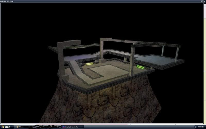
User posted image
Pretty much as far as I'm gonna go, I had to delete the quark setup file erasing all my settings :( as quark couldn't find the textures for some reason

I know the lighting is ass I was just trying out the opengl 3d view
Posted 16 years ago2008-07-22 09:13:38 UTC Post #252847
Looks really nice, pepper. Kinda' reminds me of a map called supplydepot for Enemy Territory.

Anyway, looks cool, keep up the good work.
Posted 16 years ago2008-07-22 10:31:49 UTC Post #252850
well, lately I have been trying some diferent render settings in 3Ds Max, I just got Vray, so Im having alot of fun with that.. anyways, here they are:
www.mikeverret.com And another thing, does the glass in the forth picture look too thick? A friend commented that it did, and I tried to explain that its a close up shot.. but then again, perhaps it is too think.

Links
www.mikeverret.com
Unbreakable UnbreakableWindows 7.9 Rating!
Posted 16 years ago2008-07-22 11:14:45 UTC Post #252852
I presume you mean the fifth picture? it looks a bit big yeah, but that is because you cant compare the scale with other objects. If you would put a hammer or something like that along side it then you can judge if its too big or not.
Posted 16 years ago2008-08-12 22:04:28 UTC Post #253681
Meh, might as well pimp this here as well ;)

Links to full-size screenshots are below the smaller images.
User posted image
http://www.cryotank.net/stuff/museum_b2c2.jpg
User posted image
http://www.cryotank.net/stuff/museum_b2c1.jpg

Museum, a map for Action HL and HLDM. Though I am thinking of renaming it hldm_art_gallery. Sounds more upscale, and 'museum' could mean a lot of things.

It's about 98% done- now that I fixed that damn lighting bug. Should finish beta 3 tomorrow- hopefully the final beta before release.
Posted 16 years ago2008-08-15 10:34:16 UTC Post #253801
looks real nice, Jinx :)
Posted 16 years ago2008-08-24 15:02:19 UTC Post #254481
Posted 16 years ago2008-09-17 05:01:29 UTC Post #255537
Not bad seth, some of your design choices (such as texture and prop placement) seem a bit odd, but regardless, its pretty solid stuff for a first time in the source sdk. I see your using the graffiti decals, I loved using those when I first got my hand in the source engine. There is certainly evidence of a certain amount of level design experience in those screenshots. Just remember you can decrease the size of some of the light maps on those surfaces to get nice crisp shadows but remember, they increase compile times and will munch up in game performance.

Anyway, here is some of my source work I have done recently:

dm_backwash:

User posted image
User posted image


My entry to Snarkpits 2nd mapping competition for 2008:

User posted image
User posted image


A singleplayer map I'm working on called (atm) Night terror:

User posted image
User posted image
Posted 16 years ago2008-09-17 09:33:31 UTC Post #255547
Haha, people still visit Snarkpit? :gak:
Posted 16 years ago2008-09-30 09:39:57 UTC Post #256376
User posted image
Secret Project #501.
Strider StriderTuned to a dead channel.
Posted 16 years ago2008-09-30 10:20:17 UTC Post #256377
Seecret Project #501 isn't secret anymore.
Posted 16 years ago2008-09-30 10:21:58 UTC Post #256378
But you still don't know what type of map it is. ;)
Strider StriderTuned to a dead channel.
Posted 16 years ago2008-09-30 10:22:34 UTC Post #256379
Seecret Project #501 isn't secret anymore.
That's right, but it is seecret.
Oskar Potatis Oskar Potatis🦔
Posted 16 years ago2008-09-30 10:32:03 UTC Post #256382
I'm actually thinkin' it's a compo map, but whatever, you won't release it anyway. :nya:
Posted 16 years ago2008-09-30 10:40:54 UTC Post #256385
Not for some time, no. >_>
Strider StriderTuned to a dead channel.
Posted 16 years ago2008-09-30 17:36:07 UTC Post #256404
It looks sexy. Why must Sauce taunt me so... :cry:
monster_urby monster_urbyGoldsourcerer
Posted 16 years ago2008-10-01 05:11:30 UTC Post #256424
Strideh, remember what i said about finishing that TF2 map first or else in IRC? :glad: ;)
Posted 16 years ago2008-10-01 05:35:21 UTC Post #256425
Urbanebula: :>
Probably because it makes everything tastier.

Pepper: I do, but I started this before that map! ;>

Haven't worked on either in a while, though. The map is actually quite old now.
Strider StriderTuned to a dead channel.
You must be logged in to post a response.