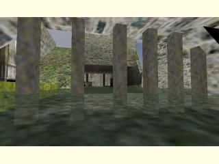
de_JrAztec
- Name
- de_JrAztec
- By
-
 HZE
HZE - Type
- Map
- Engine
- Goldsource
- Game
- Counter-Strike
- Category
- Completed
- Included
- BSP
- Created
- 19 years ago2004-12-28 09:19:54 UTC
- Updated
- 19 years ago2004-12-29 20:15:16 UTC
- Views
- 1368
- Downloads
- 459
- Comments
- 8
- Reviews
- 0
This isn`t a map that looks like aztec,I has a totaly diffrent design and diffrent textures but there are a few little details that look like those at the aztec map that you probably know...I am waiting your comments and suggestions.Don`t be too harsh though :).Thanks
+ Sky Problem Fixed
+ 2 Bomb sites
+ 2 Bomb sites
8 Comments
You must log in to post a comment. You can login or register a new account.

 CS
CS


+ Good architecture
+ OK Layout (Some things disregarded when I say that)
+ I like what you have done with the walls at the top (even if they are a bit low, make them some percentage higher)
Baddies:
- MAJOR sky prolems (You can walk on top of the level and you dont have to use noclip to get there)
- Sky isnt clipped (basically you can swim the the sky around the level)
- Not many different textures
- Texture aligning problems (also try using a "trim" texture on the walls it would look much beter!)
- Only one bombsite
- Too empty in the flat areas where the grass is (just a few more crates can make it better)
Sorry if there are so many bad points more than good points but I am about to load up bots on this map because im sure the gameplay is fun!
I will post about the gameplay soon...
Playing with the bots was quite fun after I stopped sniping them from above cos i could walk along the top of the whole level and after I stopped sneaking up behind the shielded guys using the swimmable sky...
The layout is a bit small but it is fun to play because the layout is just nice...
I wouldnty change it too much just fix the problems and maybe make it a bit bigger, also make 2 bomb spots...