Sandfort

Counter-Strike: Source CSS
Sandfort by Strider
Posted 19 years ago2005-01-30 23:10:06 UTC • Completed • Counter-Strike: Source
Loading...
Screenshot Thumbnail
Name
Sandfort
By
Strider Strider
Type
Map
Engine
Source
Game
Counter-Strike: Source
Category
Completed
Included
BSP
Created
19 years ago2005-01-30 23:10:06 UTC
Updated
17 years ago2007-05-11 02:19:42 UTC
Views
4629
Downloads
1316
Comments
13
Rating
3.50 (2)
Reviews
0
full star full star full star half star empty star Download

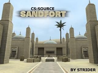
My first Source map. An fy map with an unispired layout.. hey, it's a start!

"Beneath the hot sun, surrounded by miles of scorching sand this small fort has stood the test of time. If the battle doesn't kill you then the heat surely will."

Max Players: 16 (8 per team)

13 Comments

Commented 19 years ago2005-01-31 00:08:56 UTC Comment #5810
Looks nice from the screenie. Pity I don't play CS:S. ;)
Commented 19 years ago2005-01-31 00:27:02 UTC Comment #5811
No one here seems to!
Commented 19 years ago2005-01-31 07:16:01 UTC Comment #5813
Looks lovely, I will download it and test it tomorrow after school. :)
Commented 19 years ago2005-01-31 10:08:12 UTC Comment #5817
Level making for CS has a big problem: CS players are usually afraid of playing new maps. Take 'em out of their dust and aztec, and they'll start complaining if they lose...
That's why I only 2 of my 23 maps are for CS. I'll check this one out
Commented 19 years ago2005-01-31 11:13:57 UTC Comment #5820
Nice map. Simple yet addictive. Much better than all those iceworld maps around :)
Commented 19 years ago2005-01-31 11:48:33 UTC Comment #5821
I downloaded it and I walked around:
-textures seem kinda dull
+lighting is pretty real
+sand is real
+its addictive
+I LOVE DESERT MAPS!!

4 out of 5. I like it
Commented 19 years ago2005-01-31 13:35:44 UTC Comment #5823
Looks nice, a bit small for my tastes - I got spawnkilled a time or two :P - Maybe I'm just slow. Needs a bit more of a skybox imo but otherwise fine.
Commented 19 years ago2005-02-01 04:40:15 UTC Comment #5831
It's impossible to get spawnkilled because the four building-like things block your shots.
Commented 19 years ago2005-02-01 08:18:56 UTC Comment #5833
What I was hoping for a good custom CS:S map. What I got was a gloryfied aim map.

For my honest opinion, I was bitterly disappointed. Look at the screenshot: It's the whole map.

Sure, it looks good. What good is a pretty map with the same boring gameplay as 3 billion other maps, boring old layout, without anything new?

I appreciate the fact that you tried to make the map look nice, but the map is unoriginal and boring. I know you can do better, Strider.

2.5 out of 5 (because I'm feeling nice I'll round it to 3)
Commented 19 years ago2005-02-01 15:57:07 UTC Comment #5843
I got spawnkilled because I'm a bit slower in buying things.

And one round I could have sworn the CT's spawned directly across from me.
Commented 19 years ago2005-02-04 04:28:10 UTC Comment #5871
thats your opinion trapt. i love deathmatch styled maps far more than cs or de maps. Its more of a realistic team deathmatch and is extremely fun playing decent maps on lan. Oh yeah you swore wrong RabidMonkey777 the spawnpoints are the same teams next to eachother perhaps you need to be faster at buying ( i can find a gun i like and perhaps armour or a flashbang in about 5 or 6 seconds)
Commented 19 years ago2005-02-04 20:25:36 UTC Comment #5881
What happened to Rabid was probably a CS:S bug.

It was my opinion, and I am sticking to it. All the map is is a good looking aim map. Why should I bother playing this when there is billions of other maps with the exact same gameplay?

Maps without originality don't do anything for me....
Commented 19 years ago2005-02-08 05:46:47 UTC Comment #5928
nice, i think ill run this one on my server a couple a times.

You must log in to post a comment. You can login or register a new account.