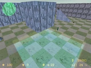
fk_glasspit_2
 CSS
CSS
fk_glasspit_2
by
nublit
Posted 19 years ago2005-11-23 15:07:54 UTC •
Completed •
Counter-Strike: Source
This should be a fun map. If you own a dedicated server or run a non-dedicated server, this is a pretty good map to upload to your server. This is a sequal (obviously), unfortunetly the first one was a server crasher, so i had to abondon it. I have tested this map several times, it dosnt crash the server at all so don't worry a single bit. It just might be a little bit laggy, because it's a glass map of coarse! Anyway i didnt use any lighting for the following reason:
...it is a glass map which tends to be laggish...
ENJOY!!
...it is a glass map which tends to be laggish...
ENJOY!!
12 Comments
You must log in to post a comment. You can login or register a new account.


When you say change the map tag, do you mean the fk or the whole name itself, or maybe something else?
- blocky
- full-bright
- VERY bad choice of texture for walls
- quite bad choice of texture for flooring
+ ...err... ill get back to you!
Really, work harder. A LOT harder. dont just cover up your leaks, fix them! and your working with one of the most powerful engines in gaming history! USE IT TO YOUR ADVANTAGE!
Align your textures, get scale, choose textures more carefully, add arcitecture and please PLEASE PLEEASE! dont submit fullbright maps.
No lighting for performance reasons? Read up on optimization, unlit maps may play nice but in mapper communities, they're frowned upon and really, you're abandoning technology that makes it not only look better, but also outlines the shapes in a map better making it easier to navigate.
It may be a tendency in current CSS communities, but such maps look horrible. Even spending a little more time and effort on them would make them look fair.
A good article about optimization can be found here:
http://www.student.kun.nl/rvanhoorn/Optimization.htm
Thirdly, i did use bad textures for the walls and floor. The checkered glass floor was the only two textures that were same EXACT texture but with different colors, so i used that. I will admit this isnt a great map but it is finished and dosnt belong in the unfinished section.
Fourthly, you'll is a word, it is short for "you will".
Fifthly, im sorry if me submitting a full-bright map pissed you off, that won't happen again
sixly(if thats even a word), this DEFINANTLY isnt my first map, it sucks, yes i know.
Other things to know are that i said it should be fun because the first version blew my clan member's minds. I thought this was enough but i found on that its better the make a glass pit map with circular pits :-/
I wish i could submit the first version but it will crash your server. I dont know why, its some weird voodoo reason i cant fix or even figure out. It just crashes the server and it dosnt work.
PS: first to post reply, i figured out what you meant by "change the map tag". It was set to 1.6 instead of source. Sorry for any inconveniance. If you downloaded the map, good for you. If you didnt, thats ok, im used to not having anyone like my maps.
...it is a glass map which tends to be laggish...
It's such irony. Because with some lighting, the compiler would run VRAD, and therefore improve performance. I don't care that it's a glass map or not, having lighting ALWAYS improves performance and boosts framerates.
You have been mapping for a year, and this is what you came up with? You need to try harder. Just look around the vault for some of other mappers works. Kasperg can whip out a map in two days, yet it looks utterly amazing.
I am sorry to say this, but if this map blew your clan's mind, they must not have seen too many custom maps.
And this was his very first Source map.
I mean, that is bad, there for I'm not going to play this map..
All these bad comments said enough, so did your attitude.
Damn, don't go all defended! Were just giving constructive critism..
Critism is there to be learned of, remember that.
About the 4 hours thing, haha, I could make a better map in 1 hour and I bet al these mappers replied here can to.
You really think a bit lightning would give the map lag? PLEASE!!!!
You're mapping 1 year? Pfft, you should know better.
Also, you think your clan members got blown away from this map?
Dude, please, there just being nice to you because your in there clan..
So I pro's and con's
+ You're doing your name honour.
- Full-bright
- Bad texturing
- Blocky
- Architecture were?
- Gameplay would suck, if there is any..
I will not vote, because I don't like giving 1 stars..