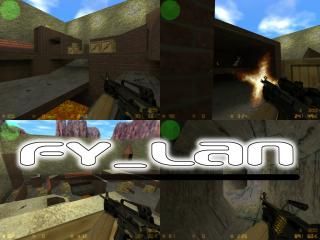
fy_LAN
- Name
- fy_LAN
- By
-
 LukeakaDanish
 - Type
- Map
- Engine
- Goldsource
- Game
- Counter-Strike
- Category
- Completed
- Included
- BSP
- Created
- 18 years ago2006-04-23 12:54:46 UTC
- Updated
- 18 years ago2006-04-23 15:32:06 UTC
- Views
- 1592
- Downloads
- 594
- Comments
- 3
- Rating
- 5.00 (1)
- Reviews
- 0
I made this map for a LAN party which i held and we had a lot of fun playing it.
Its a fast map where one player stands a chance against 3 if they dont work together propperly.
The only issue that has been noticed in this map is a minor balancing problem - ctspawn is simply not interesting enough, however to work around this seams rather tedious to me so i have left it as it is...
Please comment on anything appart from my boaring textures...
If you feel like playing this map on your server, please tell me and i'll be there playing it with you.
- Luke
3 Comments
You must log in to post a comment. You can login or register a new account.

 CS
CS


Lighting comes from nowhere.
1. Use textlighting and make some light fixtures for the under areas. If you don't know what textlights are, check the "tutorials" section.
2. Only use point lights if you require a special effect like flickering or you need to be able to toggle it off/on.
The architecture isn't horribly blocky, but could certainly be improved. Stuff like the towers could definitley be reconstructed to make them look more real. Check ZombieLoffe's "Detailing" tutorial for some tips to spruce up the architecture a bit.
Texturing is fine imo for this kind of map imo. There's certainly room for imporvement in this area for this map as well, but it is an FY map after all
I guess, if i redo the ct towers they could also be made "better" to help the balancing issue aswell as the appearance...
I will read about the lighting when i get the time and possibly post redone version.