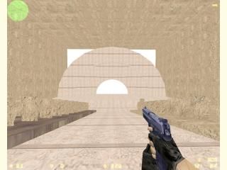
VIS freezes (de_theater)
 CS
CS
VIS freezes (de_theater)
by
Crazylikeafox
Posted 18 years ago2006-10-24 22:39:28 UTC •
Problems •
Counter-Strike
- Name
- VIS freezes (de_theater)
- By
-
 Crazylikeafox
 - Type
- Map
- Engine
- Goldsource
- Game
- Counter-Strike
- Category
- Problems
- Included
- RMF/VMF
- Created
- 18 years ago2006-10-24 22:39:28 UTC
- Updated
- 18 years ago2006-10-24 22:39:28 UTC
- Views
- 2071
- Downloads
- 733
- Comments
- 11
this map wont compile when i enable vis, when vis is disabled it compiles fine
whoever fixes the problem gets a free E-Cookie!
whoever fixes the problem gets a free E-Cookie!
11 Comments
You must log in to post a comment. You can login or register a new account.


When it seems to stop at "leafthread" it's not frozen, but still compiling. A couple things you could do to make your VIS go faster:
1. Make all the chairs func_walls. You might as well do it anyway, because in an open are like this, they're all visible at once. When you make them func_walls, Vis makes the visible all the time, and does not have to do any calculations including them. Thes chairs and the big open area are what's giving VIS such a headache.
The problem with doing this, is it will probably plunge your wpoys into the 2000-3000 range, which is far too high. This leads to the second option:
2. Transparent textures. make each row of seats ONE brush, with a 2D transparent texture of the seats--for the front, back, and sides. It wont look as realistic, but at least it will be playable from a wpoly perspective.
3. I'm sure there is another option, but I can't think of another one right now
Lastly, to make the VIS part of your compile run faster, in general, try these things:
-Scale up textures a bit. Try a test: Make a big box and scale the wall textures to .25, and notice how long the VIS takes for just an empty box. Scale it up to just 1.00 or @.00 and VIS will run almost instantaniouly!
So make sure your textures are scaled up reasonably, but don't do it too much, or your lightmaps will look bad--when you scale up the textures, the resulting lights in your map will scale up too, which looks bad if they are too high.
-Run on fast VIS all except the final compile. Fast VIS is very fast, but the downside is it doesn't make very efficent visibility calculations, resulting in higher than normal r_speeds.
I run fast VIS every time except right before I release a map. Then I fun with regular VIS to get my wpolys as low as possible.
oh and the wads I'm using are cs_747, de_aztec, and itsitaly
one last thing, what do you mean make all the chairs fun_walls, the already are....?
Use Wally to copy the textures only from those wads, and include them in a custom wad for us "testers". This way, it's easier for us to test the map. In fact, for this beta, I would only stick to the standard HL textures. I say this because more people will be apt to test it if they don't have to add 50 wads to hammer
Transparent textures are like the fence textures, preceded by a { symbol using the texture browse in Hammer. To utilize them:
1. Apply the texture, and make the brush a func wall.
2. Set Render mode to "solid" and FX Amount to "255". This done, all the blue parts of the texture will be invisible.
You could make an entire row of chairs--well on one side of the theatre--a single brush or two, and make a custom texture of the theatre seats with pure blue in-between them--giving the illusion they are seperate brushes.
Rimrook is a better texturer than me, so if you PM him, he may create the texture for you--if you don't want to give it a go yourself. If Not, I'd be willing to give a crack at it
I'm going to retexture your map and try to compile it right now...results soon.
-I completely retextured with stock HL ones only.
-Modified a decent portion of your architecture to put vertecies on-grid--mostly the arch thing on the stage and the seats.
-Added an extra brush to each of your seats. The seats could use a full re-design in my opinion--google images for reference
-Made that arch thing a func_wall to make it render right--otherwise it has faces that simply won't show. If you build something like that again, I would recommend not using the arch tool, and make sure all your vertexes are on-grid.
-Added some simple textlights--you need to compile with the file I added called "de_theater.rad" to make the lights work for future compiles.
Well, that's all I can remember. In general, your architectue was very good/clean, except for those off-grid bits. This map still has TONS of room for improvement, and I hope you continue to improve/finish it!
Here's the updated map and a screenshot:
http://rowleybob.googlepages.com/de_theater0000.zip
http://rowleybob.googlepages.com/de_theater0000.jpg
Good luck!
but anyway i think i'm gonna take your advice on the seats, i they need some massive work, also you say they weren't func_walls but how come when i go into my hammer editor and click on them they say func_wall? maybe something got lost in translation?
also about the vertex manipulation you did on my sound arches, i tried that but whenever i put the vertices on the grid it would mess up the whole shape because i wouldn't know where to put the dot, like which corner to place it...any help there?
once again thanks for ALL your help!
That pretty much applies to everything about Hammer and it's bugs--none of it is hard, it just takes a while getting "used" it and it's quirks