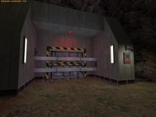
[BMHL entry] You failed.
 HL
HL
[BMHL entry] You failed.
by
ZombieLoffe
Posted 18 years ago2006-12-22 10:29:37 UTC •
Completed •
Half-Life
- Name
- [BMHL entry] You failed.
- By
-
 ZombieLoffe
 - Type
- Map
- Engine
- Goldsource
- Game
- Half-Life
- Category
- Completed
- Included
- BSP, RMF/VMF
- Created
- 18 years ago2006-12-22 10:29:37 UTC
- Updated
- 15 years ago2010-01-04 18:10:31 UTC
- Views
- 7266
- Downloads
- 1671
- Comments
- 16
- Rating
- 4.44 (9)
- Reviews
- 0
Entry for Mini-Compo : Complex Door, in this thread:
http://twhl.co.za/forums.php?pg=9&action=viewthread&id=11942
Here's a fullscreen screenshot:
http://m0px.net/zl/door.jpg
About the name, I don't know... you'll see on the end of the map.
This isn't really a finished, full-fledged map, I just finished it in a hurry to get the brushwork Mini-compo to close (last entry) - I hope that explains the un-optimisation, like not NULLed walls, no func_walls, etc. I figured since the R_speeds don't go above 400 anyway, why bother? Anyway, enjoy.
16 Comments
You must log in to post a comment. You can login or register a new account.


The ending was awesome..
The door wasn't that bad either. I liked the lasers turning off one-by-one. The rotating locks were a bit too slow, though.
It also lacked more detailed stuff.
Still -geat stuff. Add a sky outside and you've got yourself a great map.
Like Daubster's you had some excellent sprite/env_beam and sound effects, timed perfectly with there execution. You actually used a func_door_rotating, which I though more of the entrants would have taken advantage of.
The displacement-like terrain was also very nice outside the door.
(lol btw I never saw anyone texture the outside of their level with {blue before!--quite unique
The door(s) itself were also pretty good, and good use of the aformentioned rotating entity. The last stage of the door would have looked nicer with some different texturing, but whateva.
The ending had a nice twist, also like Daub's... I lol'd
Great work, and another--and final--perfect entry for the compo.
*****
However, I couldn't help but think that the lasers were a complete rip-off of my entry (if slightly better made), and the brushwork was pretty blocky and undetailed, too.
There was also one small thing that I forgot to mention, that made me think about how glitches can really be used to make special effects. I'm talking about that little light over the button, and how you didn't turn it into a func_wall, so it actually looks like it's casting the type of sharp lighting you see in newer games like Doom 3. Kinda neat, even if it was unintentional.
So I'd say this deserves 3.5 stars, but I'll round it up to 4, just to make you happy.
I can't believe I failed.