Lab11: LavaLab
 HLDM
HLDM
Lab11: LavaLab
by
darkphoenix_68
Posted 16 years ago2008-11-19 09:12:08 UTC •
Completed •
Half-Life: Deathmatch
- Name
- Lab11: LavaLab
- By
-
 darkphoenix_68
 - Type
- Map
- Engine
- Goldsource
- Game
- Half-Life: Deathmatch
- Category
- Completed
- Included
- BSP
- Created
- 16 years ago2008-11-19 09:12:08 UTC
- Updated
- 16 years ago2008-11-19 09:12:08 UTC
- Views
- 2501
- Downloads
- 844
- Comments
- 7
- Rating
- 4.67 (3)
- Reviews
- 0
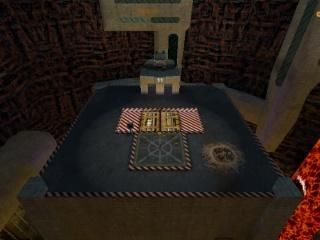
This is a research lab nestled precariously in the caldera of an active volcano -- and is a full remake of my original LavaLab level. It is bigger, faster, stronger -- and hopefully it's a little better, too. Visually it is a vast improvement over the original, but only you can judge whether the gameplay has also improved...
The general idea is the same, but the level design is quite a bit different from the original.
[Be warned: this is a complex level and it does not behave well under the HL SOFTWARE display driver. If your hardware limits you to using that driver, do not download this level! Sorry.]
The general idea is the same, but the level design is quite a bit different from the original.
[Be warned: this is a complex level and it does not behave well under the HL SOFTWARE display driver. If your hardware limits you to using that driver, do not download this level! Sorry.]
7 Comments
You must log in to post a comment. You can login or register a new account.


The map is just fantastic. The only issue are the windows. Too much bullets for them to break.
Fantastic, 5 stars
Good thing I have another computer that doesn't!
Ill review it afterschool.
The map's got really awesome rock terrain that's not visible from screenshots at all. I felt the squareness of the main structure was just too overwhelming though. It's just a really strange map, it's got a kind of old-school inventive spirit you don't see much anymore with everybody shooting for ultra-realistic urban settings and such.
And as for the windows ... my windows are ALWAYS too strong! Not sure what's happening there...
This is just amazingly huge and has many very pretty, uber detailed, DISTINCT areas. Amazingly improved over the original, and i loved that one too. It's hard to imagine all this fits in one bsp, seriously... I didn't walk through the whole thing because it's, well... huge, but i noclipped through a great deal of the map...
+Grand scope of the map--did i mention it's very big? = )
+An intricacy of detail you rarely ever see in goldsouce maps
+very distinct, very pretty areas and vistas to the lava and outlying labs
+imaginative layout and design
+great general mapping
+cool idea/setting for a map
+I like the source style monitors and the hammer screel LOL
-almost too complex for my tastes
-probably too big for my tastes
-the stock window textures on those beautiful outlying buildings are horrible and really detract from the nice buildings
-can't think of any without going through more thorougly
Superb work on an epic scale, which is normal for your grand projects... Bravo! = )
* * * * *
srry: 4 stars is beneath insult for a map like this. even if you didn't like the map, the shear amount of work and time--not to mention the compile time must have been enormous--warrant a 5-star rating, nothing less. shame.
It did turn out a little too big/complex even for my tastes -- and typically there's only two of us in it when I get to play -- but once you learn your way around it works pretty well.
The glass in the outlier buildings ... yeah. The texture works pretty well on a semi-transparent entity, but is a bit blah on the non-transparent world brushes. If I had a few more leaves to play with I'd probably build an empty room behind the windows and make them properly semi-transparent. (I will do that with the "Erupt" version anyway, so I guess there will be the potential for comparison... I may even give it a shot with LavaLab, but I'm pretty sure it will break the compile -- which, for the record, is about 16.5 hours on a 3Ghz machine with 3Gb of RAM...)
Edit: I tried several different ways to get transparent glass with a space behind in the windows around the edge -- and every single attempt broke the compile. The level really is that tight...