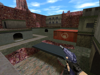
zm_hlfire
- Name
- zm_hlfire
- By
-
 Lajron
 - Type
- Map
- Engine
- Goldsource
- Game
- Counter-Strike
- Category
- Completed
- Included
- BSP
- Created
- 12 years ago2012-07-26 12:38:51 UTC
- Updated
- 12 years ago2012-07-26 12:38:51 UTC
- Views
- 1805
- Downloads
- 525
- Comments
- 7
- Rating
- 3.50 (2)
- Reviews
- 0
It's a zombie map 

7 Comments
You must log in to post a comment. You can login or register a new account.

 CS
CS


The lighting is rather bland, though, and some shadows are rather distorted.
The geography was okay. The mountains weren't too bad, but the ground itself could've used more pizass.
Other than that, decent architecture, I like the setup.
try this link but i don't have any problems with downloading the file and extracting it.
https://www.dropbox.com/s/a8zz8k7m0q0ppxr/zm_hlfire.zip
edit
I was able to open it using WinRar
Agreed with dimbark the lighting is really plain, but other than that i feel like this is really solid, good work.
alos if you edit this ever, increase the back clipping plane, cuze rock terrain drops out if you are on the edge of the map.
3 stars, easily 4 or 5 with a little more work
Neither with the terrain because they are gonna kill zombies lol