Commented 10 years ago2014-07-19 05:10:41 UTCComment #20647
Kitteh is scart, but kitteh will play! <kitteh trembles>
Fun gameplay and goodies all the way to the very ending(which is sweet btw)!
You did well matching the original style of Half-Life(a good thing!), going more the gameplay/scripting route over eye candy.
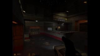
If I had one complaint, It would be the map is very dark. It fits the horror/suspense theme, so no big worries, just make sure your HL brightness settings are set to stock(so you're not making artificially dark maps).
Big kudos too for entering with your crazy work/school schedule! (Once again, you have inspired me ;))
Commented 10 years ago2014-07-19 12:22:06 UTCComment #20648
Thanks Captain! I never noticed, but my gamma was around 80% when I made this. I played it again with a 50% gamma and It was a bit darker, but I don't think it's too bad. It's a night map anyway Thanks for the kudos I put a few minutes into it each day until I had a free Friday night and cranked out the rest!
Commented 10 years ago2014-07-19 12:58:59 UTCComment #20649
Oh yeah, it is very-nicely nighttime! (I think my old eyes are just having trouble, staring at too many bright led screens all day..)
Fun stuff doe. I wanted to describe the gameplay above, but to not create spoilers, I will just say I really enjoyed it, and it makes me sad that I won't have time to add any to my map ='(
Commented 10 years ago2014-07-19 15:15:50 UTCComment #20654
Sorry for a really unorganized review.
I really liked that you added gameplay to such a small simple layout. I felt it could have used more puzzle like gameplay though. I really liked the multisource buttons and the lighting effect for the final exit was brilliant!
I loved the car parked at an angle with it's headlights though they could have used gradient lighting imo and definitely called for some texture lighting on the head and tail lights.
Some choices imo could have been changed a little like the glass having it's fx_amount set a little too high looks strange at night. Some more glowing sprites could have been added. The ambience was nice.
The large exit doors looked really nice.
Is it strange that my favorite part of this map is the car? It's placement and angle just looks awesome.
Also, you definitely held very close to the competition brief/ closest I've seen so far.
Commented 10 years ago2014-07-19 16:42:38 UTCComment #20659
Ah, great stuff!
While at first I found the lighting a bit dark, I noticed that pretty much everything that should be lit is. The darkness in the more unimportant areas actually helps sell the nighttime feeling, in my opinion. Really nice, eerie atmosphere.
I liked the enemy placement, and the scripting was nice and fun as well. Good gameplay for the map.
Fun gameplay and goodies all the way to the very ending(which is sweet btw)!
You did well matching the original style of Half-Life(a good thing!), going more the gameplay/scripting route over eye candy.
If I had one complaint, It would be the map is very dark. It fits the horror/suspense theme, so no big worries, just make sure your HL brightness settings are set to stock(so you're not making artificially dark maps).
Big kudos too for entering with your crazy work/school schedule! (Once again, you have inspired me ;))
Well done and good luck in the contest! =P
I never noticed, but my gamma was around 80% when I made this. I played it again with a 50% gamma and It was a bit darker, but I don't think it's too bad. It's a night map anyway
Thanks for the kudos I put a few minutes into it each day until I had a free Friday night and cranked out the rest!
Fun stuff doe. I wanted to describe the gameplay above, but to not create spoilers, I will just say I really enjoyed it, and it makes me sad that I won't have time to add any to my map ='(
Great Job! =P
I really liked that you added gameplay to such a small simple layout. I felt it could have used more puzzle like gameplay though. I really liked the multisource buttons and the lighting effect for the final exit was brilliant!
I loved the car parked at an angle with it's headlights though they could have used gradient lighting imo and definitely called for some texture lighting on the head and tail lights.
Some choices imo could have been changed a little like the glass having it's fx_amount set a little too high looks strange at night. Some more glowing sprites could have been added. The ambience was nice.
The large exit doors looked really nice.
Is it strange that my favorite part of this map is the car? It's placement and angle just looks awesome.
Also, you definitely held very close to the competition brief/ closest I've seen so far.
Good luck in the competition!
While at first I found the lighting a bit dark, I noticed that pretty much everything that should be lit is. The darkness in the more unimportant areas actually helps sell the nighttime feeling, in my opinion. Really nice, eerie atmosphere.
I liked the enemy placement, and the scripting was nice and fun as well. Good gameplay for the map.
Great work, and good luck in the comp.