VERC: De_Torn: Interview with Crinity and Madcross Last edited 2 years ago2022-09-29 07:54:28 UTC
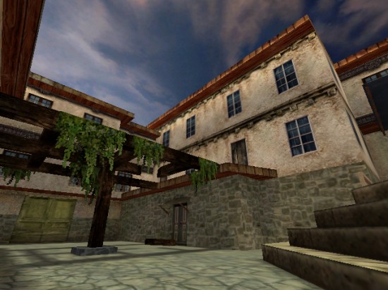
This is an interview with Crinity and Madcross, authors of the de_torn Counter-Strike map. Crinity and Madcross talk about the initial planning and design stages of the map as well as their motivations for the design. Thanks to Gonnas for conducting this interview and to Crinity and Madcross for taking the time to answer these questions. I think we'll all be looking forward to more work from these guys.
What are your names, what do you do for a living, how have you been involved in the FPS community in the past, and have you previously released maps?
What was the inspiration behind this map?
I understand the textures are completely custom, did either of you make them or was it an outside texture artist?
Do you play a lot of HL or any of its mods?
What are your names, what do you do for a living, how have you been involved in the FPS community in the past, and have you previously released maps?
Crinity: My name is Nick Coombe and I'm a freelance graphic designer & level designer, working out of Toronto. I've been involved in the FPS community since 1999, when I first started dabbling with Worldcraft. I've released two HLDM maps (Gravtank and Nova), and I'm working on several mod projects, including Existence, Natural Selection and Raven.
Madcross: Please allow myself to introduce...myself. My name's Matt Coombe, I've been a professional graphic designer for two years and have begun professional 3D work over the past year. I also live in Toronto. I'm a relative newcomer to the FPS mapping community although I've been enjoying FPS games since day one. My first mapping experience actually began by re-creating small areas of Toronto in Worldcraft to help pre-plan promotional events for the marketing company I was working for. Apart from a small HLDM map I have just released (Tornado), de_torn will be the only other map I have released to the public.How did this turn into a joint effort?
Madcross: It actually began one winter afternoon when I was at work. I had been planning to get my teeth into creating a map for CS that I could really use to break out into the mapping community. Crin and I had talked previously about working on a map together but had never got to it. While sitting at my desk during a lunch break I had a flash of inspiration for a layout and sketched it out on my computer using Illustrator. I showed Crin the layout that night and we began discussing plans for the look and feel of the map. Crin was working heavily on a map for the Existence mod at the time so I began laying out the map in Worldcraft and creating the architecture of the first few buildings. I also began the groundwork for the textures and had something we could use to test for timing and gameplay within a few days. At about that point Crin started mapping some areas of the map as well as joining in the texturing while I continued to work on others.What did you do in the making of this map?
Crinity: We shared the load pretty evenly, creating textures and architecture and setting up the lighting. Madcross left the sound up to me.
Madcross: Yeah, it ended up being about half and half, we both mapped different areas of the map although during bug fixing and tweaking we both worked pretty much in every area. I worked on a lot of the special effects entity set up while Crin did the sound.
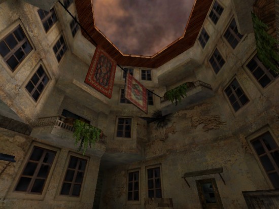
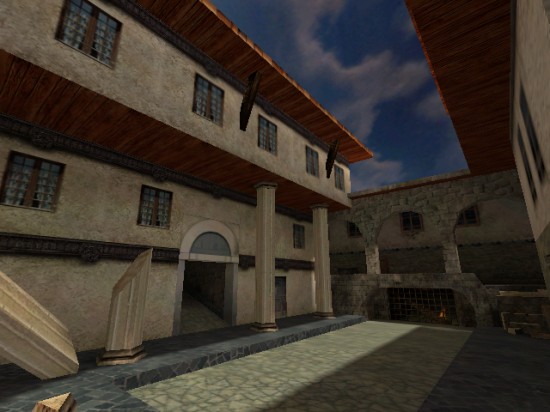
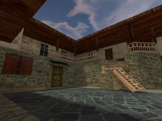
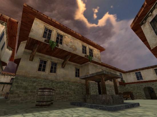
Crinity: We wanted to create a wartorn town, but we weren't sure where to place it. Initially we were going to go for an Eastern European setting (sort of like BalkanConflict), but after doing some image research, Turkey seemed to offer a lot in terms of eye candy, with it's cross between European and middle eastern/Arabian architecture.What do you hope to achieve with the design and layout, what kind of gameplay do you envision?
Crinity: Madcross is largely responsible for the style of map that Torn became, so I'll let him answer that.
Madcross: I had planned the map from the beginning to be a fast, running style map with less camping and more open fire fights. The map was also made from the start to hold the capacity 32 players, as there had been quite a few requests on the CS forums at that time for more maps of that type. I really wanted to create a kind of frenetic, action packed map where the choke points would definitely bring the two teams together without being predictable or reducing the options a player would have for reaching the bomb points. This required a fair bit of tweaking and changes were made right the way through development to ensure the right kind of confrontations would be created when the two teams came face to face.What stages were involved in the design process?
Madcross: Well the first and most important stage we came to realise was preplanning. Getting a well thought-out 2D map down on paper is a very important first step. With the 2D map made it's a lot easier to visualise how the map will play out, where the choke points are likely to be, and where there may be difficulties with view distances and r_speeds. We talked a lot about how we wanted the game to play out, what the story behind the map was and what kind of aesthetic we hoped to achieve with the architecture and texturing.How long did the map take to build, from the original design to the finished product?
The next step was basically converting the 2D map into a floor plan in Worldcraft. All the floors and stairs in the map were built to scale and some player spawn points placed where the two teams were supposed to start. A render was quickly done with just this (not even any walls yet!) so we could run around the map and test the timings of the routes as well as find out exactly where the two teams would meet. With the info we gained from these tests we could tweak the routes and placing of the choke points. The buildings were then mocked up with just blocks so that we could then test for line-of-sight issues and view distances. Another render was done and we planted PODbot in for the first time to get an idea of how the map would play. It was great to have 32 players running around the map before it even looked remotely like a village. I can't tell you how useful PODbot has been in the creation of this map as we always tested each stage of the map with with bots to make sure every thing was working as we wanted. Of course bots can never really show how a real player will act in a certain map but it can give very clear indication of where fire fights are likely to happen, how specific areas will be used, and even if one side has an advantage in certain areas or throughout the whole map.
With the buildings mocked up, tested and tweaked we then each took areas and detailed them to add interest and landmarks, texturing as we went. With the detailing and texturing done, we then went back and added sounds effects and entities for special effects and explosions. Phew! Several months work in one gigantically long answer!
Madcross: The original design was thrown together sometime back in January. We worked on it kind of slowly to begin with, but began to pick up the pace as the map began to take shape. The map was pretty much finished in June around when beta2 was released but we've had the chance to tweak it more and more while waiting to see if it would make CS 1.3.How has the map changed since the first version was given to the playtesters, was the response good or did you discover any major bugs or gameplay problems?
Crinity: We had a great response from the playtesters, and we were lucky to be able to get a lot of good players, including couple of Clans (in particular the NRG clan headed by Apexs, who set up regular playtests on their servers). I would say the response was good because a lot of bugs were found, including gameplay issues. By having a lot of playtests and getting great feedback, we were able to squash any bugs as they came up. The most heinous bug was found during the first beta tests, where it was possible to plant the bomb in water at BOTH bomb spots, which meant the bomb would 'detonate', but the round wouldn't end and no one would be injured. This is the same bug that N@rby's map Aztec had. Our map had a huge problem at the open sewer bomb spot especially, because the bomb could be planted through the grate, where the CT's couldn't reach it at all?
Crinity: We created all the textures ourselves, about 50/50. Neither of us had worked on textures much before, but we are both artists, so we took to it pretty well. It was a lot of fun to be able to create textures for specific architectural details, rather than having to hunt around for existing textures that most closely 'fit' what we needed. I know I'll be creating my own textures for any future projects I work on - it gives so much more control over the look and feel of the map.What current CS maps do you aspire to, are your favourites, and would say you have been influenced by?
Crinity: The circular gameplay of Prodigy was something we tried to incorporate into Torn - I've always liked Prodigy for how evenly around the map the firefights occur, especially during the latter stages of a round, when more 'hunting' starts to happen. The flow around that map is great. The vertical/overlapping play in Italy was also a good reference point, and we worked on that aspect a good deal for Torn, although it's subtler (I would have liked to have an overlapping bridge a la Italy, for instance). I think subconsciously we incorporated elements of a lot of maps - the courtyard/promenade style fighting in Aztec; the speed of Dust etc.
Madcross: I would agree with Crin. We tried to incorporate a lot of the gameplay elements that we love from the maps already out there into de_torn. While laying out the routes for torn I would say I was most influenced by Dave J's excellent de_dust. I really like the speed and openness of dust as well as the carefully controlled choke points that guarantee awesome confrontations. cs_italy also blew me away when I first saw it and the multilayered aspects of it add a huge amount to the complexity of the gameplay.What in your opinion is the key to making a successful map, what makes a good FPS map?
Crinity: Gameplay has to come first. Putting your finger on what exactly makes for good gameplay is a little more difficult, though. One of the most important elements at a CS mapper's disposal is timing. A well-made map is orchestrated so that firefights occur at exactly the right locations. When designing a map, it's good to think up a scenario or style of battle you would like to create, then figure out how to bring the players together in that location at the right time. Another important element is variety - changes in scale, height and lighting all add to the excitement and unpredictability of a map, which is important for maps that have the potential to be played on an ongoing basis for several years (!) Lastly, and this ties in with the idea of providing variety, is to give players options, and this applies to any multiplayer map. Give people freedom to decide on how they tackle a given situation and you add immensely to the replayability and longevity of a map. There's nothing more boring than being shuffled into one firefight after another with no opportunity to do things in a different way. We tried to create options in Torn that allow for some pretty nifty double-backing and flanking, without creating a maze map, which lies at the other end of the options scale. There has to be a balance.
Madcross: What he said...With the production of de_torn drawing to a close, are you planning any future maps together or separately?No but seriously, I would agree with Crin. I think preplanning of your map and making very conscious decisions about how you want the map to play out before you even lay a single brush down is one key to making a successful map. I think another important key is to look really carefully at what maps you admire and try and work out specifically what it is about those maps that makes them so damn good. Everyone can learn a lot from the work of others.
Crinity: Right now we're concentrating on our own maps, but we always collaborate in terms of brainstorming and sharing ideas and suggestions, and we may well work on a mutual project again in future.
Madcross: Creating de_torn together has been a great experience and has certainly allowed us to play ideas and concepts off each other. I think we would both agree that Torn is a much better map because of that. We'll most likely continue to input into each other's projects in one way or another whether it be with testing or coming up with new concepts.Do you have any advice for aspiring mappers?
Crinity: Research. Read tutorials. Learn about lighting. Learn about timing. Learn about architecture. Visit these sites, they are your gods of information:
This site: www.valve-erc.com (your first stop on the road to mapping nirvana)
Handy Vandals Almanac (the big list)
The Gamedesign.net forums (a treasure trove of ancient Worldcraft secrets)
And remember, an hour of planning can save you a week of rebuilding.
Madcross: And testing! I would strongly suggest that new mappers test their map as soon as possible within the design process. It can save a lot of headaches later on. It's helps so much to get an idea of potential problems with routes or areas before you have taken a lot of time to detail them. Bots like PODbot are a great way to do this. Taking the time to learn how to use them is really worthwhile.
Crinity: I used to play a lot of HLDM, but I've moved on to CS these days. I haven't played many other mods - I find I work too much to spend much time playingDOD looks good though, and I'm looking forward to Uncrossable Parallel.
Madcross: I played ridiculous amounts of HLDM while I was at university but gradually moved on to CS over a year ago.Tell us a joke?
Crinity: Uh. I'm crap at jokes. How about:
Q: What's brown and sticky?
A: A stick.
Madcross: Err...
Q: Why did the monkey fall out of the tree?
A: It was dead.
Q: Why did the chicken fall out of the tree?
A: It was stapled to the monkey.
- Article Credits
- Graham 'Gonnas' Smith – Author
This article was originally published on Valve Editing Resource Collective (VERC).
The original URL of the article was http://collective.valve-erc.com/index.php?doc=1015275213-85479000.
The archived page is available here.
TWHL only publishes archived articles from defunct websites, or with permission.
For more information on TWHL's archiving efforts, please visit the
TWHL Archiving Project page.
Comments
You must log in to post a comment. You can login or register a new account.


