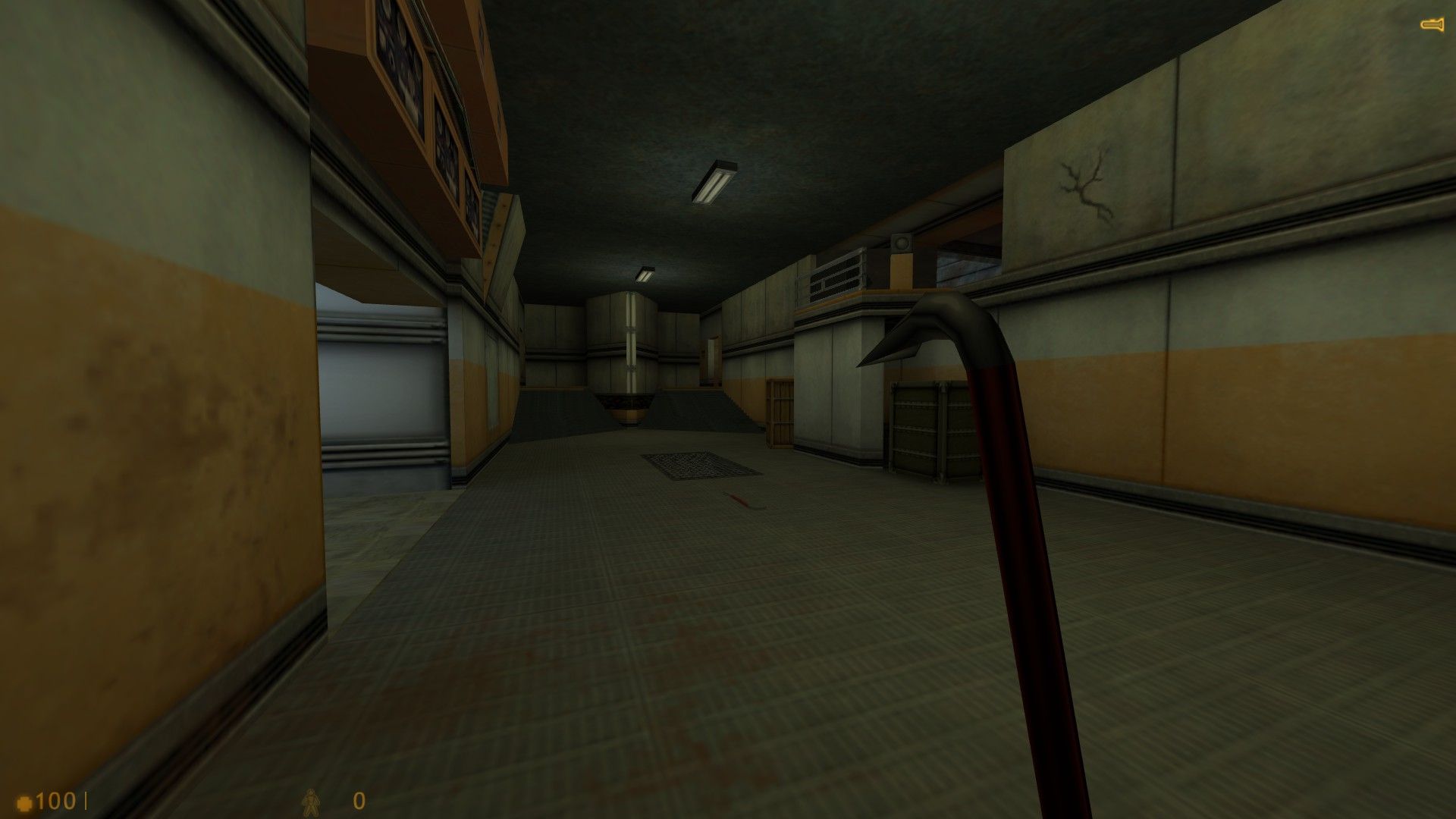
WIP still a lot to do in the rest of the map

Posted 1 year ago2023-06-09 18:24:52 UTC
3 Comments
You must log in to post a comment. You can login or register a new account.
You must log in to post a comment. You can login or register a new account.
You say it’s WIP, but since you’re sharing it I’m still going to tell you the remarks I have: The architecture could still be made more interesting, especially the ceiling . You could add more details in addition to the two crates and the crowbar already present.
The grate at the center of the hallway looks off, so does the crowbar perfectly parallel to the wall.
The wall texture you’ve used is great but it has borders. You should make your room higher so that the texture doesn’t cut halfway into the ceiling. (It’s also visible at the end of the hallway, the border is around the middle of the wall when it should be at the bottom and at the top.)
Lastly, the slopes at the end of the hallway look bad, you should change the texture maybe. You should also add trims on the bottom of the walls to have a border separating the slope from the wall.
For some reason the button on the first floor is facing the hallway, when it should face the other way (i.e. the user). You’ve also used a wall texture for the ceiling above the button.