Soup Miner
Created 19 years ago2005-09-22 17:36:10 UTC by
Soup Miner
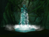
It's dark.Seconded. I'm looking at an almost black screen for most of these shots.
I'm looking at an almost black screen for most of these shots.Looks quite nice, but I can't make all that much out.


I don't see how I could make it any less boxy.Trims, supporting beams for the wooden ceiling... the problem is not so the squareness of the environment but the detail spreading. Long, boring surfaces make a square map look blocky. Putting some details now and then helps breaking up these surfaces so it feels less boxy.