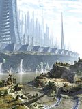
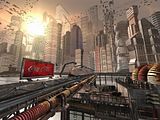
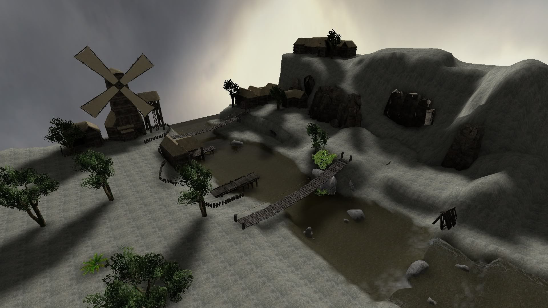
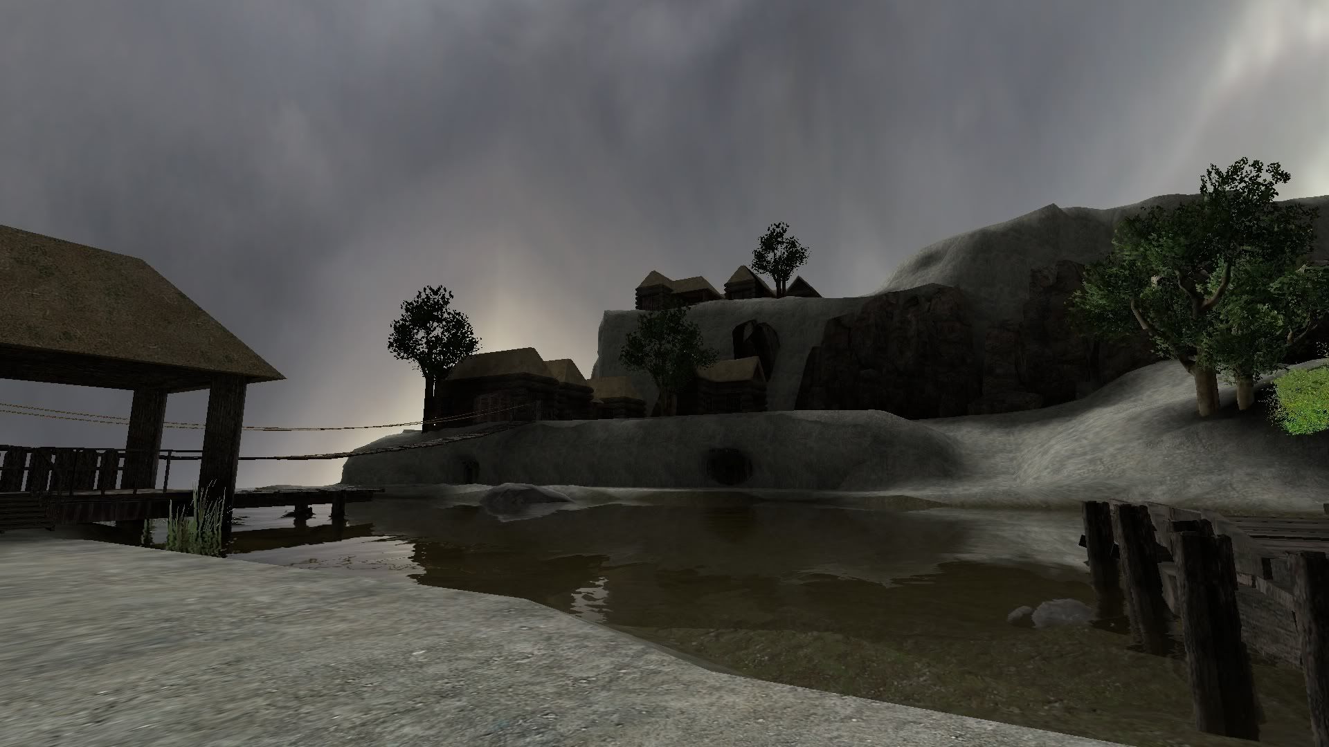
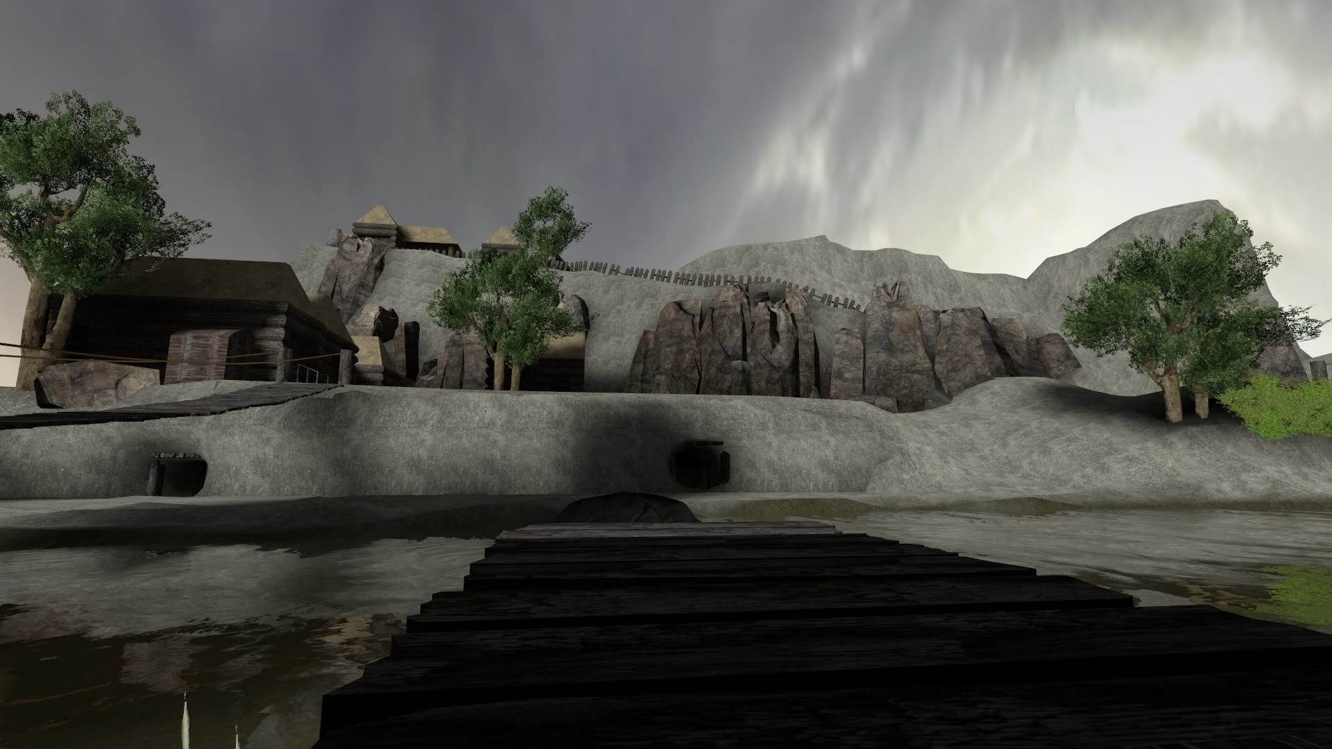
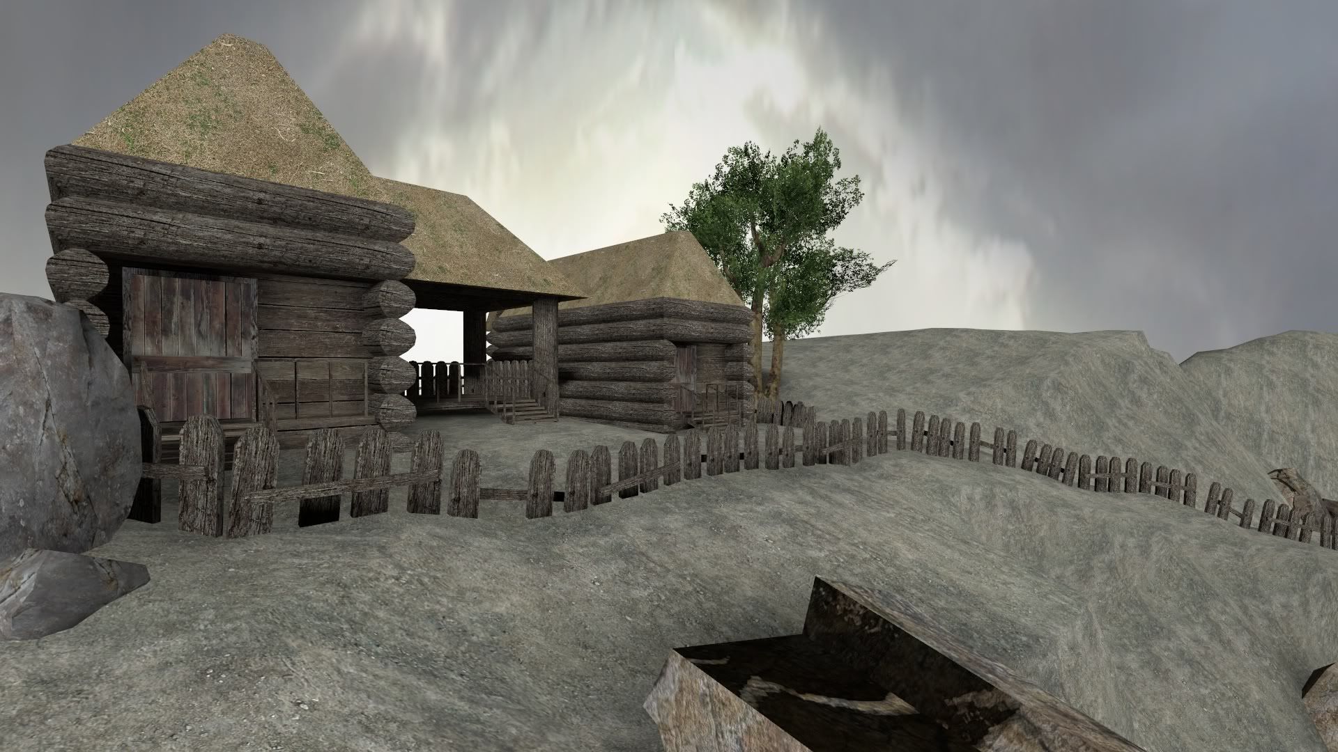
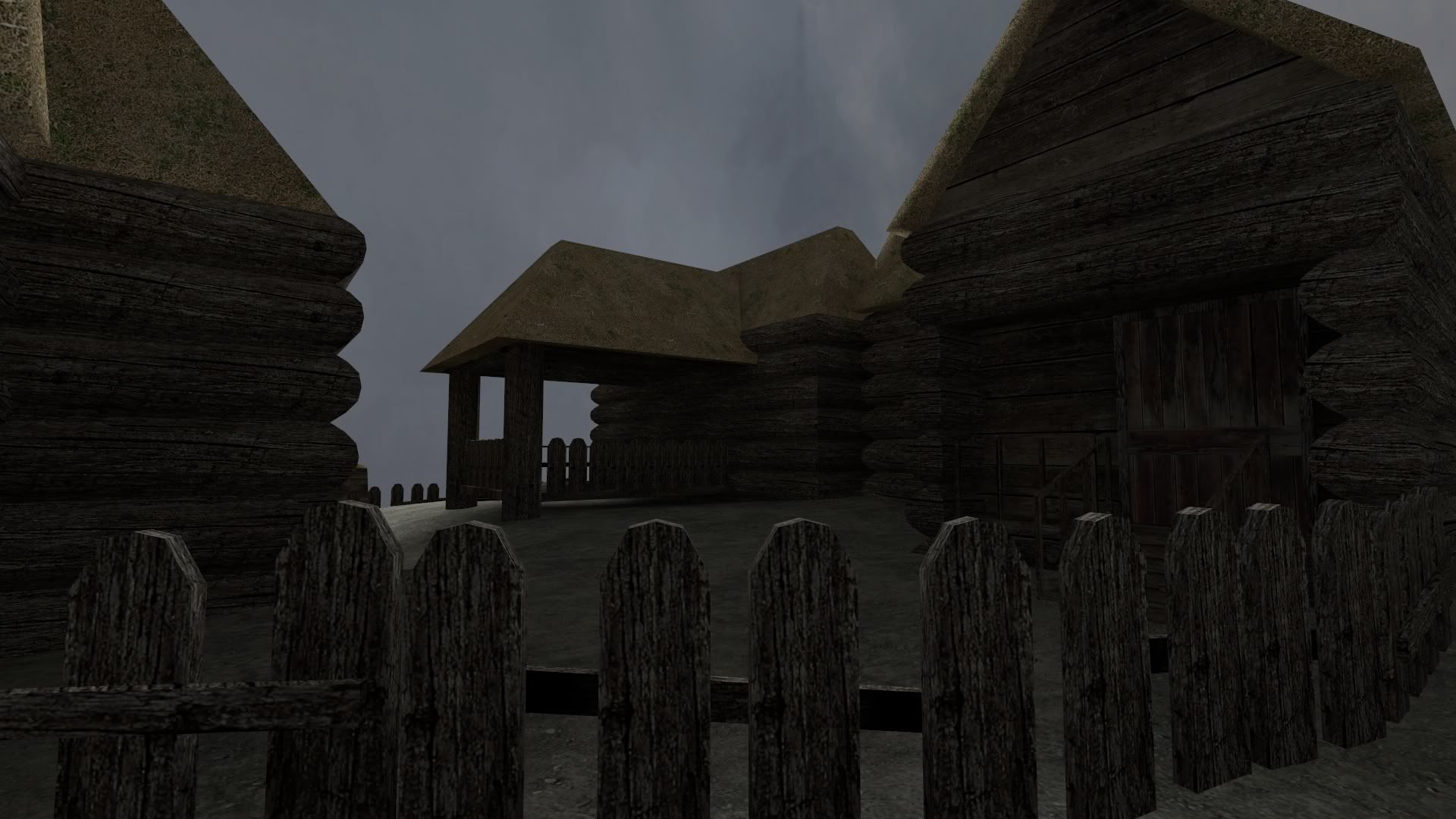
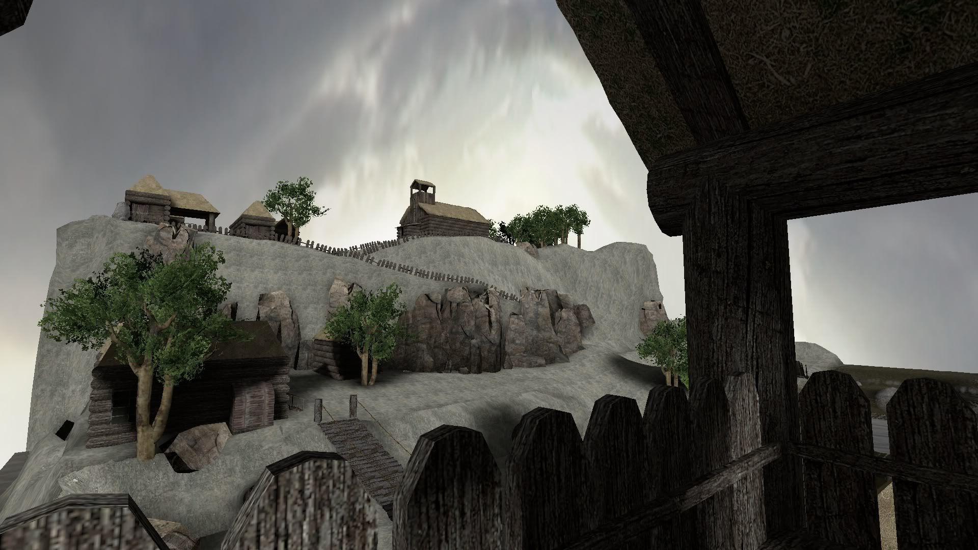
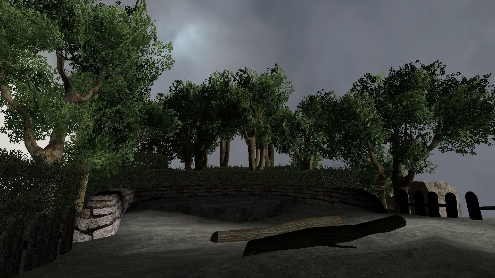
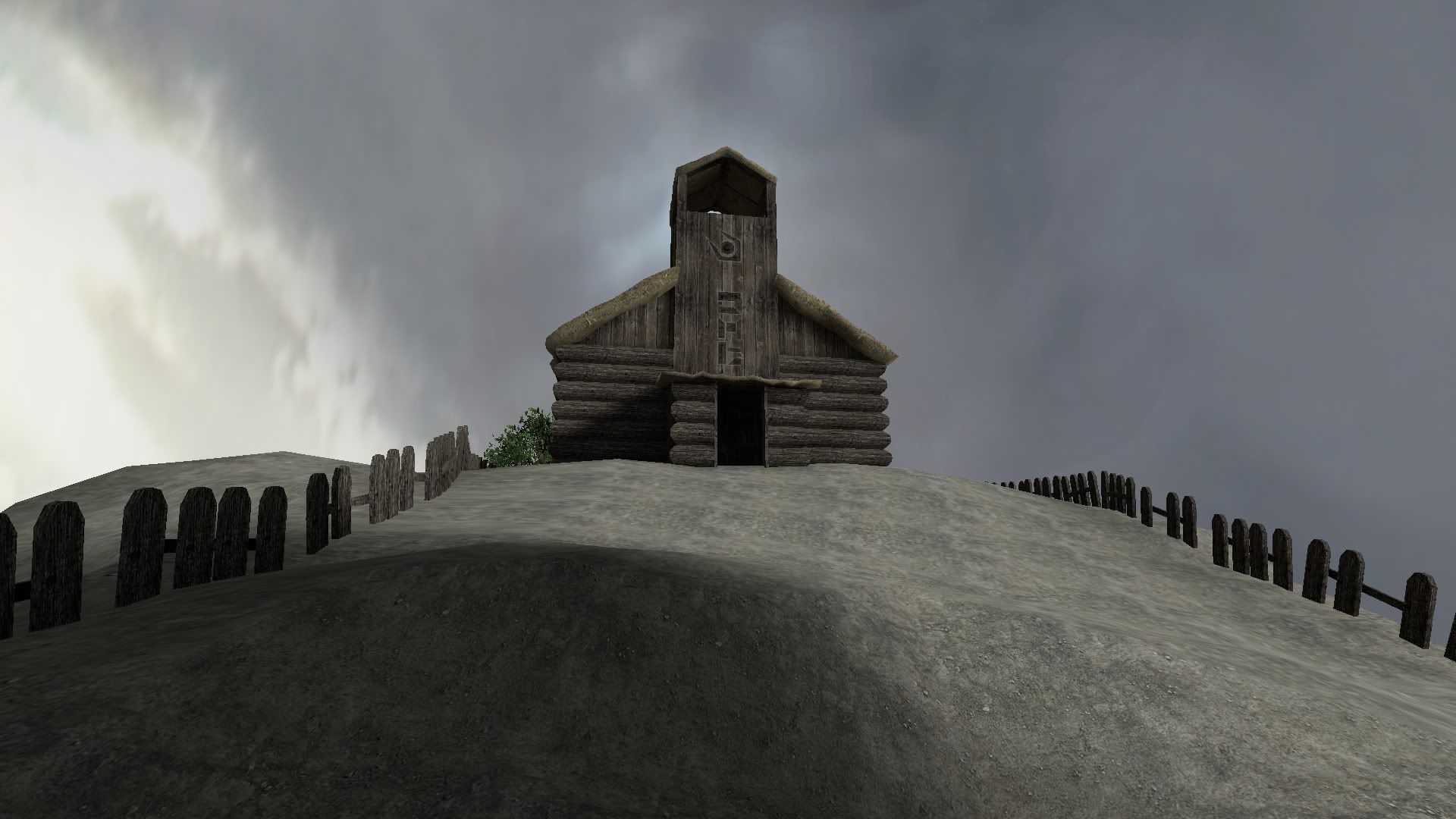
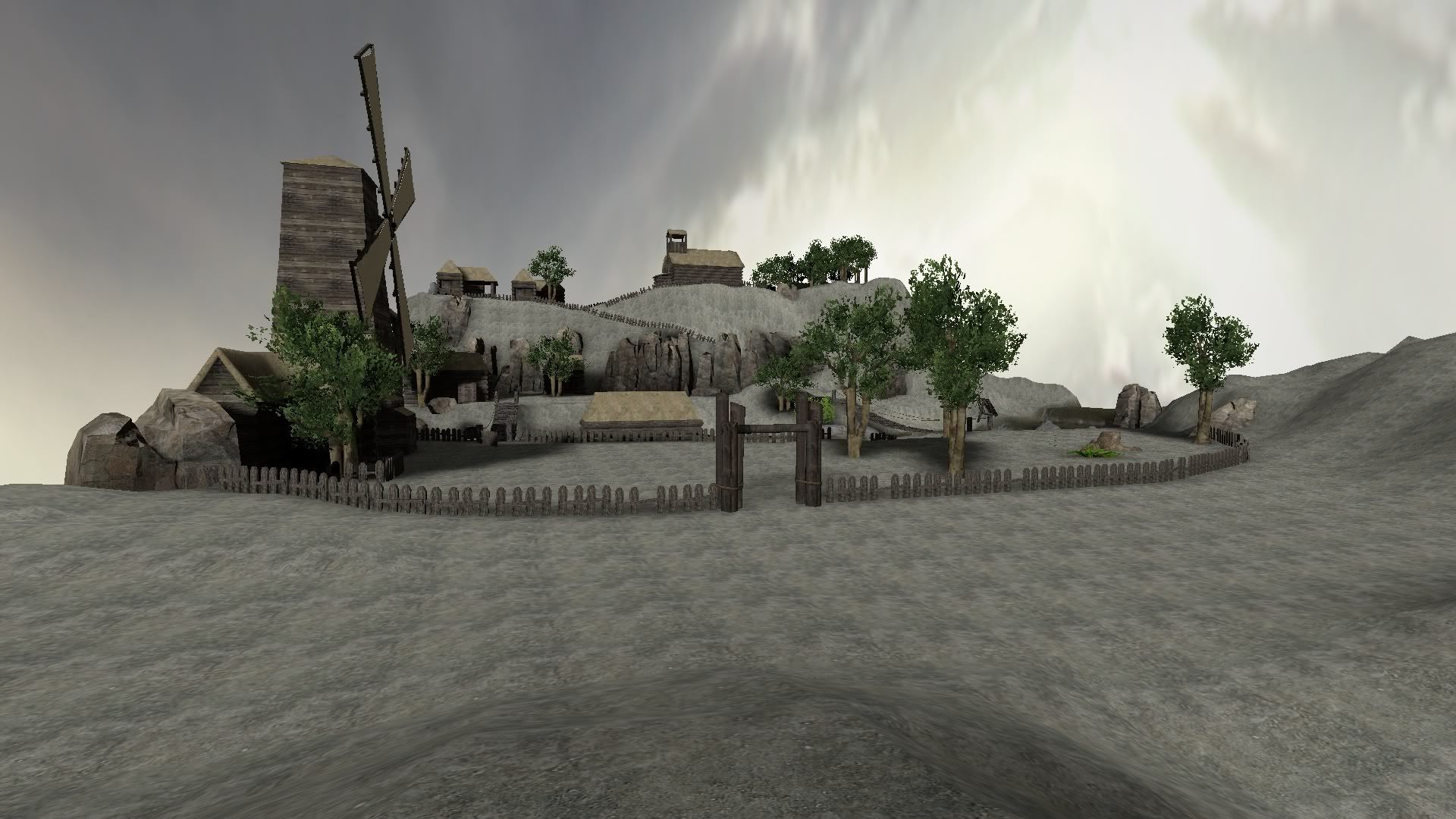
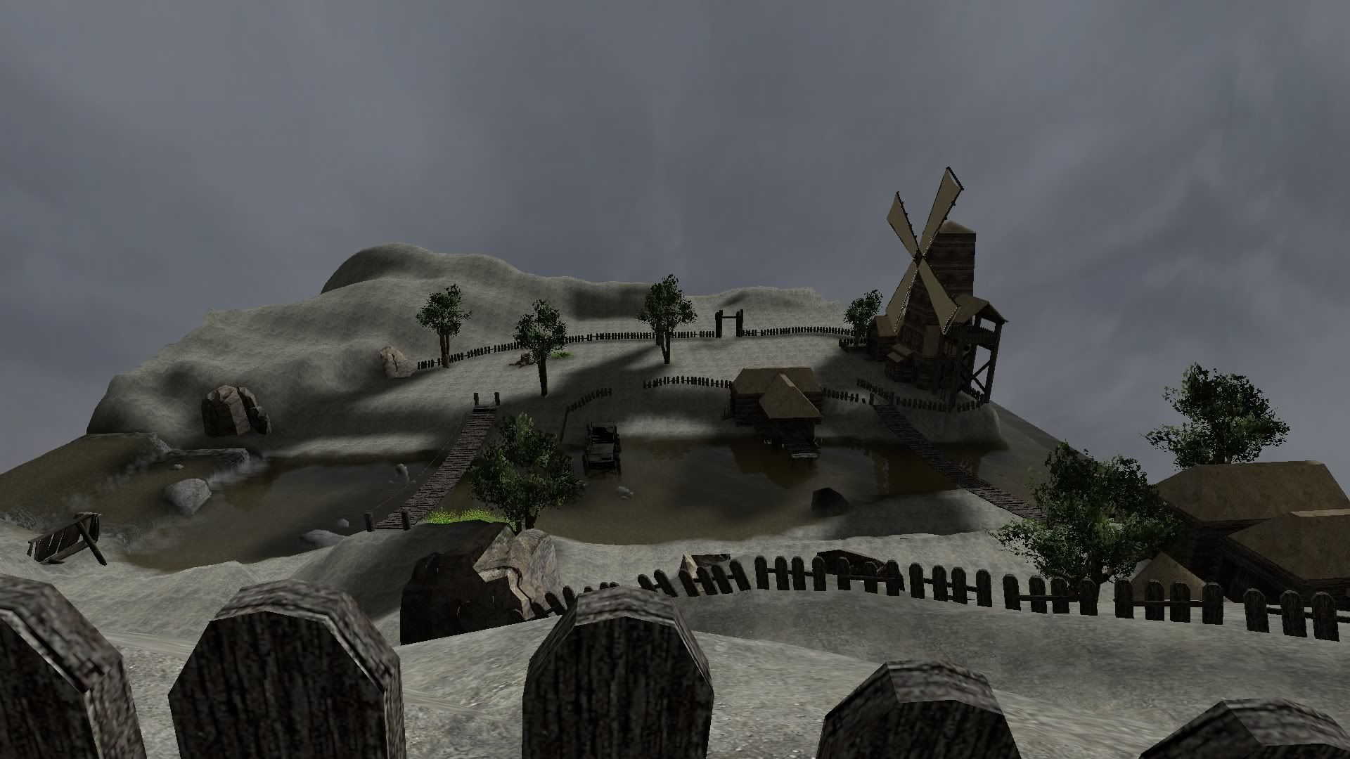
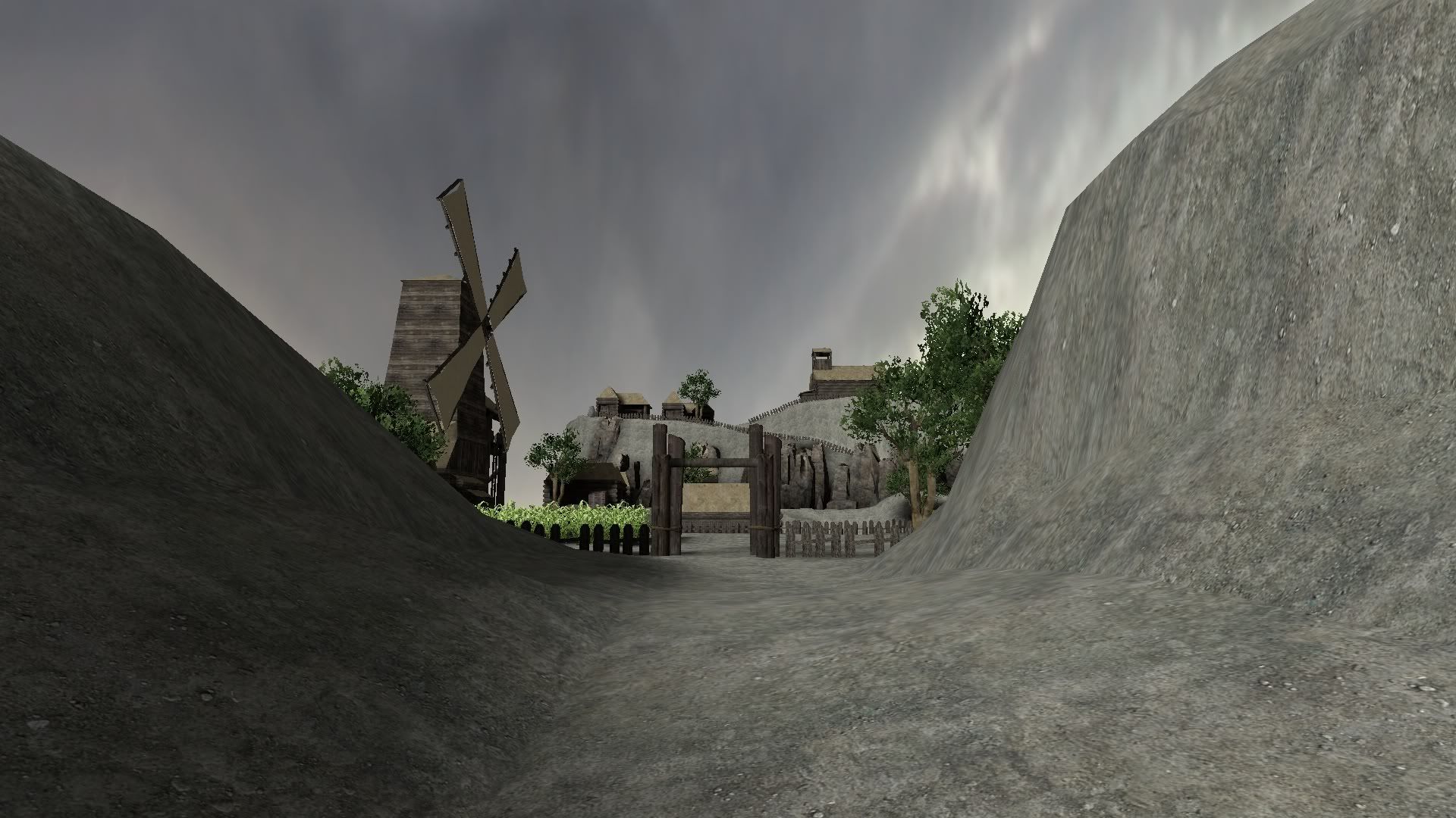
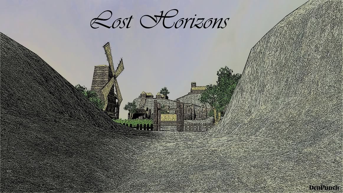
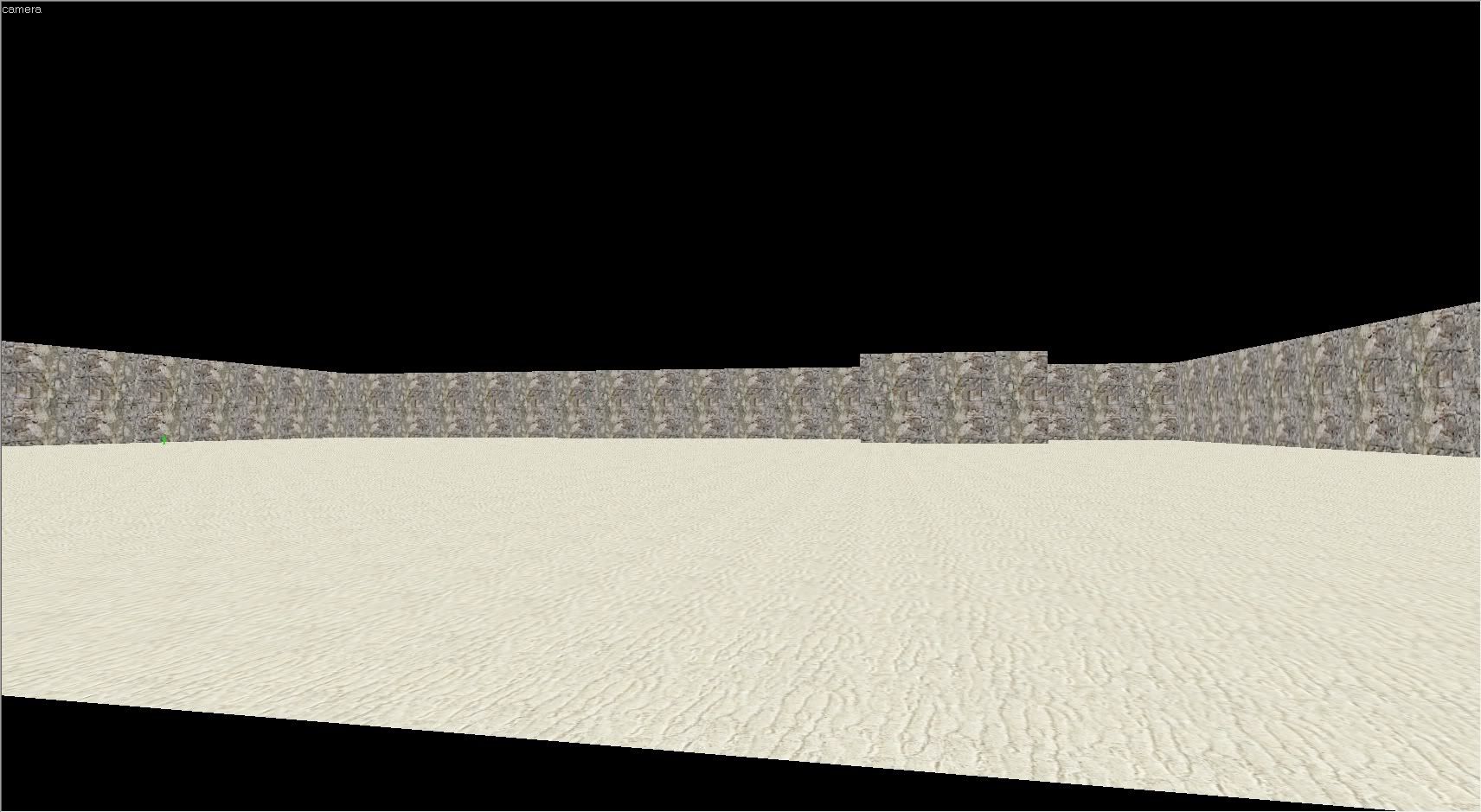
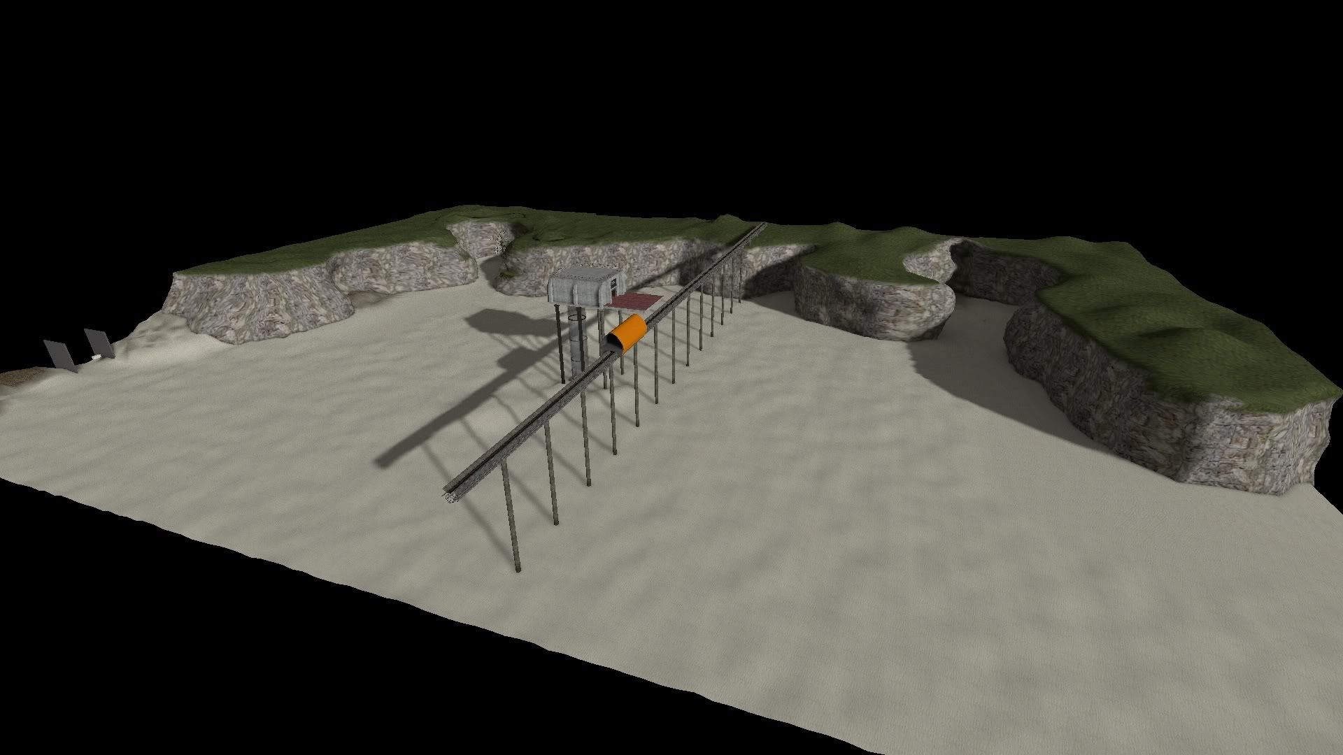
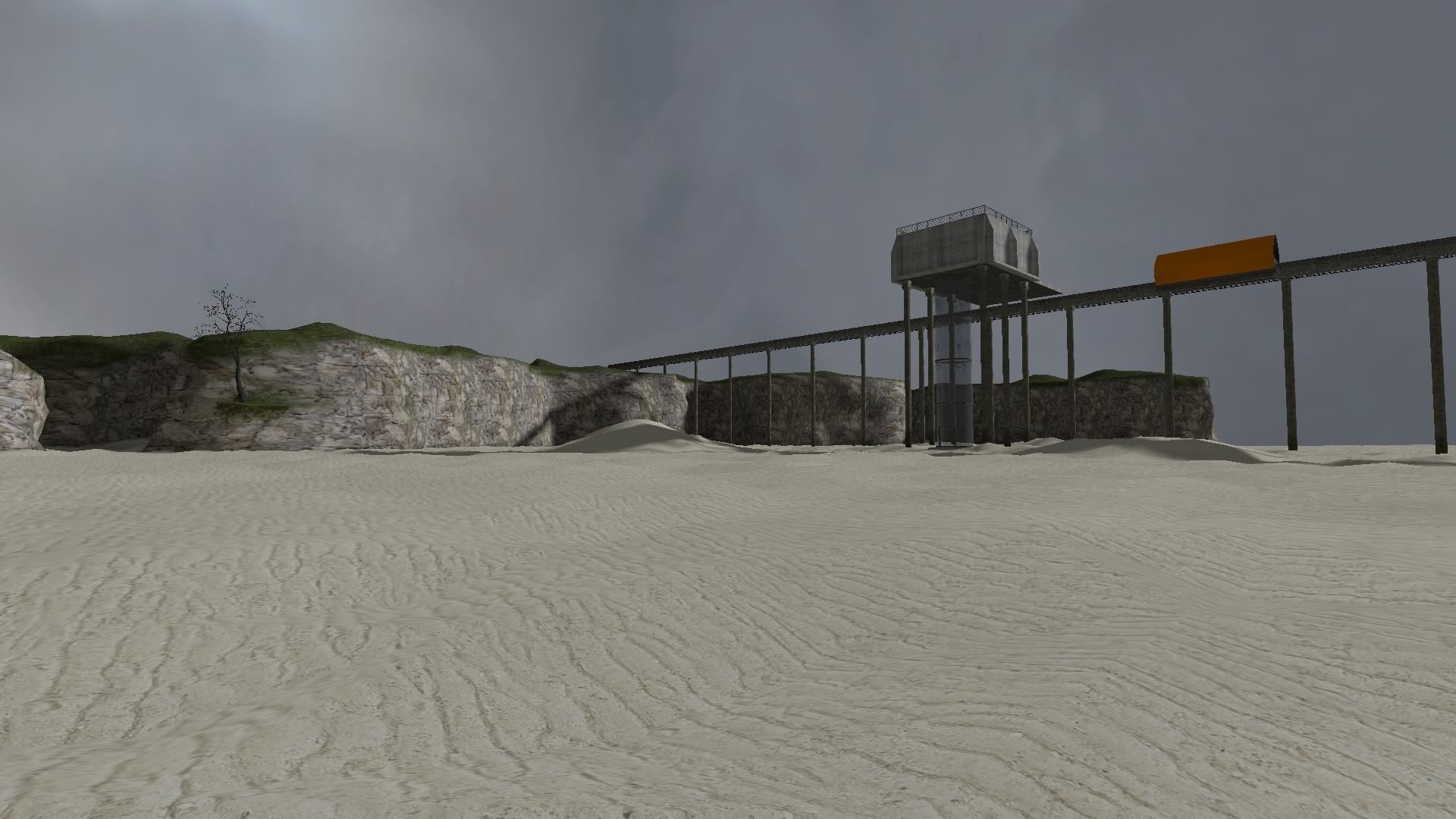
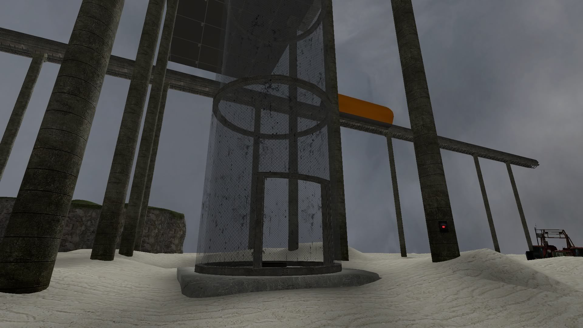
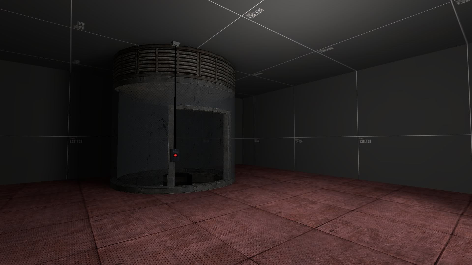
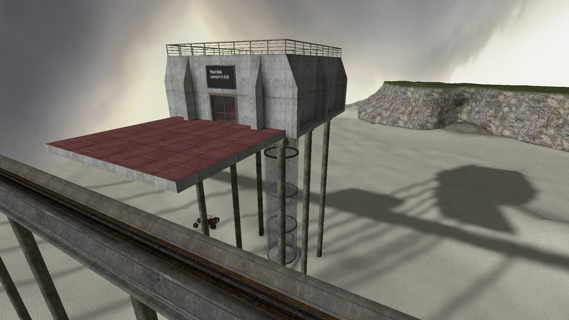
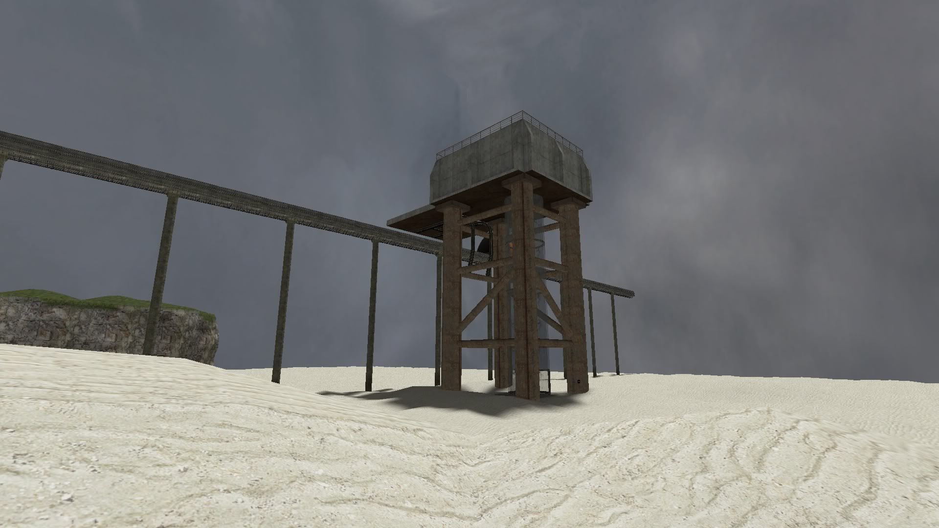
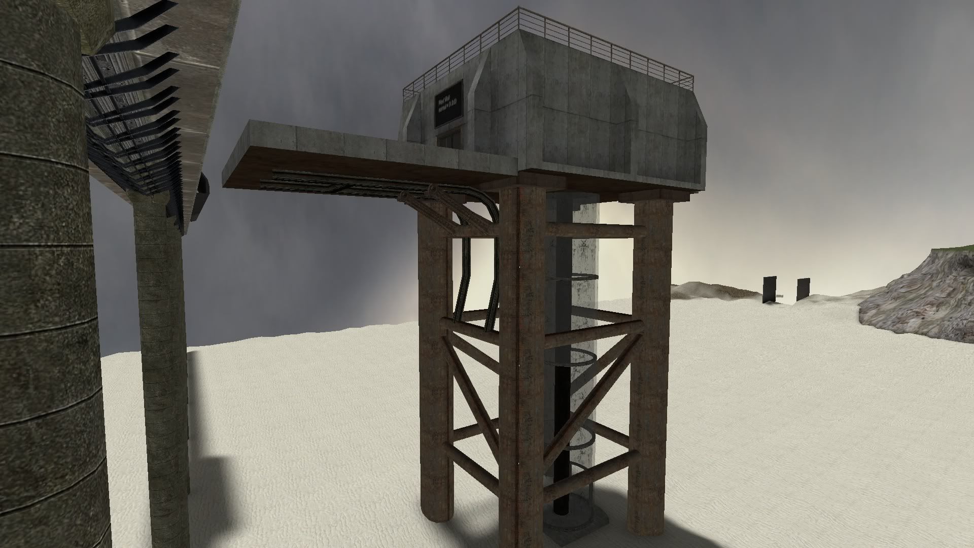
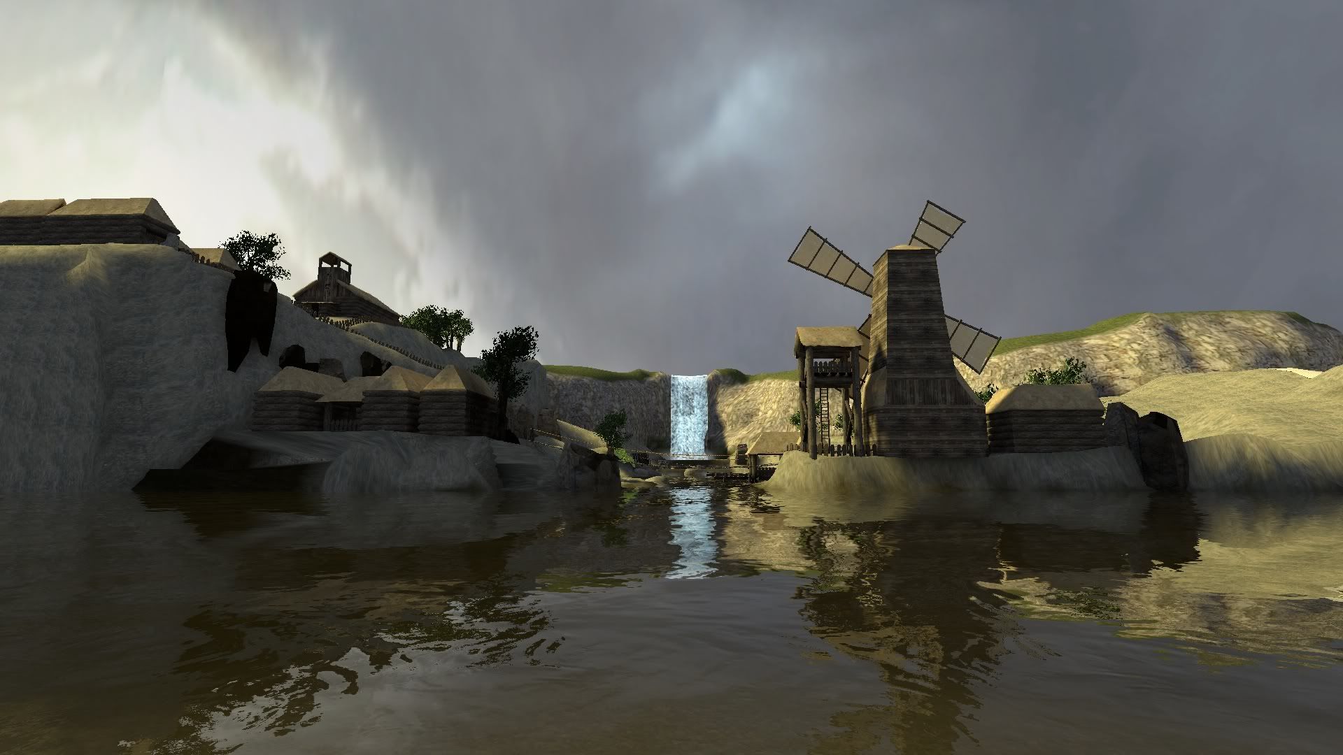
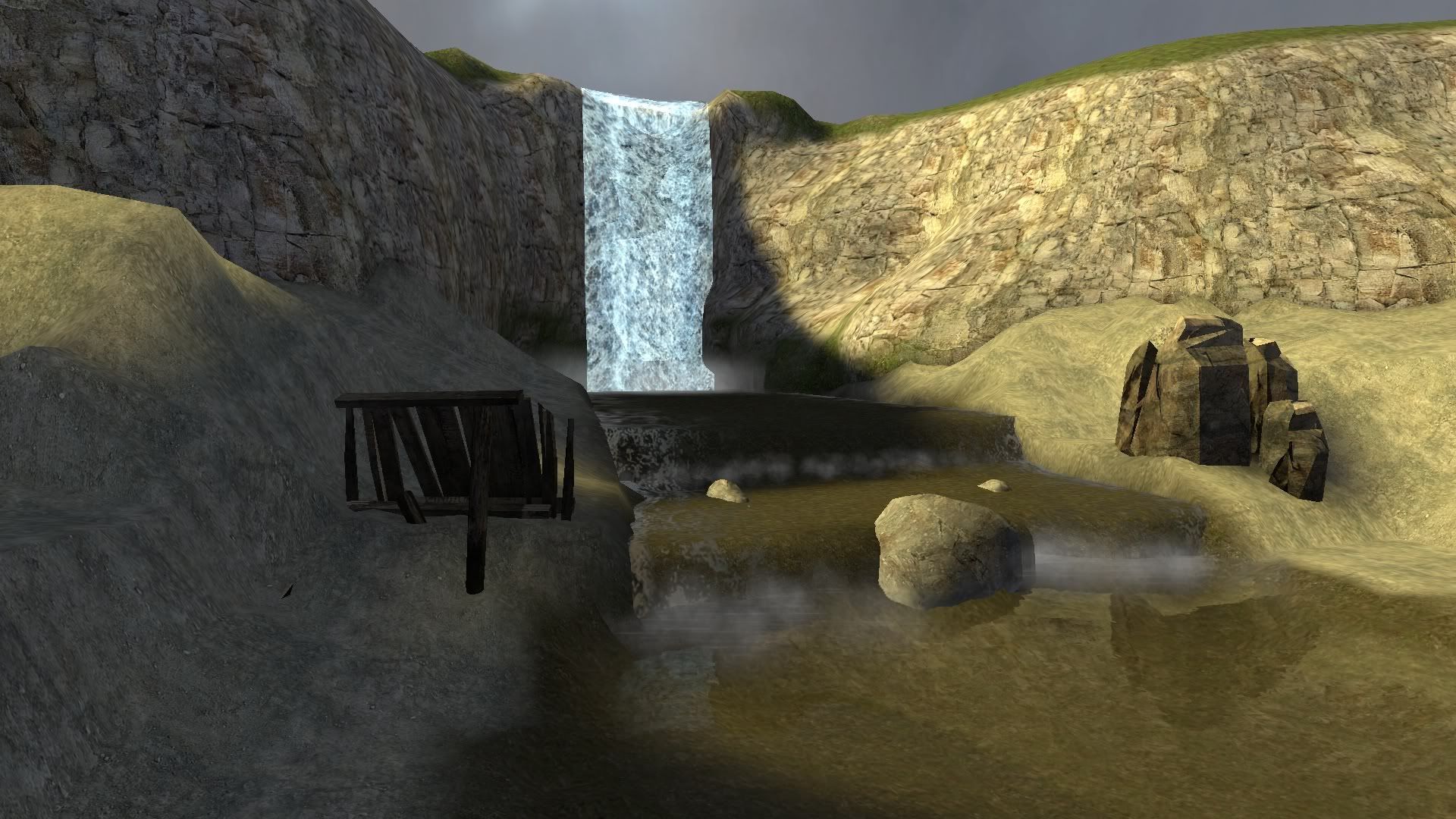
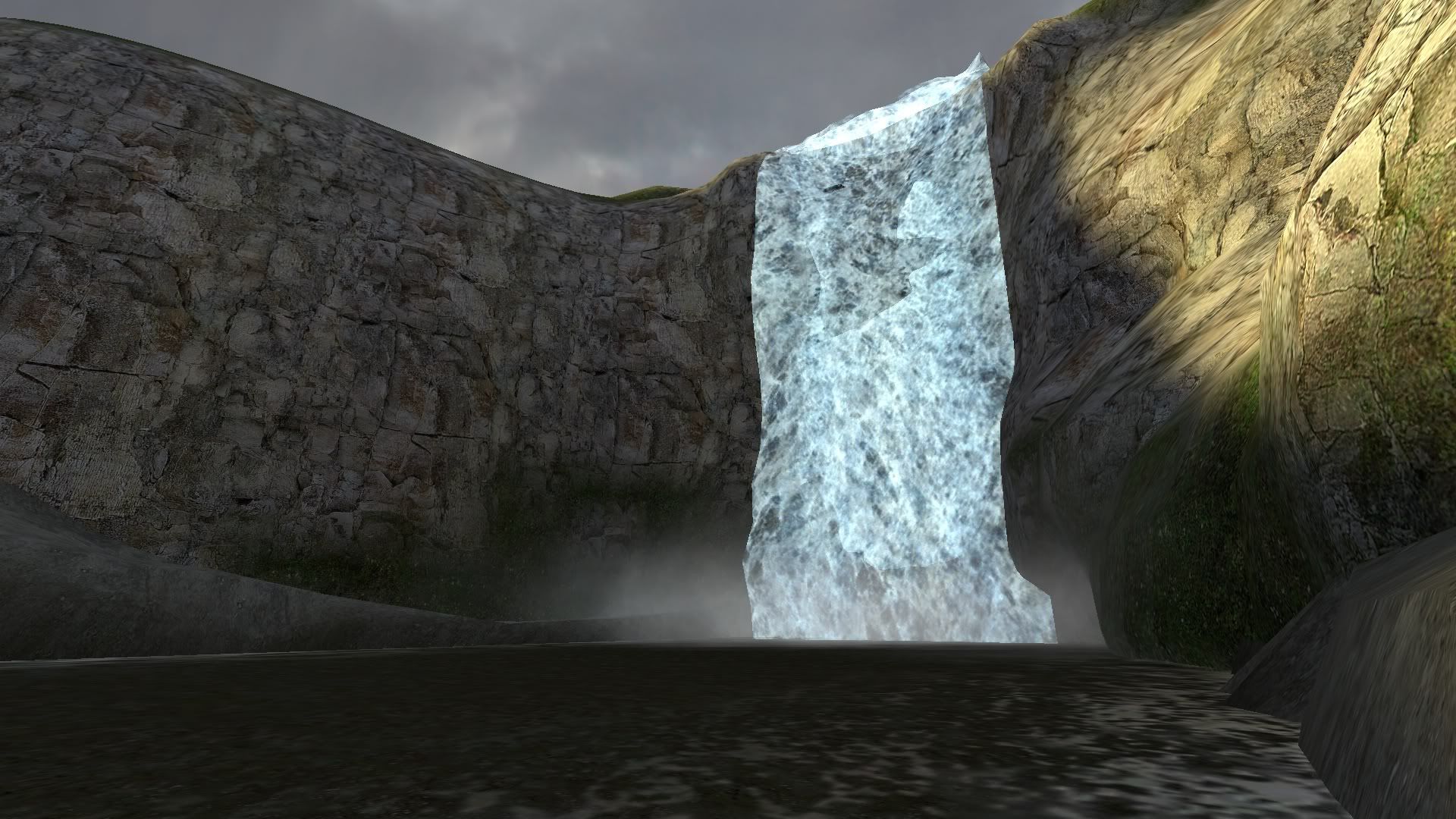
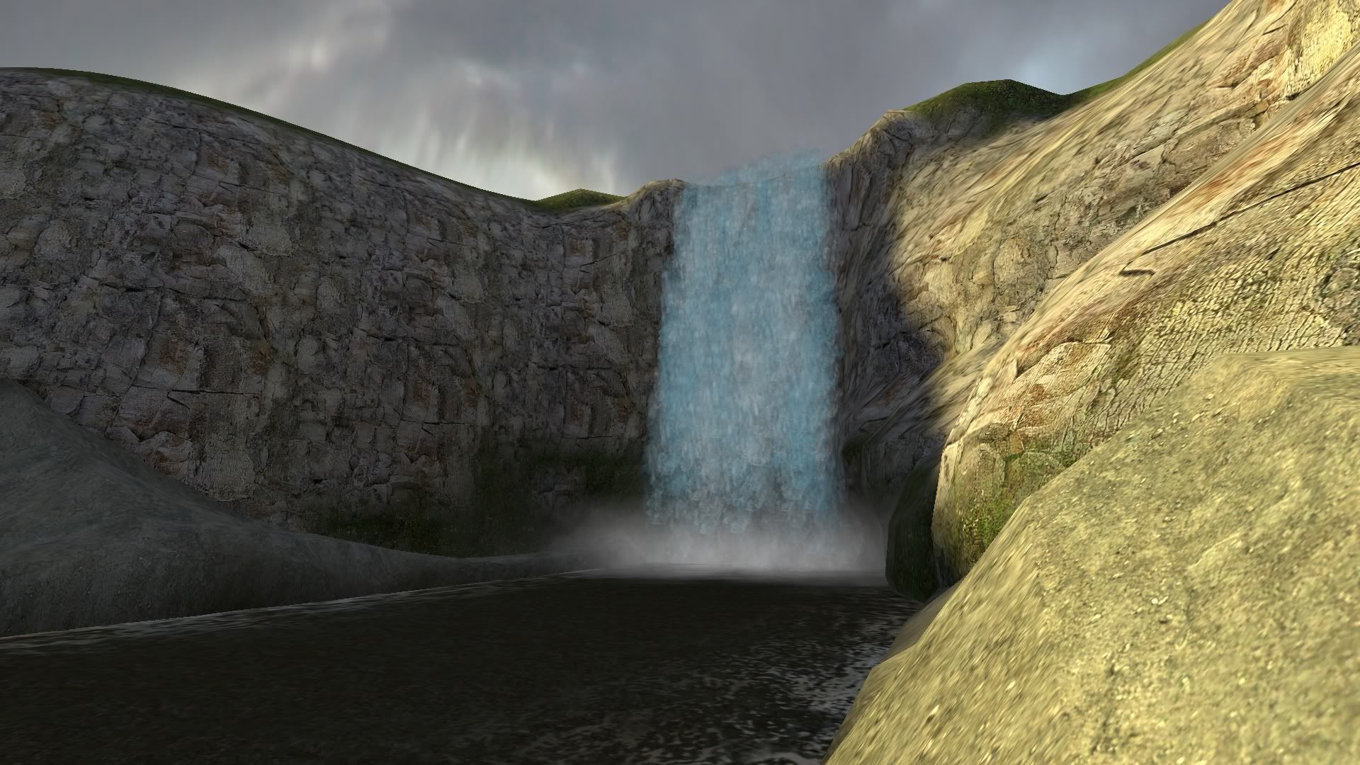
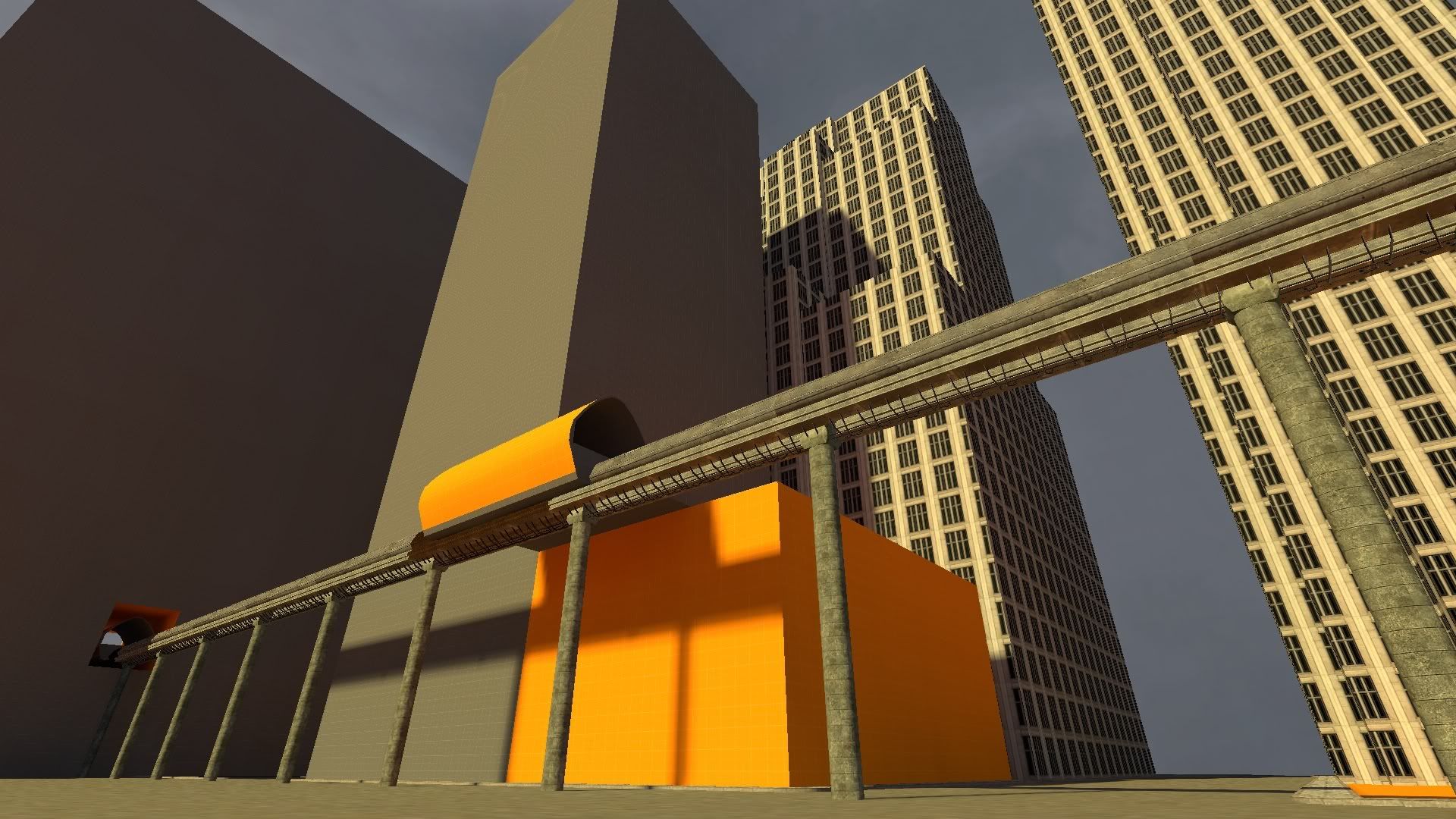
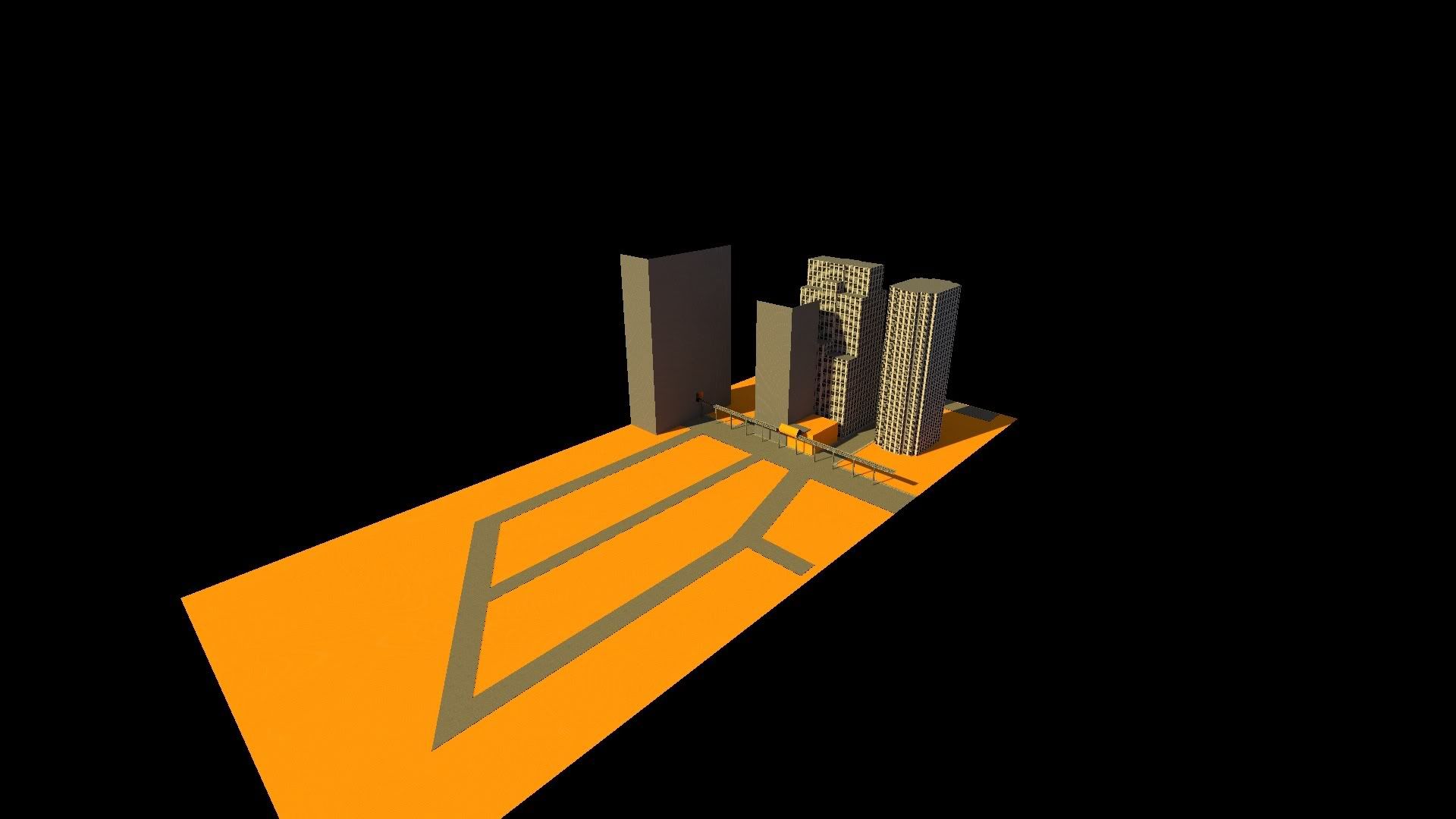
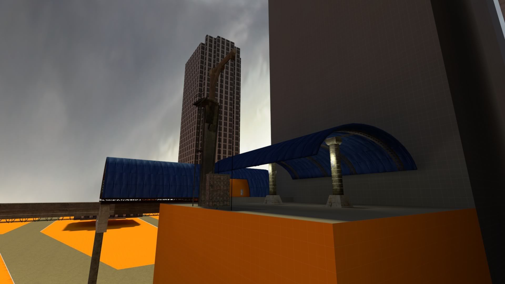
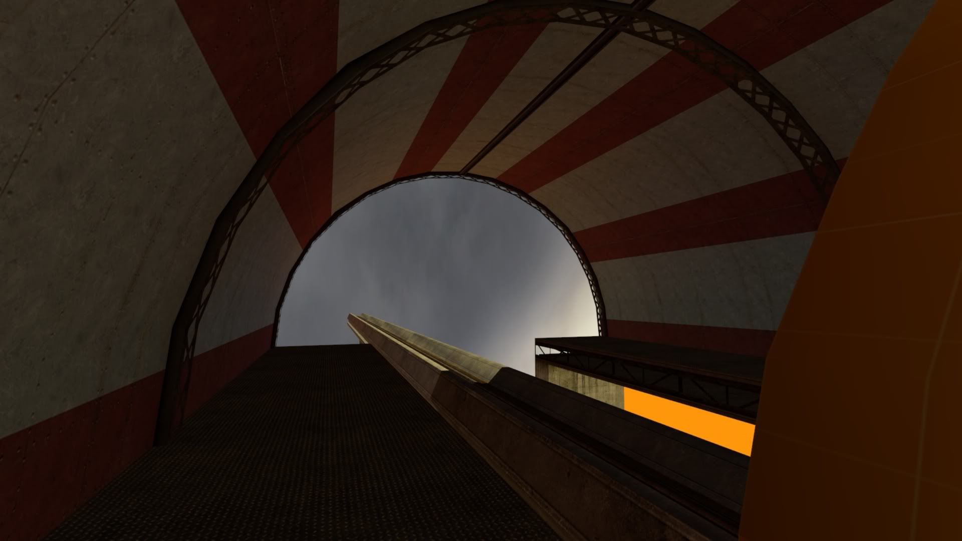
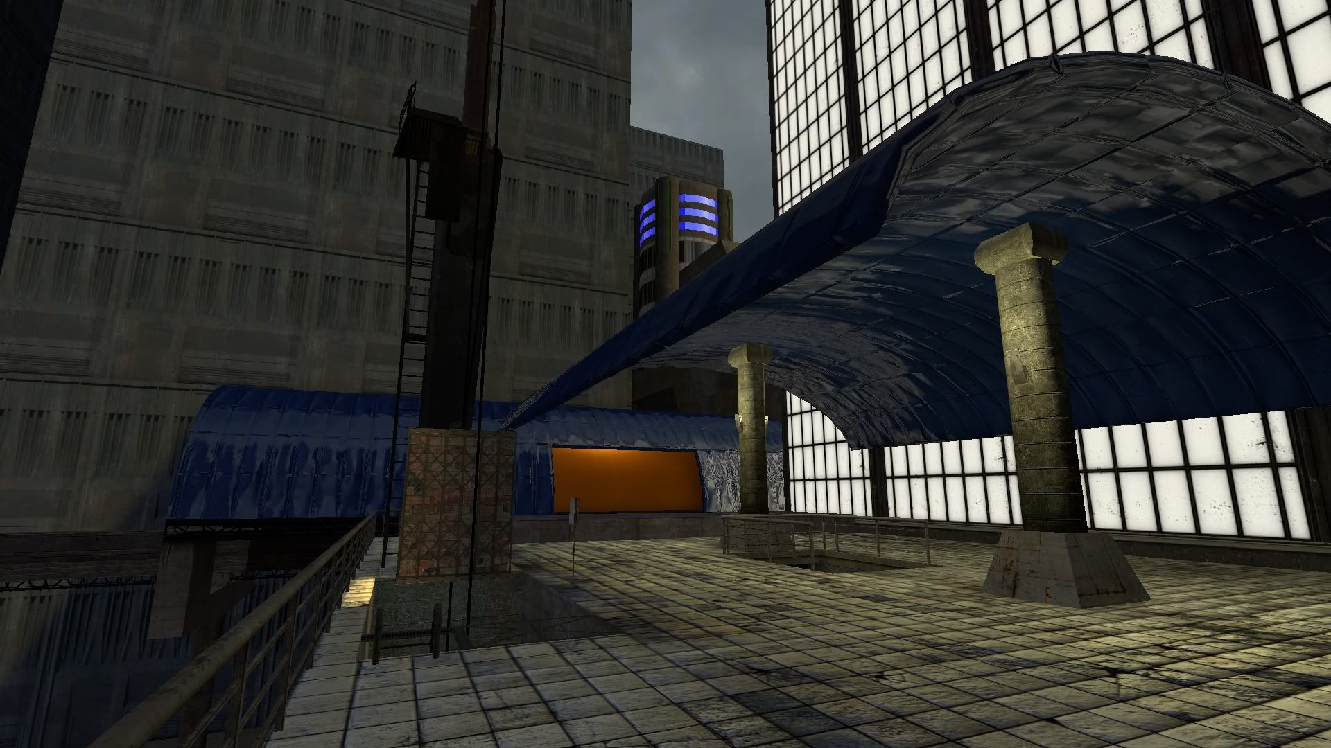
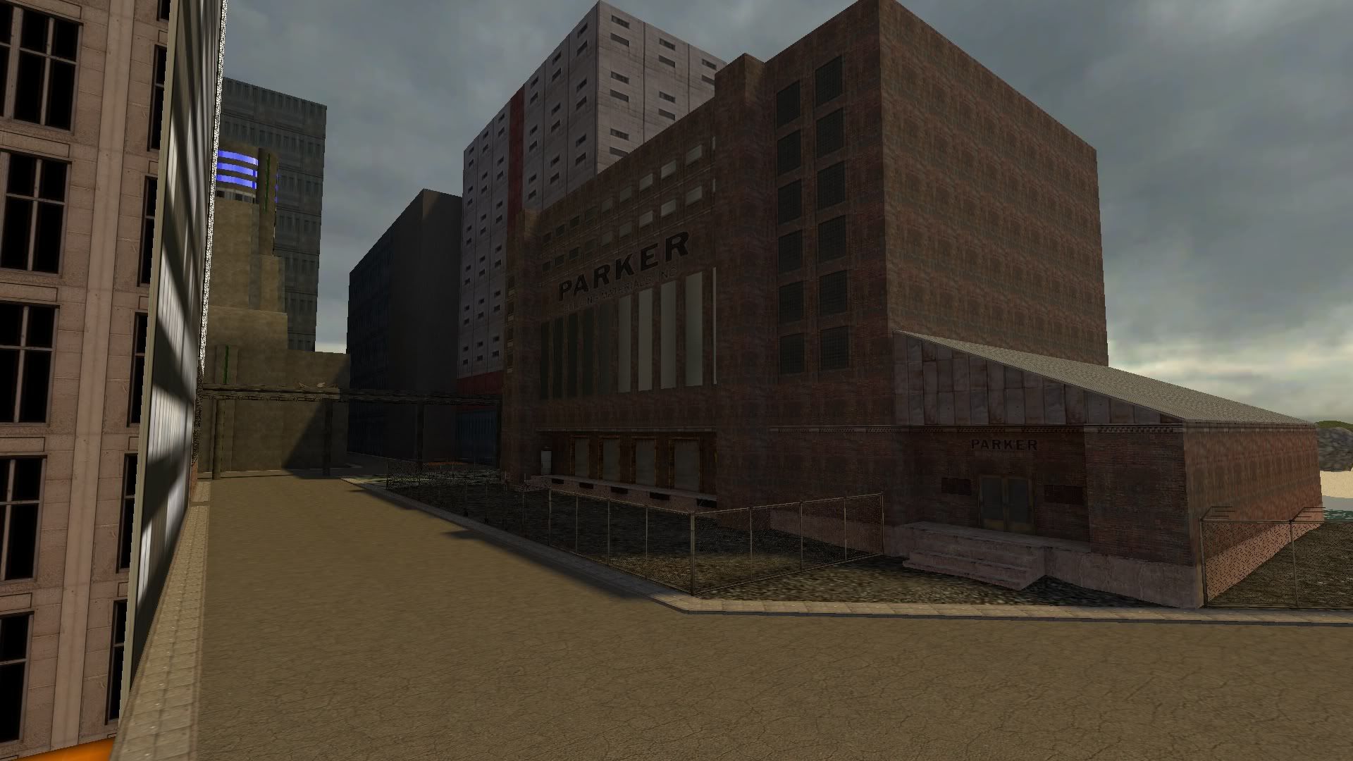
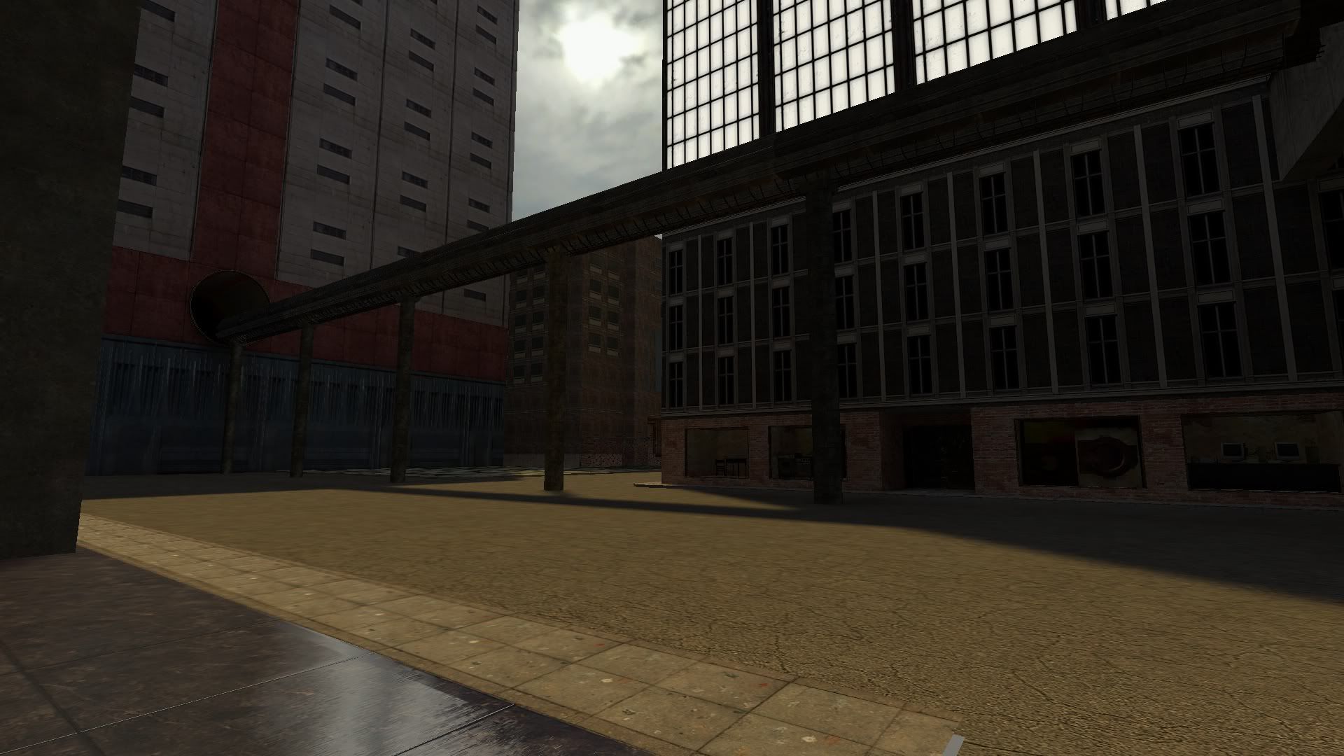
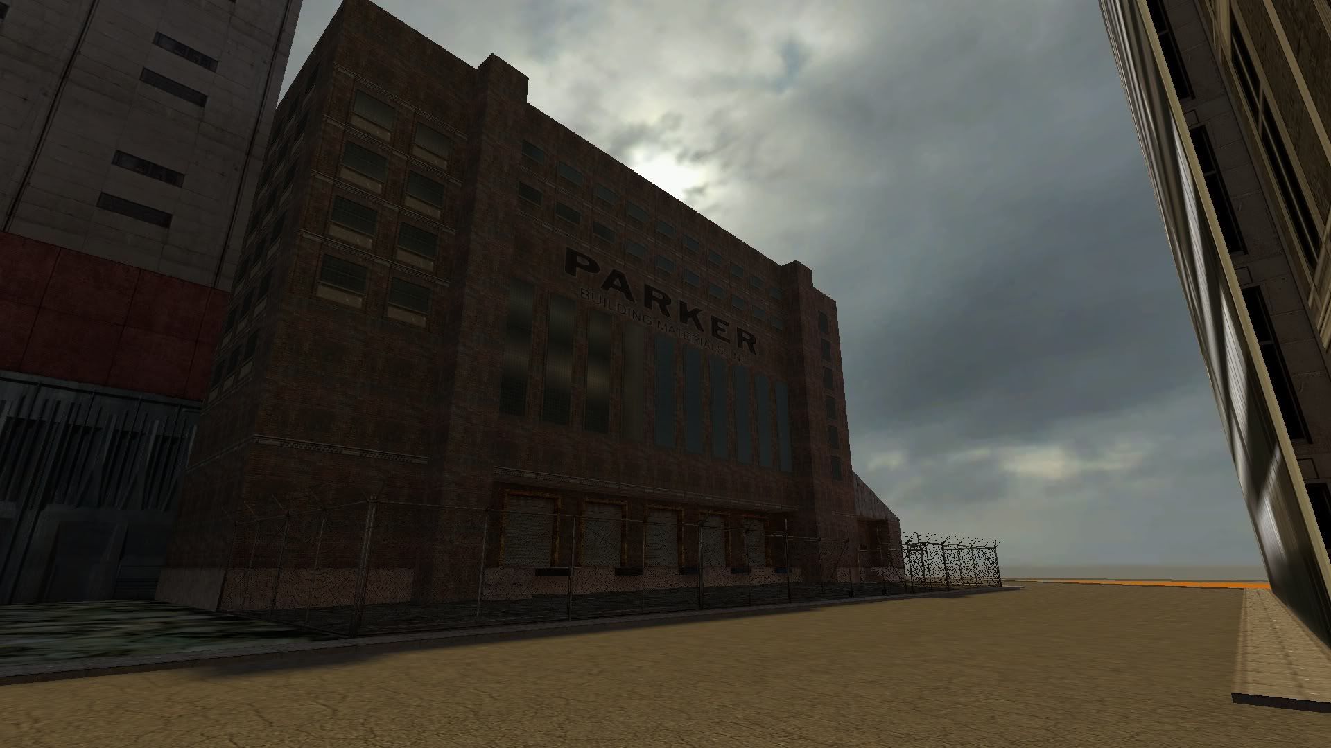
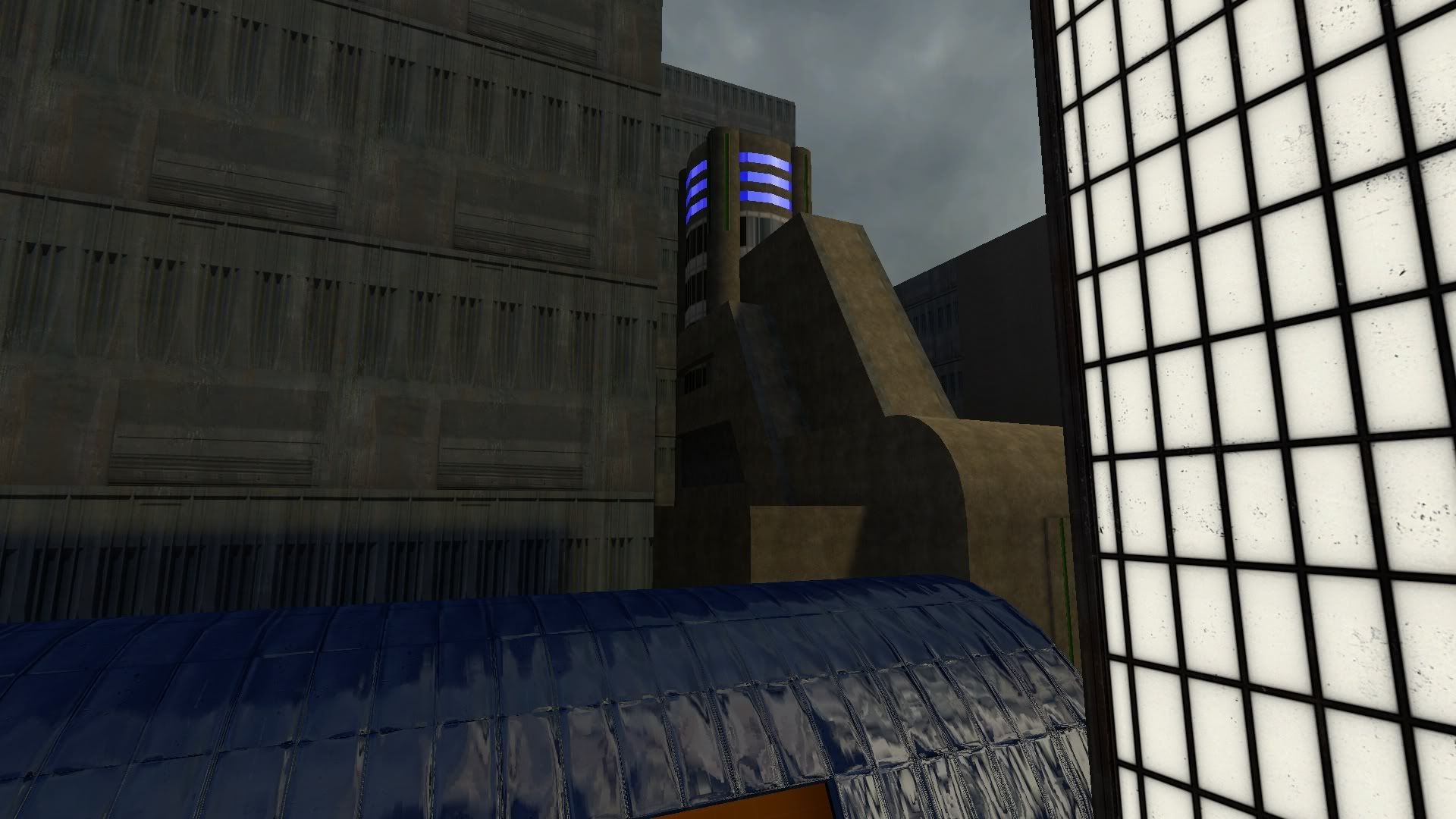
This is a map I am working on for Garry's Mod.
Here is the concept art:
Here are some pics of different stages of development:
Here is a link to the forums I am hosting this map and will be hosting the game, when the time comes:
http://projectmobius.pforum.biz/forum.htm
Lost Horizons - Source RP Map project
Created 14 years ago2010-03-24 23:50:04 UTC by
 Don Punch
Created 14 years ago2010-03-24 23:50:04 UTC by
![]() Don Punch
Don Punch
Posted 14 years ago2010-03-24 23:50:04 UTC
Post #279988
Posted 14 years ago2010-03-26 07:34:51 UTC
Post #280009
looks great Don! Looking forward to more pics....
)
My only complaint is your image hosting.. can't you link directly to the image or use imageshack like everyone else?!
Posted 14 years ago2010-03-27 01:00:17 UTC
Post #280030
What's wrong with photobucket?
Posted 14 years ago2010-03-27 02:03:10 UTC
Post #280032
nothing, except link to the image directly and not to the photobucket page, like i said above.
Posted 14 years ago2010-03-27 02:16:46 UTC
Post #280034
sorry captain....I too use photobucket. I will forthwith change to imageshack for further image postings.
lol
all you have to do is open it in a new window and it comes in fine (no edit)
lol
all you have to do is open it in a new window and it comes in fine (no edit)
Posted 14 years ago2010-03-27 02:21:16 UTC
Post #280035
there's nothing wrong with it afaik, but like image shack, you can link to the user page or the image iteslf. I was just trying to say people prefer being directed to the image itself, and not the page with the ads, that's all.
)
edit: when you click "open in a new window", the thumb comes up instead of the regular image, gah..P
Posted 14 years ago2010-03-27 02:59:24 UTC
Post #280037
It's a lot more convenient for the viewer to not have to wait for the rest of the page to load, especially since the image is the last thing to load on websites like Photobucket and Imageshack. It's also a lot more convenient to not have to click a downsized image on a web page to view the whole picture. Nobody ever actually views the cropped image. Ever.
Less clicks, less waiting, more happy time.
That's why it's better to link to an image directly.
Less clicks, less waiting, more happy time.
That's why it's better to link to an image directly.
Posted 14 years ago2010-03-30 17:27:58 UTC
Post #280123
Posted 14 years ago2010-03-31 16:55:13 UTC
Post #280145
looks gorgeous man! 

Posted 14 years ago2010-03-31 19:00:16 UTC
Post #280147
Yes, very good. How far in development are you now?
Posted 14 years ago2010-04-01 03:15:53 UTC
Post #280154
I'd say about 10%.
I am going to use the teleporter method of doors. Just think Fallout 3 and you will instantly understand what i mean. SO all of these structures are hollow. All the interior will be in a seperate 'void' area of the map.
As far as the overall grid size, what you see in the most recent pics is only about 15-20% of the total area. I am also making in inside of the city (refer to the 1st pic in the thread), and there will be a set of caves too(under the current part I am working on now).
Posted 14 years ago2010-04-02 00:49:31 UTC
Post #280191
Posted 14 years ago2010-04-02 03:27:00 UTC
Post #280193
This looks very great. Good luck with it!
Posted 14 years ago2010-04-05 00:19:13 UTC
Post #280250
My mapping method is as follows right now:
A. Map for 20-30 mins
B. Play HoN for an hour
C. Rinse and Repeat
Updates. Almost done with this section of the map.
A. Map for 20-30 mins
B. Play HoN for an hour
C. Rinse and Repeat
Updates. Almost done with this section of the map.
Posted 14 years ago2010-04-05 14:02:39 UTC
Post #280269
My only criticism is that the grey texture is very repetetive and boring, and makes the map look blank. I don't know if you're going to leave it like that or put things over it/change the texture around, but in my opinion, I think you need to mix it up, add more foliage, more details and colours. Otherwise, the map is beautiful!
Posted 14 years ago2010-04-05 15:07:50 UTC
Post #280271
Posted 14 years ago2010-04-05 16:19:02 UTC
Post #280273
@ ashephard: yea, I am planning on making some custom blend textures with detail sprites and models to fill it in.
@ Rimrook: good link, I been looking for some more pics of that scene. As you can see, I started just as a recreation, then started making it my own.
Thanks to those links I actually got in contact with the artist.
@ Rimrook: good link, I been looking for some more pics of that scene. As you can see, I started just as a recreation, then started making it my own.
Thanks to those links I actually got in contact with the artist.
Posted 14 years ago2010-04-05 16:32:58 UTC
Post #280276
Where did those tree models come from?
Did you make them?
Did you make them?
Posted 14 years ago2010-04-05 19:04:13 UTC
Post #280277
not excatly sure, it was in my gmod folder, so who knows
model name is: models/cherokemodels/palmy/tree_big03.mdl
on the subject of models...
can anyone link me to a download of a haystack or wheat(or even a good corn model) for source?
I tried to find the one from l4d2 or even l4d, but had no luck extracting them.
model name is: models/cherokemodels/palmy/tree_big03.mdl
on the subject of models...
can anyone link me to a download of a haystack or wheat(or even a good corn model) for source?
I tried to find the one from l4d2 or even l4d, but had no luck extracting them.
Posted 14 years ago2010-04-05 19:59:33 UTC
Post #280278
This looks great and i applaud your quick progress! As soon as i finish my cubicles entry i'm switching to source mapping (your mapping is inspiring me)
)
Posted 14 years ago2010-04-05 22:46:34 UTC
Post #280281
I lost almost a full days worth of mapping today fixing some potential problems. All those fence posts (with weird angles and verticies not on grid) where eating up my planes, so I busted out good ol' propper and had to replace and posistion every fence on the map.
However, I did complete the bounding area of the village.
This is where you will be teleported to as you leave the wasteland and enter the village.
The entrance to the village
However, I did complete the bounding area of the village.
This is where you will be teleported to as you leave the wasteland and enter the village.
The entrance to the village
Posted 14 years ago2010-04-06 00:45:00 UTC
Post #280282
too late to edit, but I just wanted to do this for the hell of it.
Posted 14 years ago2010-04-06 00:50:39 UTC
Post #280283
You can't be too late to edit. Editing bumps topics just like a new post does.
Posted 14 years ago2010-04-08 16:46:56 UTC
Post #280361
Posted 14 years ago2010-04-10 01:48:44 UTC
Post #280384
Havn't posted many pics the last few days, as I have been streaming most of my work.
For those of you who didn't see any of the streams...
BeforAfter
For those of you who didn't see any of the streams...
BeforAfter
Posted 14 years ago2010-04-10 02:11:15 UTC
Post #280385
That box building room station/platform thing looks too heavy and unbalanced for those thin pillars, and looks like a very unstable structure overall. I know it's not finished, it's just an observation.
Posted 14 years ago2010-04-10 22:20:56 UTC
Post #280388
Yea there is a lot more to it than what I have done yet
Edit:
You got me to thinking, I was just gonna do a set of beams around those poles with a ladder system, but that wouldn't add any support, so thanks for the CC on that one man.
Edit:
You got me to thinking, I was just gonna do a set of beams around those poles with a ladder system, but that wouldn't add any support, so thanks for the CC on that one man.
Posted 14 years ago2010-04-11 18:44:29 UTC
Post #280436
zomg how did you get map to match the concept art so perfectly?! that's insane!
P
Is everything made out of world brushes or are you modeling too?
Posted 14 years ago2010-04-11 21:33:57 UTC
Post #280441
to in the last pic above your post, there are 3 visable brushes in that structure (including the rails and supports). Just the floor, and 4 walls are brushes.
Everything else is a model.
Everything else is a model.
Posted 14 years ago2010-04-11 21:45:48 UTC
Post #280442
Good! Looks much more sturdy now. Definitely has improved.
Posted 14 years ago2010-04-14 21:17:52 UTC
Post #280506
more pics
Added Large waterfall to main area and combined wastelands and village areas
Added Large waterfall to main area and combined wastelands and village areas
Posted 14 years ago2010-04-14 21:47:51 UTC
Post #280507
Those rock walls are too smooth. For cliff faces, sharp edges are your friends.
Posted 14 years ago2010-04-14 23:17:43 UTC
Post #280508
how do you do waterfalls in source lol i never figured it out.
but this is incredible don - mad props
but this is incredible don - mad props
Posted 14 years ago2010-04-15 01:33:12 UTC
Post #280510
Redid the water fall, this time using the particle system.
The way I did it previous, and the way I still have for the lower falls, is using a basic scrolling texture.
Little different in source, but its only 1 line in the vtf.
This new waterfall is actually about 10 particle systems and 6 env_steam's working together.
The way I did it previous, and the way I still have for the lower falls, is using a basic scrolling texture.
Little different in source, but its only 1 line in the vtf.
This new waterfall is actually about 10 particle systems and 6 env_steam's working together.
Posted 14 years ago2010-04-15 13:30:31 UTC
Post #280517
That one looks great!
Posted 14 years ago2010-04-20 00:59:07 UTC
Post #280645
Here is a rough draft of the city area of this map
Gonna be pushing some limits if I fill this all in, along with the rest of the map.
Gonna be pushing some limits if I fill this all in, along with the rest of the map.
Posted 14 years ago2010-04-20 06:37:53 UTC
Post #280649
Just remember, if it's Gmod, leave lots of space and budget for spawning.
Posted 14 years ago2010-05-05 01:50:26 UTC
Post #280981
Havn't posted much media lately, so here is a little bit of what I have been doing.Counter-weighted elevator ^This is the last part of the 'make-shift' parts of town. The reast of the city will be futuristic (dammit)
Posted 14 years ago2010-05-10 23:12:02 UTC
Post #281145
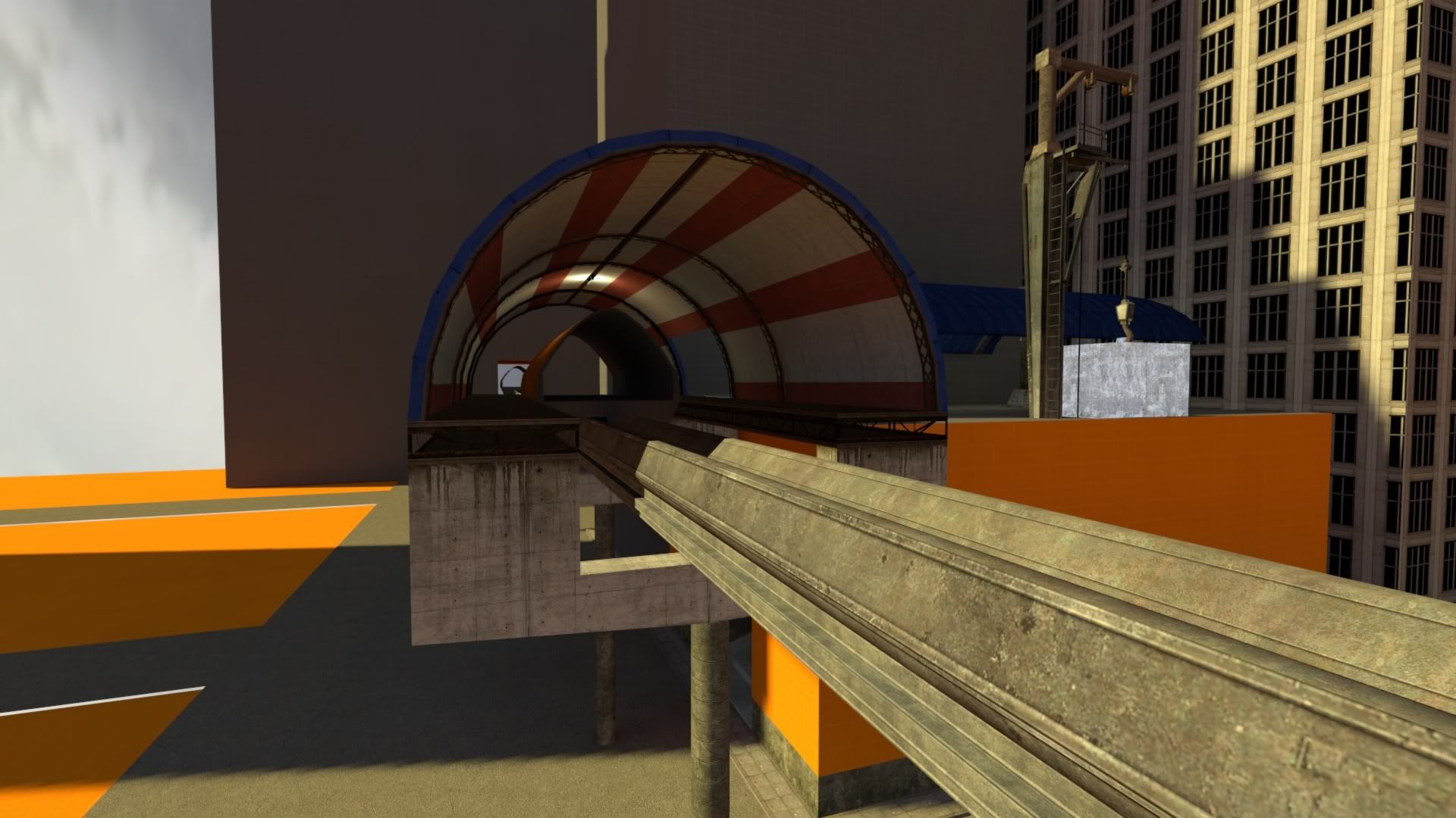
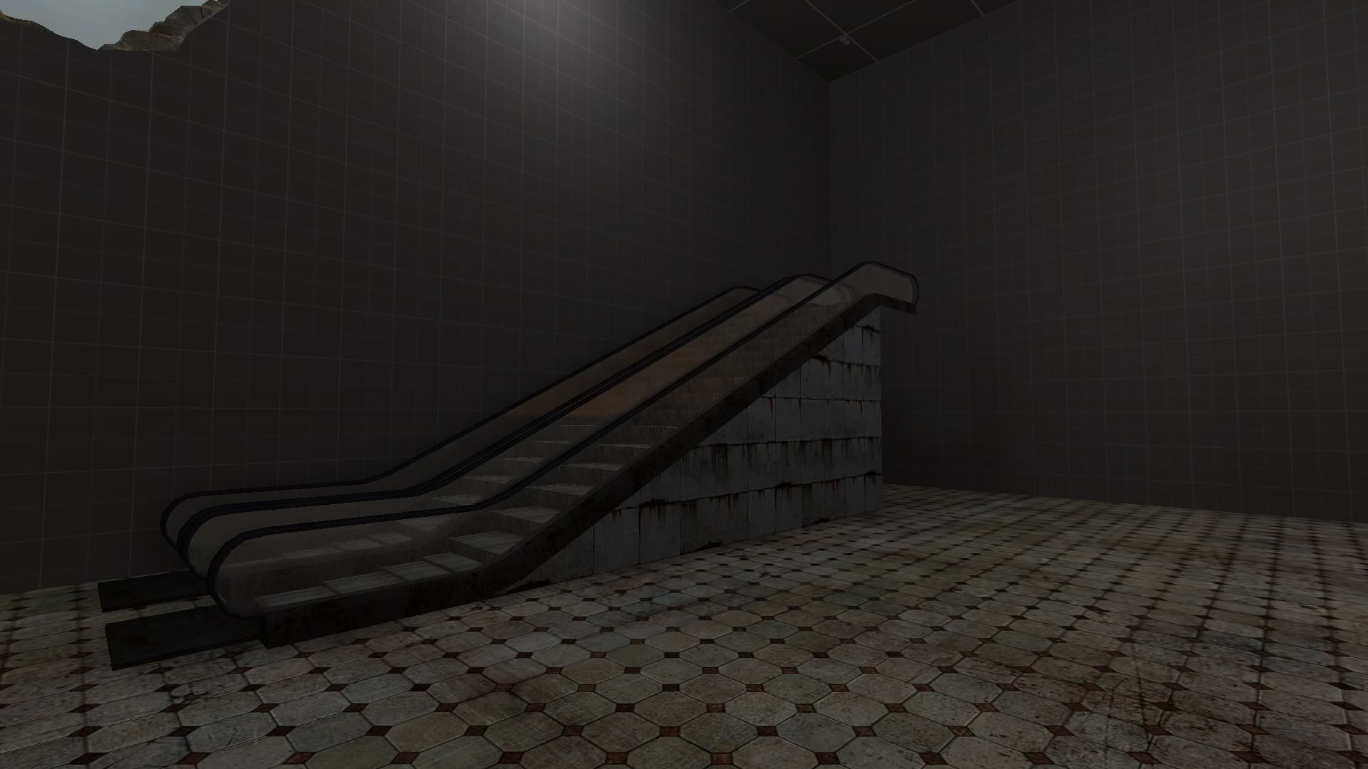
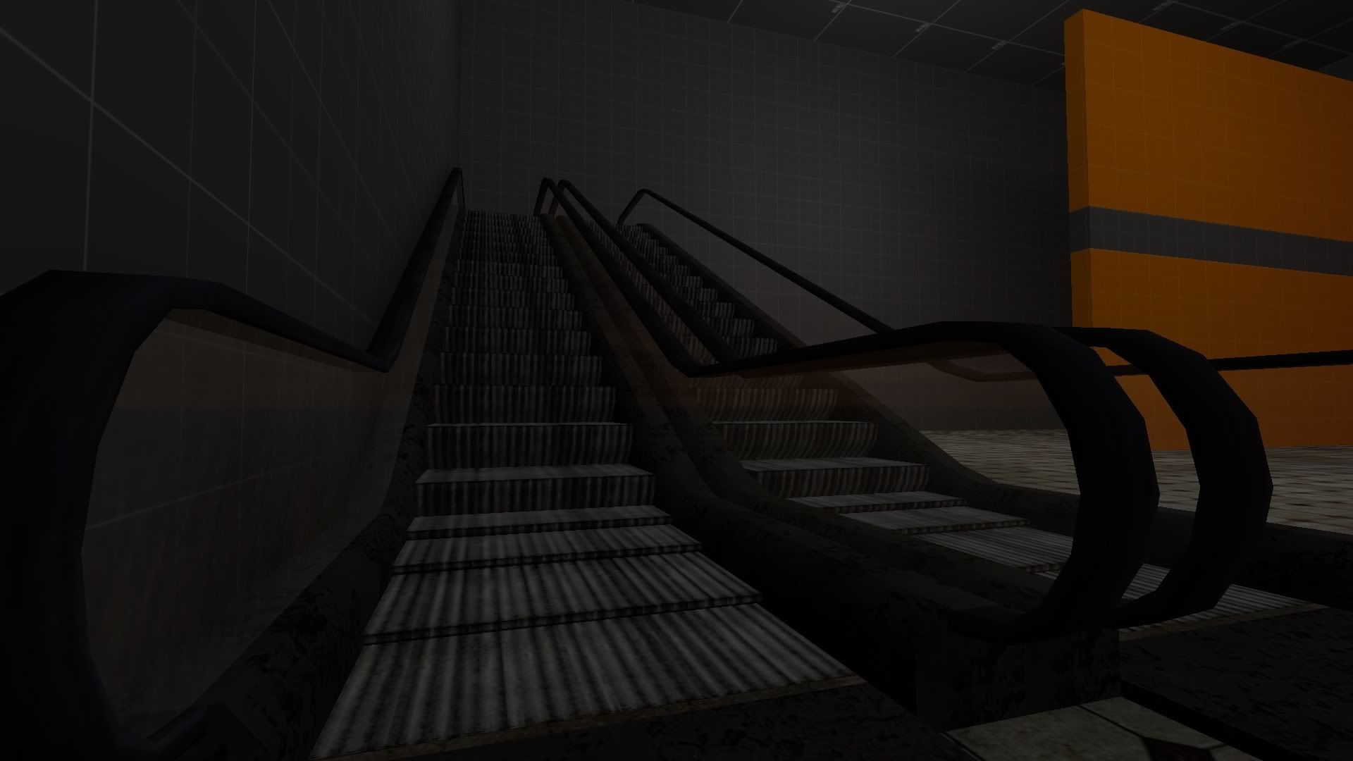
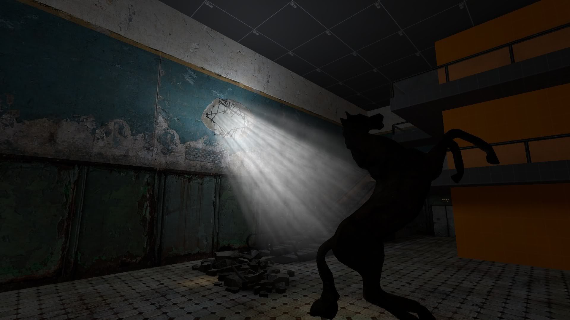
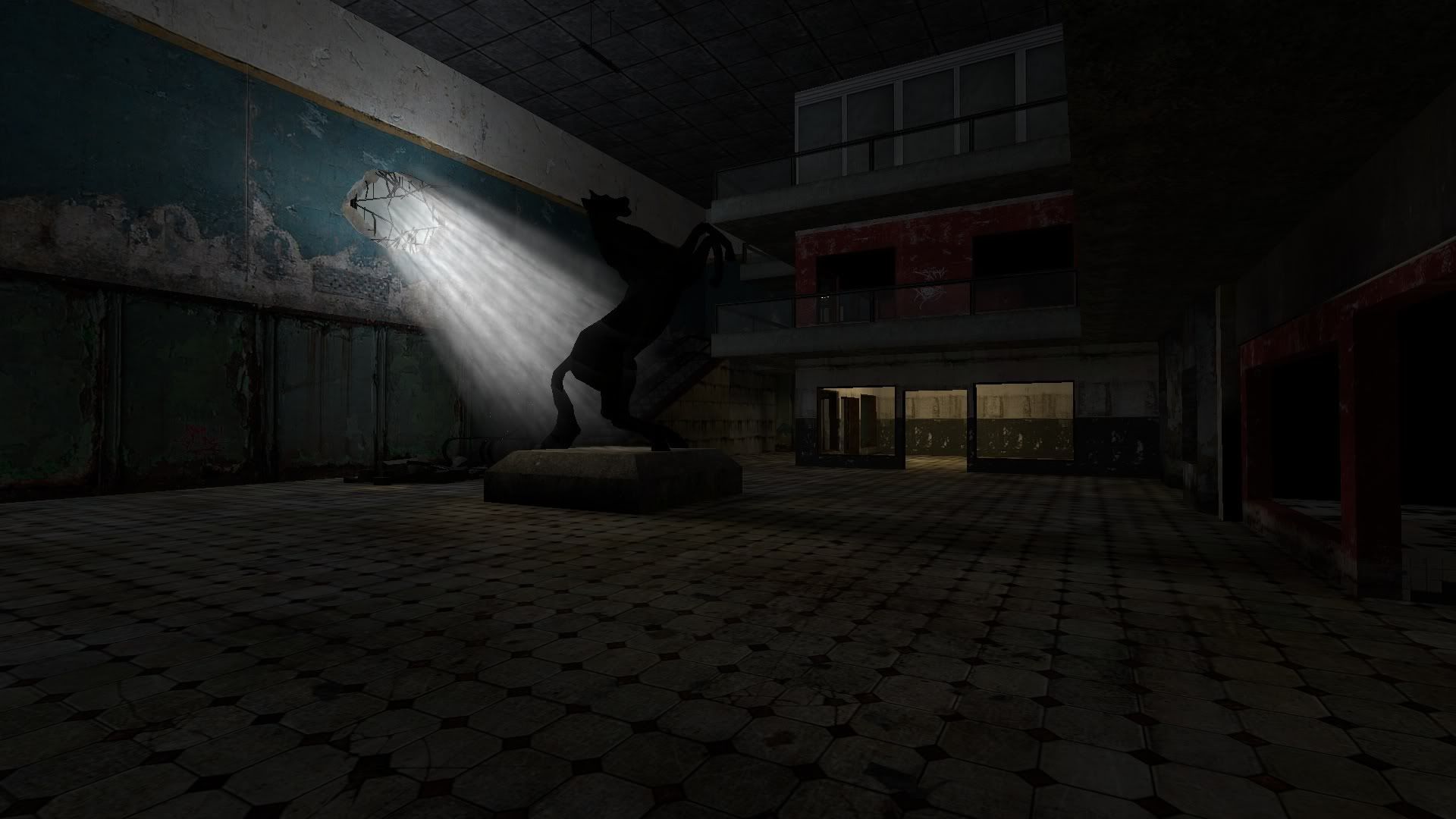
Started on some of the interiors today. Working on an old run down mall in the city.
The city will be broken into 2 unequal sides. 1 side, is the 'New City' that takes up about 4/5 of the area, the other is the remains of the 'Old City'
The 'Old City' is where the train comes into, right on the border of the 'New City'.
Anyways, this is a model I made for the inside of the mall.
The city will be broken into 2 unequal sides. 1 side, is the 'New City' that takes up about 4/5 of the area, the other is the remains of the 'Old City'
The 'Old City' is where the train comes into, right on the border of the 'New City'.
Anyways, this is a model I made for the inside of the mall.
Posted 14 years ago2010-05-10 23:38:26 UTC
Post #281147
I'm not sure escalators are (horizontally) that long at the bottom.
Posted 14 years ago2010-05-12 01:21:23 UTC
Post #281180
Inside the mallMight rework the vol. lighting model to be toned down a bit, but for now it works
Posted 14 years ago2010-05-26 21:09:58 UTC
Post #281446
So I forgot to turn up my graphics settings, big whoop, wanna fight about it?
Ignore the large solid buildings, they are place holders.
Haven't posted in a while on this, so here is a bulk update.
Been working a lot on the city side, it is broken into 2 parts seperated by the tracks.
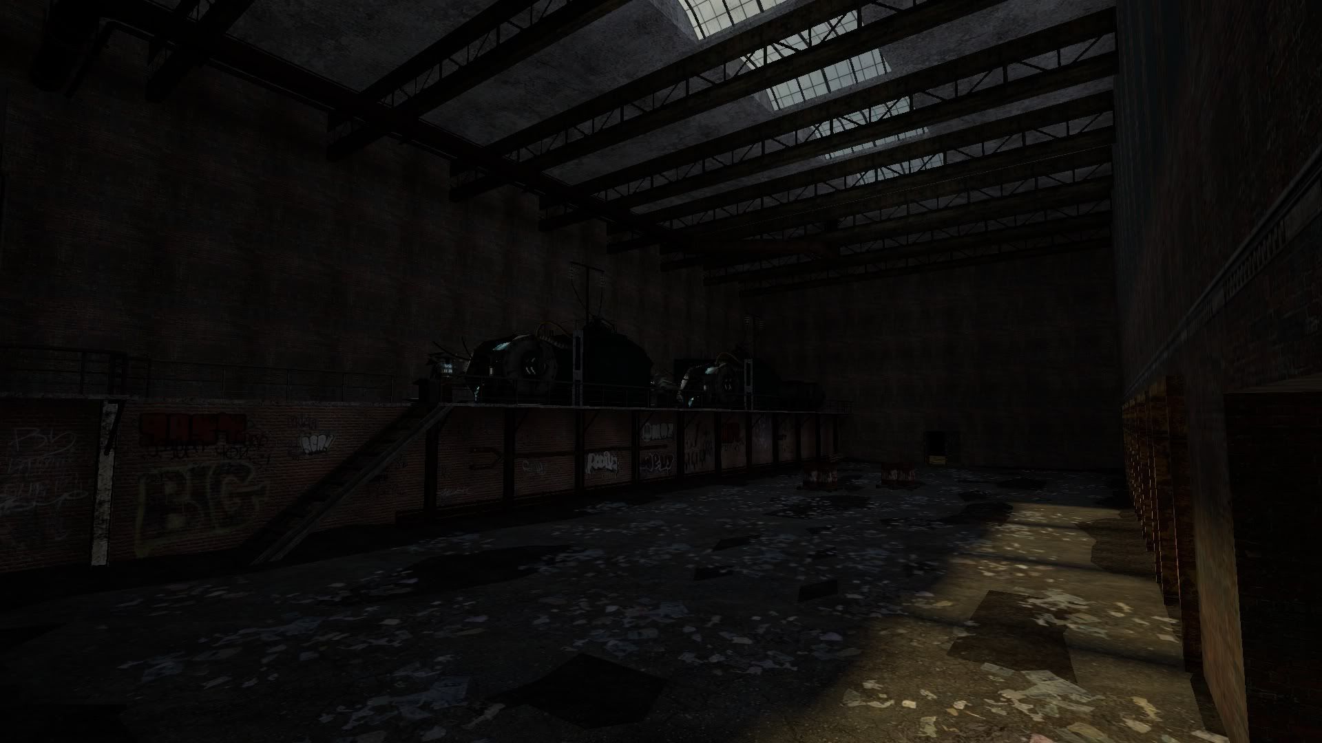
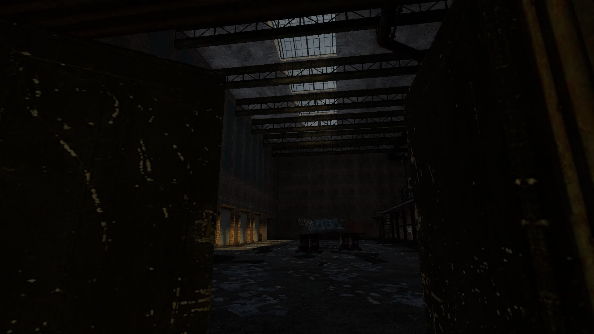
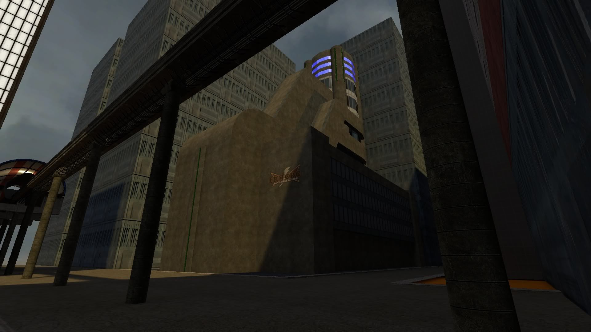
1st side (small) is the old city, the pre war side. It is run down and for the most part forgotten.Mall update:Inside the abandone factory:New building I am working on, on the 'Rebuilt side':
Posted 14 years ago2010-05-27 00:28:55 UTC
Post #281447
I'm not sure if you've addressed it yet, but something needs to be done about the sunlight It's very dull. Needs much more contrast, or at least it needs to be brighter.
You must be logged in to post a response.

