Hey people
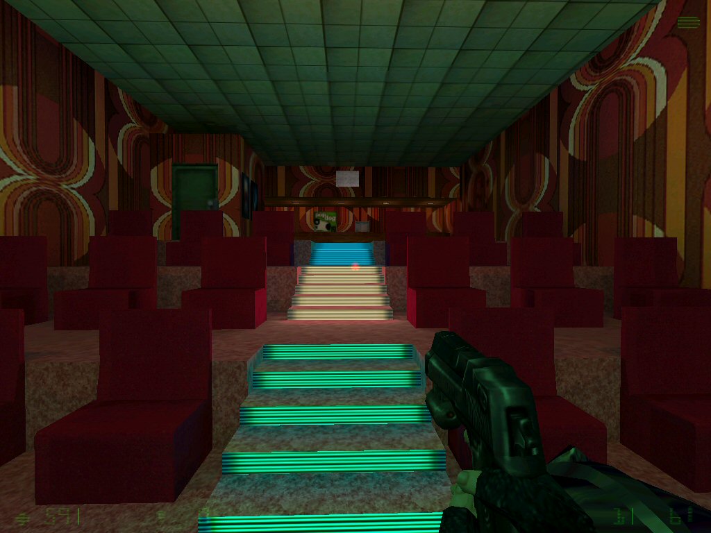
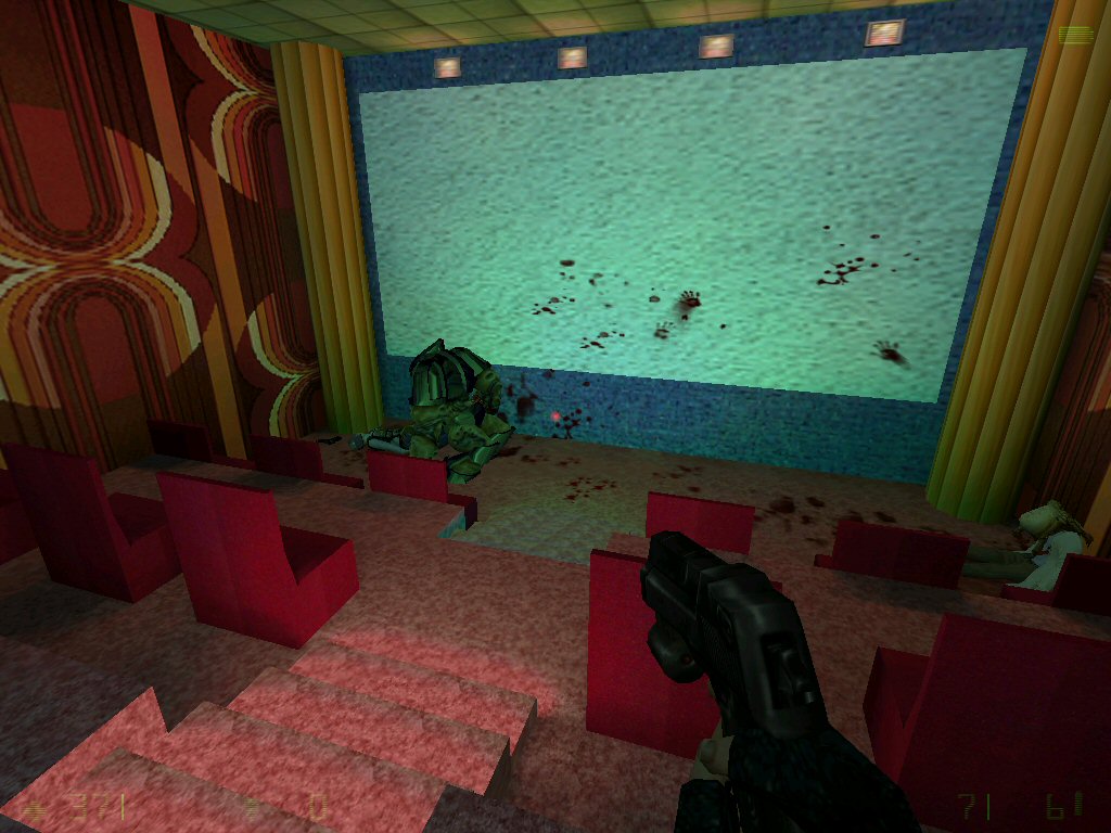
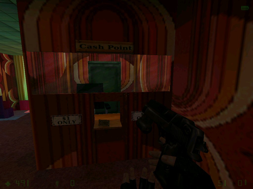
today I'm opening this personal topic in which I will allways post pictures of my current mapping if I'm idealess and in need of your experience and ideas.
So lets get started shall we?So what do you think what else would you add or change if you were in my position?
So far some people on moddb gave me the advice to change the chairs and make everything more realistic. But what could I make better on the chairs?
1 Chair consists of 3 brushes so far. 2 main brushes + 1 rounded up brush that they don't look that boxy.
I'm looking forward for your ideas..
23-down
23-down's picture thread Ideas required
Created 14 years ago2010-04-18 06:16:35 UTC by
 23-down
Created 14 years ago2010-04-18 06:16:35 UTC by
![]() 23-down
23-down
Posted 14 years ago2010-04-18 06:17:40 UTC
Post #280605
Posted 14 years ago2010-04-18 06:52:32 UTC
Post #280607
It reminds me of the first map in Duke Nukem. I recommend you look at pictures of real chairs, like these two for example:
Posted 14 years ago2010-04-18 07:20:22 UTC
Post #280608
You can add some balconies and dim the lights around where the viewers should sit. don't know how large that map is but you could also add a hallway that leads to the toilets.
Posted 14 years ago2010-04-18 08:23:49 UTC
Post #280609
That first chair looks pretty awesome, potatis.
Posted 14 years ago2010-04-18 08:44:16 UTC
Post #280610
cool thx I will try to recreate that chair.. But I have my doubts that I get it that good looking.
As side of that I have no added many small lights on the ceiling like in a real cinema and I replaced most textures. I also added sterio speakers for 3D sorround effects. I will soon show you my progress with new pictures.
And also nice idea about the toilets I haven't thought just about that yet. I will add them asap.
Posted 14 years ago2010-04-18 16:18:00 UTC
Post #280613
That first picture reminds me of the Lucky Money Club from Deus Ex. Just the way the lights look, and how the light hits that certain ceiling texture. Maybe I'm just going crazy, perhaps Potatis can vouch for my observation.
Anyway, the textures, combined with the lighting, really don't give me an impression of blocky architecture, which is good! But the chairs are in plain sight, and they ARE blocky, and it takes away from the rest of the map.
Anyway, the textures, combined with the lighting, really don't give me an impression of blocky architecture, which is good! But the chairs are in plain sight, and they ARE blocky, and it takes away from the rest of the map.
Posted 14 years ago2010-04-19 01:22:50 UTC
Post #280615
Ha movie theatre! =)
Looks like a good start to me. To make things look realistic, use reference pics of various movie theatres, and use them as a guide.
for the chairs i would personally make them func_illusionary, and use simply-shaped clip brushes to approximate there boundries. (this should cut down on your compile time for so many chairs)
you might also make the movie screen a texturelight, and possibly a renerfx to make i look realistic. (you might also layer 2 "screens" with one of a normal rednerfx/mode, and one with some kind of flicker or even "distort" or "hologram" to make the screen look like it's being projected.
last but not least i would use a fade brush to simulate the movie projector's projection(like cs_office but much bigger) from halflife.wad, and set rendermode to "texture" and experiment with the renderamout, tho i would recommend 5-15.
Posted 14 years ago2010-04-19 08:04:14 UTC
Post #280619
wow.
Posted 14 years ago2010-04-19 10:13:13 UTC
Post #280621
Wow awesome ideas.... I knew I can count on you people.. I will try those ideas immediately. When I'm finished I will record a video with fraps instead of showing you pictures.. Thx
Posted 14 years ago2010-04-19 10:46:34 UTC
Post #280623
you might want to look into an animated texture for the screen as well.. just one of those static-y looking screens - like a TV with no signal, you know.
Unles it's already there, hard to tell from the screenshot, looks like a Fifties wall texture. I do like the stair's 'runner lights' if that's even the proper definition.
Oh and find a speaker texture, and put some speakers in the ceiling. Maybe some soundproofing on the walls, with some more speakers...
You must be logged in to post a response.


