So for the past 3 months or so since the release of cs_trepidation I've been working on a defusal map under the title "de_desertion."
After seeing what I guessed to be the fortieth generic Dust-clone map I had come across in my time as a CSS player, I decided that I needed to make a point. I wanted to show that it's possible to make a map in the Dust setting without losing a sense of uniqueness and originality. This map would not be a Dust clone. This map had to have its own personality - it had to be crammed with custom content and with things never usually seen in the environment CSS players devote themselves to.
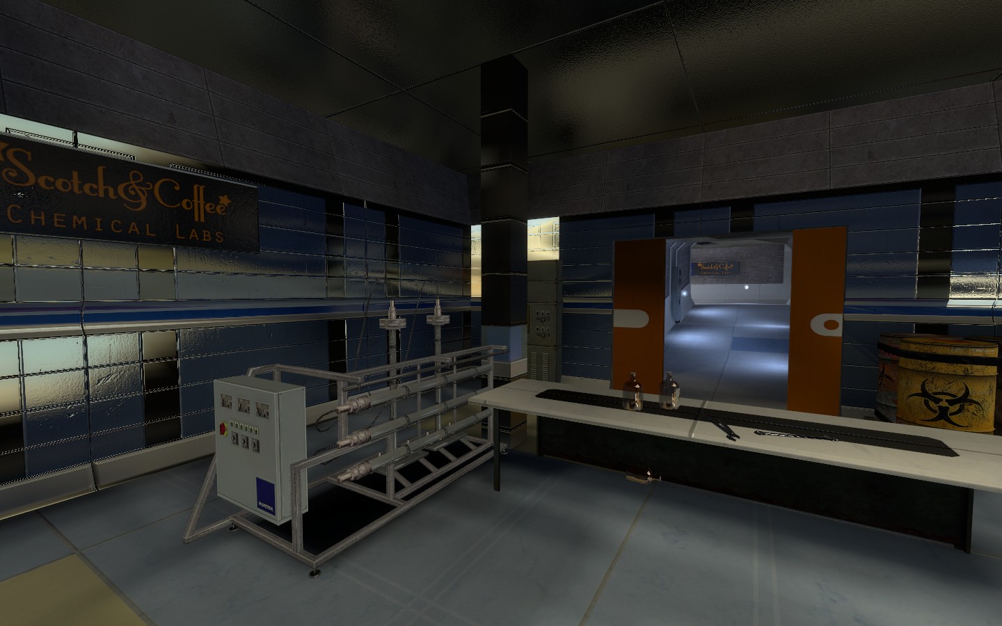
So I came up with several ideas but the one that stuck was a high-tech lab hidden underground in a desert environment. This was for two reasons - one, I had just made a neat set of lab textures based loosely on the game Evil Genius, and two, I wanted there to be an extremely stark contrast to the map to give it some flair.
Three months later, I had a playable layout.
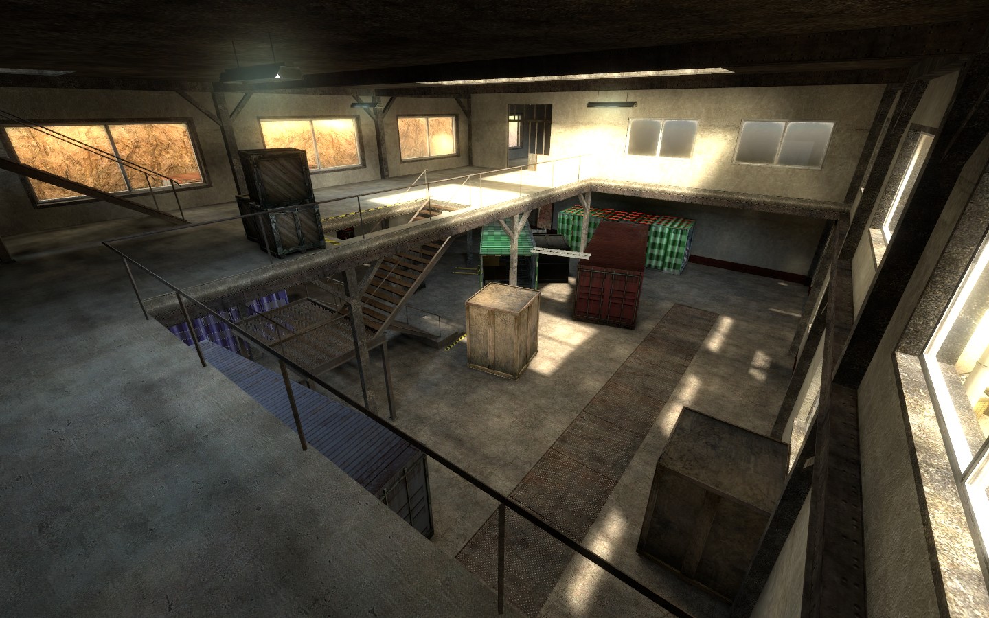
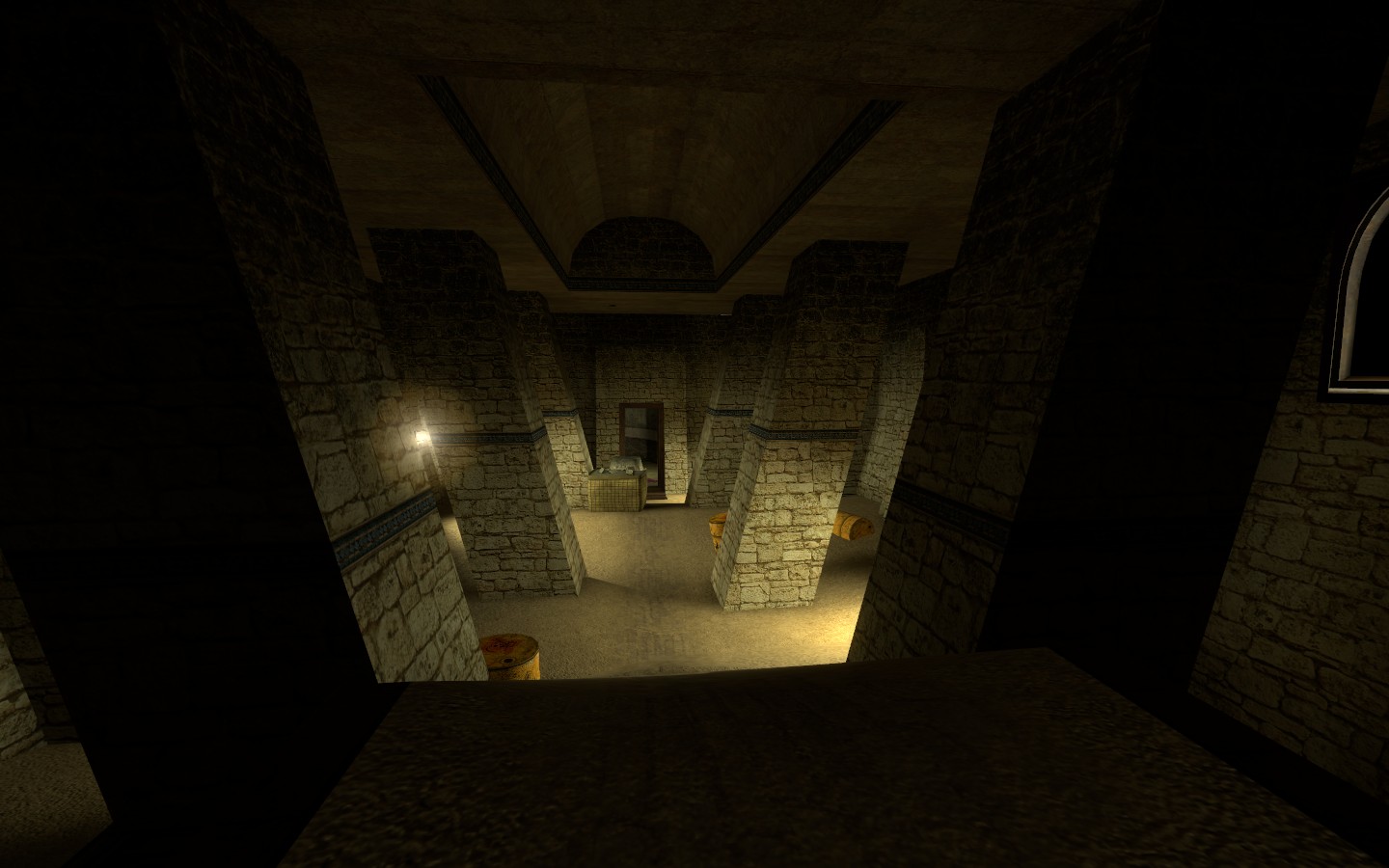
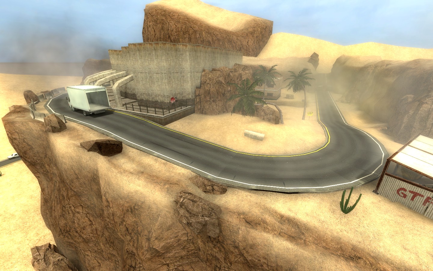
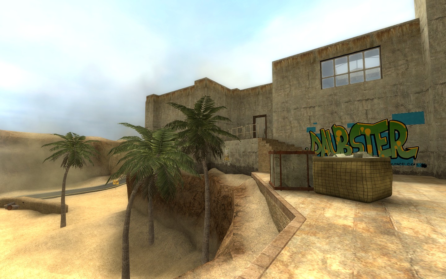
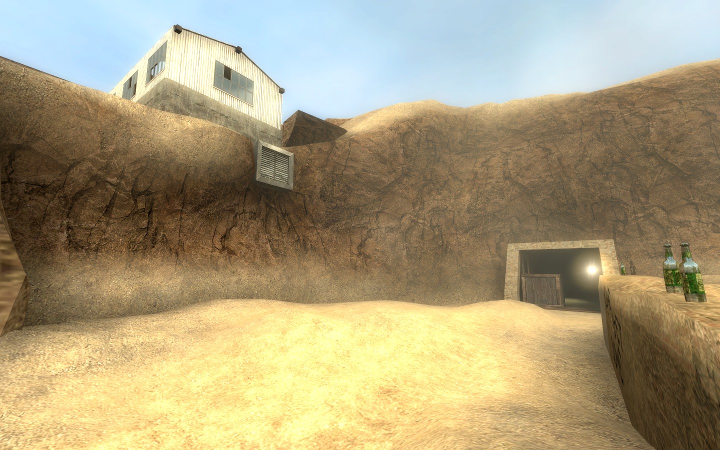
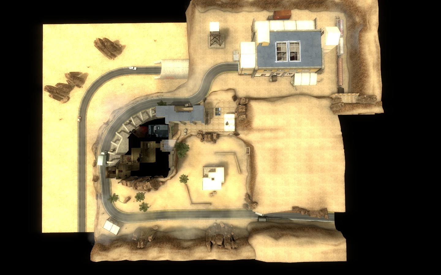
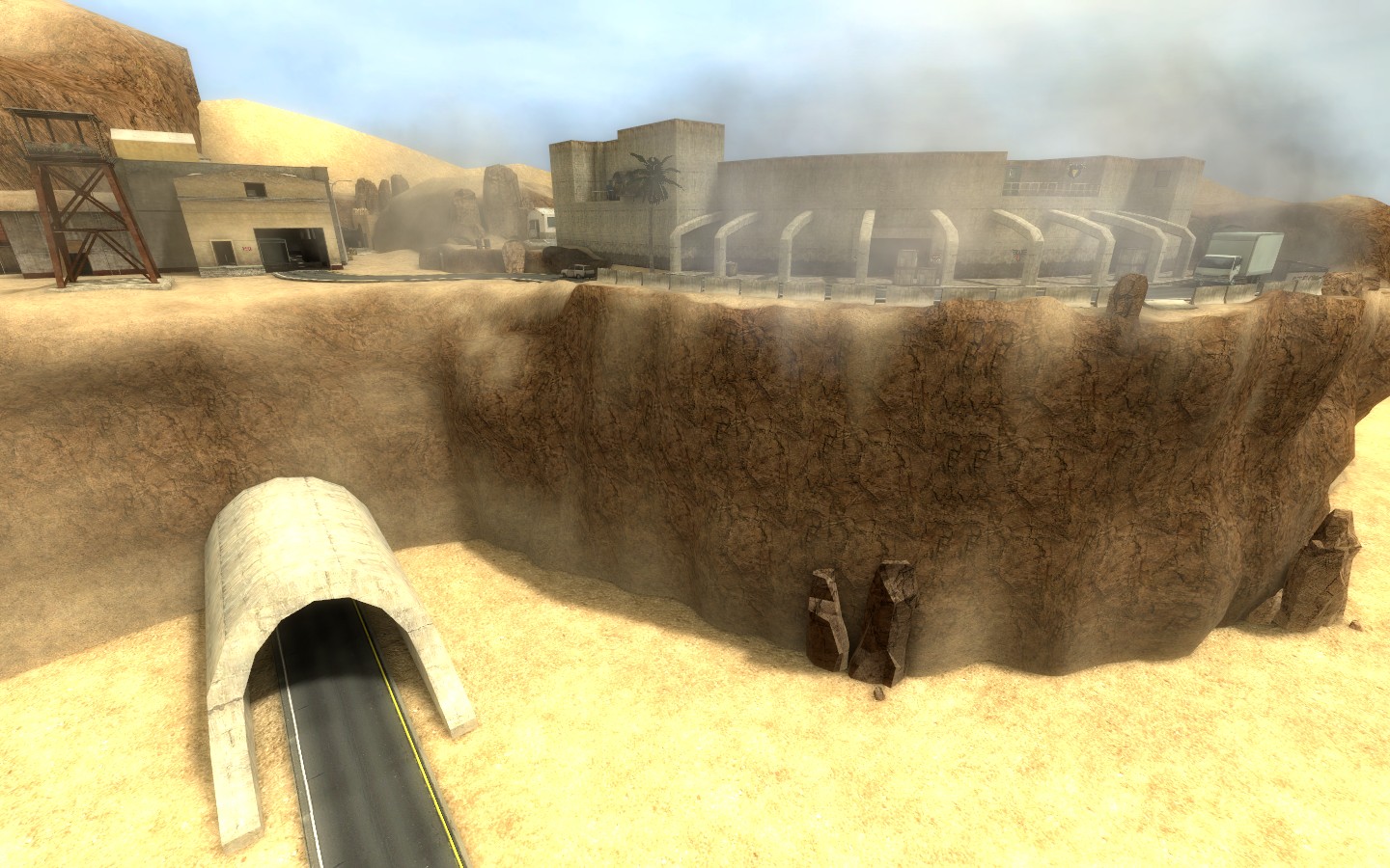
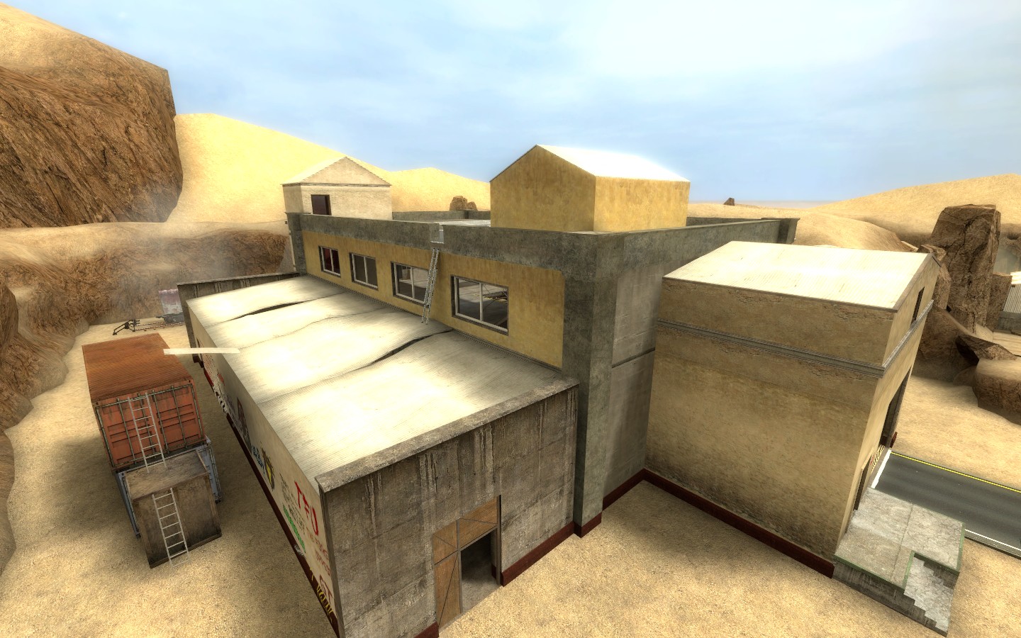
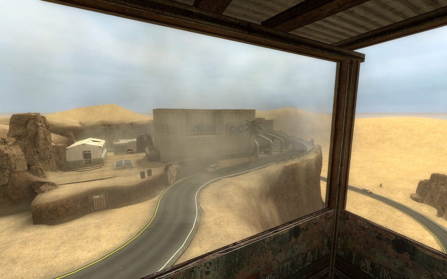
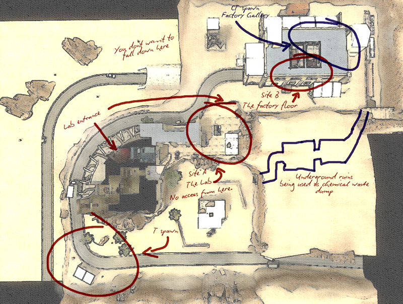
The following shots are very WIP, but give a good idea of the location.This is without a doubt the biggest map I've ever made. The surface alone is bigger than de_aztec, and there are also a whole series of underground passages and labs.
It messes with the conventions of CSS by having quite an open layout and expansive bombsites which make firefights extremely unpredictable. It's my hope that this will keep players coming back. There's always a new tactic to try.
I'd love to know what you think of it so far and whether or not you agree with my desire to be as far removed from de_dust2 as possible. I mean, obviously the classic does something right or players wouldn't keep going back to it - but I personally am sick of playing the same rounds over and over on it.
Any suggestions are welcomed with open arms and an open mind.
Also, I would really, really, really like some help regarding optimisation of huge open maps like this. The compile times are starting to get... Excessive.
Cheers, folks.


