Definitely can never be ashamed of good glass or a good body man. It actually looks pretty cool to be honest, nice metallic shine!
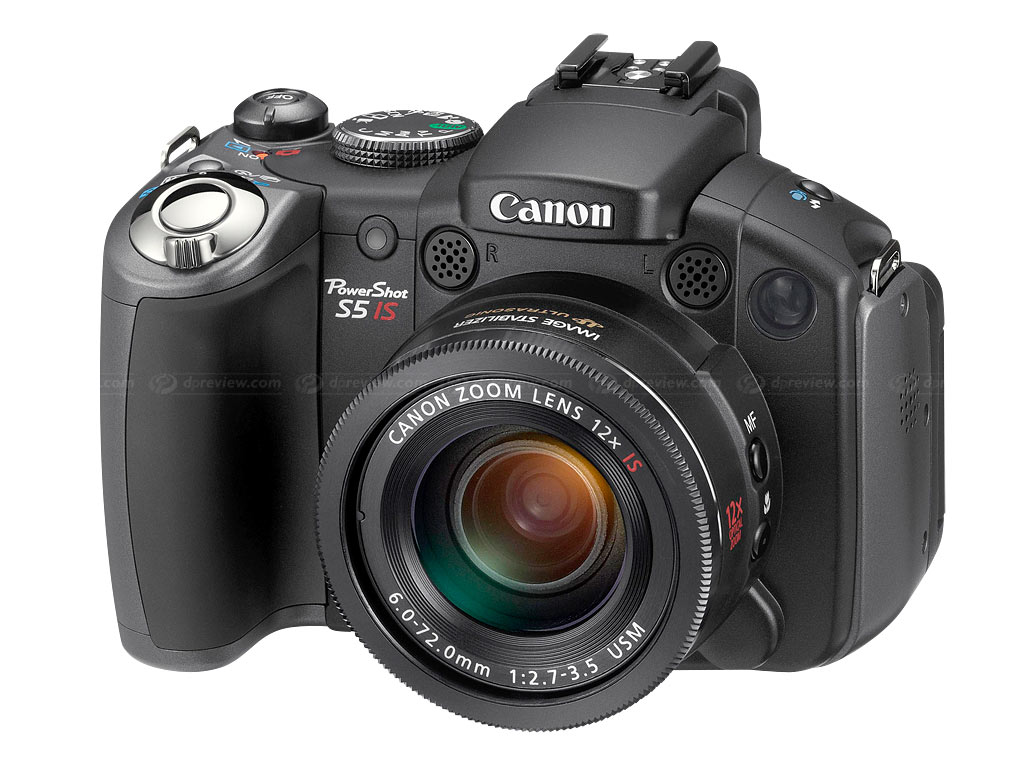
Picked up this entire kit + a pretty good Bridge camera for $30! Score!And no, I do not own an insubordinate amount of camera equipment.
I sold all of my (Really nice) photography equipment for booze and cigarettes and other drugs when I was dealing with depression. So I'm back to square one, buying all my equipment over again. ):
Post Your Photos
Created 17 years ago2007-08-06 23:50:34 UTC by
 Archie
Created 17 years ago2007-08-06 23:50:34 UTC by
![]() Archie
Archie
Posted 11 years ago2013-12-05 02:37:05 UTC
Post #316988
Posted 11 years ago2013-12-05 12:26:29 UTC
Post #316989
Sorry to hear about your depression Elliot, Glad to see you're over it and getting back in the game.
That seems like an incredible deal for $30.
And Archie, you know my thoughts on that lens =p
That seems like an incredible deal for $30.
And Archie, you know my thoughts on that lens =p
Posted 11 years ago2013-12-10 05:39:42 UTC
Post #317062
Okay you're warned, film SLR fanatic rant inbound.
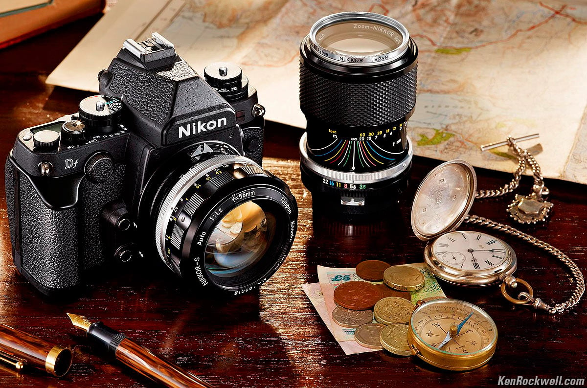
I was always under the impression that a DSLR is supposed to be a SLR but with a digital imaging sensor instead of film. There are certain sacrafices that would have to be made such as a LCD screen for review and troubleshooting etc of course, but one thing I never could understand for the life of me is what possible good reason could they EVER have for removing the shutter speed and ISO dials!? (And indirectly the exp comp dial) It's all the same as making lenses out of plastic and removing the aperture dial and focusing scale!
Their presence could not possibly interfere with further progress of the camera, could they? Was it truly necessary to remove all these useful dials and replace them with a shitty hollow plastic do-it-all-through-500-menus dial?
Well, maybe I'm not entirely crazy, because Nikon has decided it's not right either:Yes, that is a DSLR with a shutter speed, ISO and Exposure Compensation dial. The lens doesn't have a aperture dial, but if you want high build quality you can always pick up a manual focus lens because they still work on newer Nikons.
I know this is a newer generation of 'ooh-shiny', but I can't be the only one who cares about this stuff, right? Right?
Maybe I just have too much passion and come across as a pedantic control freak. Whatever, I'm just happy that somebody else acknowledged it and decided to do something about it.
Posted 11 years ago2013-12-10 06:04:52 UTC
Post #317063
I'm sure the reason for removing the shutter speed dial is that shutter speeds not only have a much wider range now than 50 years ago, but also have more intermediate steps. Having a dial that encompasses speeds from 30 seconds to 1/8000th of a second in thirds of a stop is pretty impractical.
ISO follows from what ASA was, and past a certain point, cameras started to read it directly from the barcode on the film spool. At that point, it wasn't really necessary that the user input that manually, so most kept the manual override buried away in a number of submenus nobody really cared about. I suppose nobody thought of putting a dial back in after the transition to digital, considering it's changed way more often, but I'm going with the same theory as with the shutter speed: Most serious digital cameras offer several intermediate steps for ISO values, often in thirds of a stop (see: Canon EOS 7D and above), so it would be impractical to have so many values on the same dial.
ISO follows from what ASA was, and past a certain point, cameras started to read it directly from the barcode on the film spool. At that point, it wasn't really necessary that the user input that manually, so most kept the manual override buried away in a number of submenus nobody really cared about. I suppose nobody thought of putting a dial back in after the transition to digital, considering it's changed way more often, but I'm going with the same theory as with the shutter speed: Most serious digital cameras offer several intermediate steps for ISO values, often in thirds of a stop (see: Canon EOS 7D and above), so it would be impractical to have so many values on the same dial.
Posted 11 years ago2013-12-10 17:46:13 UTC
Post #317068
Hmm fair point, but that does not mean you have to remove the dial entirely. Just add a 'custom function' slot that lets you use the extended shutter speeds and increments. If you hate standard shutter speed increments so much (clearly there wasn't a problem with them back in the film days), then you could just leave it on the custom fn selector at all times.
This is the digital age, we should be able to make compromises for technological advancements in a way other than 'it ain't broke, but let's remove it anyways and fix it'
This is the digital age, we should be able to make compromises for technological advancements in a way other than 'it ain't broke, but let's remove it anyways and fix it'
Posted 11 years ago2013-12-10 18:59:25 UTC
Post #317070
are these creatures guiding a hangman's soul
on another tired creature's shoulder
or just laughing at my insight below?
I choose the cold steel
on another tired creature's shoulder
or just laughing at my insight below?
I choose the cold steel
Posted 11 years ago2013-12-20 03:10:11 UTC
Post #317178
Now a proud owner of a Nikon D100. (:
Posted 11 years ago2013-12-20 08:53:39 UTC
Post #317180
Nice. Kind of old, low iso. Put a fast lens on it.
Posted 11 years ago2013-12-20 14:31:32 UTC
Post #317183
is this thread about posting photos or about posting photos of your equipment?
Posted 11 years ago2013-12-20 15:05:27 UTC
Post #317185
Hold on tight, Bruce, because this may blow your mind.
It can be about both.

It can be about both.

Posted 11 years ago2013-12-20 15:29:59 UTC
Post #317187
sorry must have posted during one of my blackouts
anyway, imageshack sucks, removing photos randomly
anyway, imageshack sucks, removing photos randomly
Posted 11 years ago2013-12-20 18:55:00 UTC
Post #317189
Been there done that too many times Bruce, so it's all good haha.
When I get a lens adapter I'll be posting my own photos instead, I was just pretty excited about my new dslr. :3
When I get a lens adapter I'll be posting my own photos instead, I was just pretty excited about my new dslr. :3
Nice. Kind of old, low iso. Put a fast lens on it.Yeah, I go for old pro dslrs instead of new entry-level dslrs. A better image sensor doesn't mean shit if the weather here wrecks the camera.
Posted 11 years ago2013-12-20 19:48:44 UTC
Post #317194
It's called Post your photos. Doesn't specify photos of what.
Posted 11 years ago2013-12-20 19:54:06 UTC
Post #317195
Feels.
Posted 11 years ago2013-12-21 04:58:21 UTC
Post #317196
I'm still a little rusty, so forgive the rough concepts.
Largely a test of my photoshop skills for getting the toning correct. I'm a real film junkie so dynamic range is very important to me.
Concept image of a self portrait I might do. It needs more pharmaceutical drugs, alcohol, stronger cigarettes and the notes I had written down while completely delusional and deranged. :/
If your display is not set up for SRGB color management, these images are probably going to look fucked up or really shitty. Apologies.
Posted 11 years ago2013-12-21 05:42:38 UTC
Post #317197
Love the bottom one. There is something about it that draws my attention. I just hope there is one in the future with a lot more happiness to it~
Seeing the progress of people's artwork, especially when its self-concepts is wonderful, you can see them express themselves, and release what they are thinking, and most of the time they'll improve and grow, and you can see that through artwork like this. Love it. <3
Seeing the progress of people's artwork, especially when its self-concepts is wonderful, you can see them express themselves, and release what they are thinking, and most of the time they'll improve and grow, and you can see that through artwork like this. Love it. <3
Posted 11 years ago2013-12-21 05:55:55 UTC
Post #317198
On another note, crappy promotional pictures for a friend at a performance where I couldn't move around freely at.
Just so you know I have permission from her to post these here. She's a local performer, her music is really good, I can't put any previews of her music up because she hasn't finished her album yet, I will when she has. Silly girl, pulling a funny face with her eyes.Quality a bit dodgey, old camera with non-manual focus sucks.
Just so you know I have permission from her to post these here. She's a local performer, her music is really good, I can't put any previews of her music up because she hasn't finished her album yet, I will when she has.
 Silly girl, pulling a funny face with her eyes.Quality a bit dodgey, old camera with non-manual focus sucks.
Posted 11 years ago2013-12-21 13:56:45 UTC
Post #317206
Posted 11 years ago2013-12-22 06:55:00 UTC
Post #317210
Thanks man, I'll be sure to make a new self portrait after I finish up the old one.
Here's an alternate angle for the self portrait. What do you guys think is better?
All of these photos look 2x better when you view them fullsize by the way. I only post thumbnails to be courteous as the fullsize are really large.
Here's an alternate angle for the self portrait. What do you guys think is better?
All of these photos look 2x better when you view them fullsize by the way. I only post thumbnails to be courteous as the fullsize are really large.
Posted 11 years ago2013-12-22 13:14:31 UTC
Post #317212
Elliot I think there is WAY TOO MUCH NOISE in your photos... But otherwise, they're good. c:
Posted 10 years ago2013-12-22 21:30:47 UTC
Post #317215
They're slightly surreal.
I get a 404 on the full sized version of the first one. And Brad's going to be pissed that you forgot to clear out the data for his bronze Volvo 214-5PV.

I get a 404 on the full sized version of the first one. And Brad's going to be pissed that you forgot to clear out the data for his bronze Volvo 214-5PV.

Posted 10 years ago2013-12-22 23:16:18 UTC
Post #317219
Missed this thread!  Two pictures I took with my Nikon D40 last summer with sky superimposed over water. With a shadow-girl added in PS for fun.Might have gone a bit far with the hue,here, but I think it has a fairytale feel.
 Two pictures I took with my Nikon D40 last summer with sky superimposed over water. With a shadow-girl added in PS for fun.Might have gone a bit far with the hue,here, but I think it has a fairytale feel.
Posted 10 years ago2014-01-20 20:55:48 UTC
Post #317567
Top Gear live! Way too much fun.
Posted 10 years ago2014-01-20 22:01:33 UTC
Post #317568
Chicks with flamethrowers. You know they're up to something when they come up with those things.
Posted 10 years ago2014-01-20 22:01:35 UTC
Post #317569
Chicks with flamethrowers. You know they're up to something when they come up with those things.
Posted 10 years ago2014-01-20 22:52:42 UTC
Post #317570
That looks hilarious Archie, especially the final image! Is the white car the ref? =P
Posted 10 years ago2014-01-21 07:11:30 UTC
Post #317573
Actually the white car was The Stig and was playing for England.
Despite that, we still trounced them 8-3.
Despite that, we still trounced them 8-3.
Posted 10 years ago2014-01-23 00:37:36 UTC
Post #317602
Posted 10 years ago2014-01-23 03:19:02 UTC
Post #317604
Great picture, it looks almost artificial.
Posted 10 years ago2014-01-28 00:36:49 UTC
Post #317648
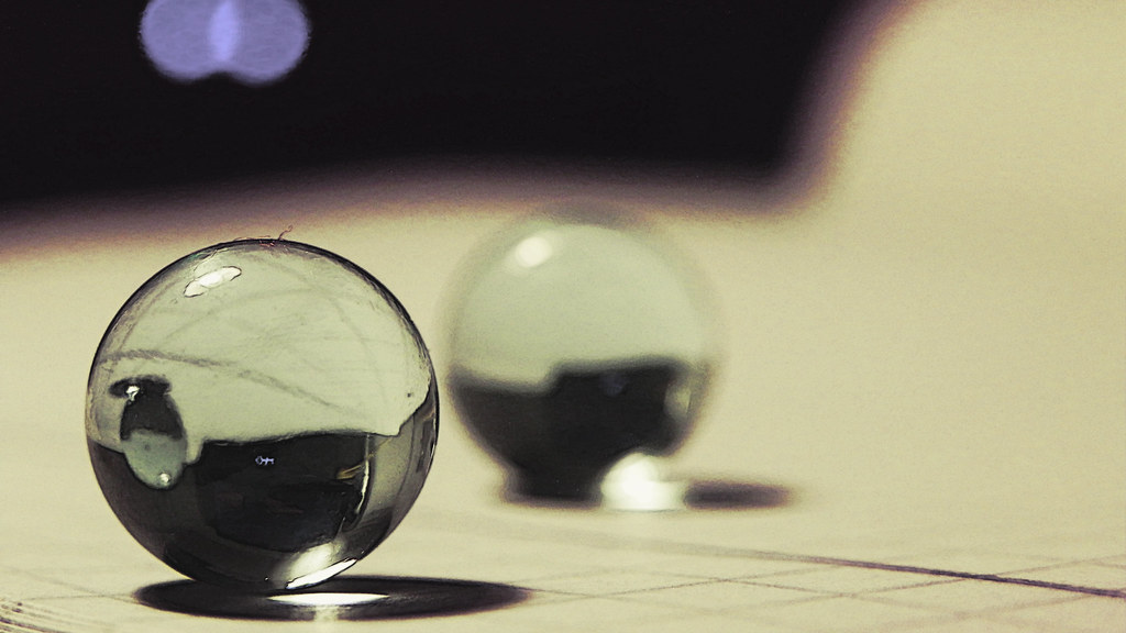
The sphere on the right, with a black outline, resembles the black mesa logo.
Well, vaguely.
Well, vaguely.

Posted 10 years ago2014-01-30 22:09:48 UTC
Post #317705
Posted 10 years ago2014-02-19 22:43:17 UTC
Post #318009
hello. i'm back again. yes, yes, i know, big deal, but please hold your applause.
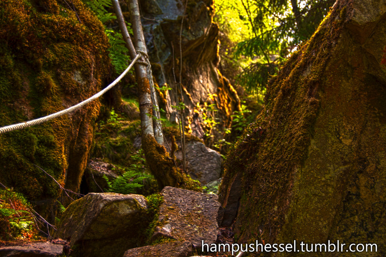
i recently got rid of a spare camera and a couple of lenses. with this newly acquired money i went out and got myself something real nice.haven't had a chance to try them out yet. been really busy as of late. bla bla. so here are some shots (that i didn't completely hate) from 2013. sorry about the watermark. i took them from, uh, my site.also, i may or may not have fallen in love with an ultra wide aspect ratio.
i recently got rid of a spare camera and a couple of lenses. with this newly acquired money i went out and got myself something real nice.haven't had a chance to try them out yet. been really busy as of late. bla bla. so here are some shots (that i didn't completely hate) from 2013. sorry about the watermark. i took them from, uh, my site.also, i may or may not have fallen in love with an ultra wide aspect ratio.
Posted 10 years ago2014-03-01 17:06:17 UTC
Post #318161
Haha for what it's worth, I expect good photos when I see your name pop up here.Who's that sexy beast? Ohh yeah that's me.
I'm sure anybody who's been here long enough to know my history probably imagined me a fat, nerdy pimple faced assface.
I'm sure anybody who's been here long enough to know my history probably imagined me a fat, nerdy pimple faced assface.

Posted 10 years ago2014-03-01 17:56:15 UTC
Post #318162
Never imagined you fat. But it's quite a surprise to see that you are almost a Gordon Freeman.
What's that you have in your hands?
What's that you have in your hands?
Posted 10 years ago2014-03-01 18:36:39 UTC
Post #318163
Sexy bitch! (though i don't remember Gordon sporting a Mac-10) 
BTW you don't look fat at all, though we won't know for certain until you post the ]pics in a leopard skin mankini

BTW you don't look fat at all, though we won't know for certain until you post the ]pics in a leopard skin mankini

Posted 10 years ago2014-03-01 23:42:16 UTC
Post #318166
Actually I'm really fucking skinny. I generally wear semi-baggy jackets (not as baggy as that picture, I was planning to stay out during the freezing temperatures at night) and hoodies so as not to accentuate my chicken arms.
Posted 10 years ago2014-03-02 09:58:31 UTC
Post #318168
You look much older than you probably are.
When I was 14-15 I wore really baggy clothes to hide my slightly-over-weight figure. Then I realised I looked really stupid and tight clothes did the job much better. My weight hasn't changed at all and I still think I should shave off 2-3kg somehow, but people have been telling me I look slimmer all the time. Doesn't make much sense.
Not really relevant, but I just remembered that.
Posted 10 years ago2014-03-02 20:09:19 UTC
Post #318172
wtf u look like Gordon Freeman
Posted 10 years ago2014-03-02 20:37:34 UTC
Post #318173
Looks different than from a certain video 

Posted 10 years ago2014-03-06 21:27:21 UTC
Post #318198
This shoot is way too much fun. Three more weeks of pure joy at work? Impossibru!
Posted 10 years ago2014-03-09 09:43:15 UTC
Post #318202
Be afraid.
Posted 10 years ago2014-03-09 09:48:45 UTC
Post #318203
LOOOOOOOOOOOOOOOOOOOOOOOOOOOOOOOOOOL
Posted 10 years ago2014-03-09 20:06:21 UTC
Post #318204
wat.
Posted 10 years ago2014-03-12 15:19:02 UTC
Post #318224
Seconded.
Posted 10 years ago2014-03-14 00:30:43 UTC
Post #318261
I'm almost scared to post these now, but I just had a great chance to use my little portable generator for a night shoot. I kept kit to an absolute minimum as it was just me, so I used two 1000W diva lights with softboxes and a bit of orange gel on one to simulate a fire.
Definitely some mistakes - my key light was far too low-angled creating unflattering shadows from her nose, but overall I'm extremely pleased with the result. First time shooting stills properly at night.
Definitely some mistakes - my key light was far too low-angled creating unflattering shadows from her nose, but overall I'm extremely pleased with the result. First time shooting stills properly at night.
Posted 10 years ago2014-03-14 04:07:45 UTC
Post #318268
Why almost scared? They're pretty good, especially for a first night shoot.
Posted 10 years ago2014-03-22 23:58:27 UTC
Post #318281
Definitely doesn't look bad; For next time, try to diffuse the lighting as much as you can.
Your lighting setup looks very direct, and makes her skin look rough and almost shiny to a degree. Remember: smooth, soft lighting is flattering lighting.
Criticism aside, it really does look good. I'm just too OCD to ignore the lighting.
Lately I've been getting so anal about what I post so I don't have much to show nowadays.I've had this blade for a while now, and about a month ago or so I managed to break the tip off. Feeling as though binning it would be a waste, I decided to just grind the top of the blade down to the edge and then gave the top an edge as well. The knife is freestanding in a plank of wood.
This next set is about illusions.This scene appears well lit and warm, but in actuality it was taken during a total power grid blackout in one of the coldest, windiest nights we've had on the island that I can remember. It was pitch black, you couldn't tell your ass from your elbow if both were glued to your face.This one is a little simpler. A deadbolt attached to... Nothing. It's a black posterboard that the lock has been propped up against. But without examining it, your brain will simply believe it's a door... Or more generically, a surface that it is validly attached to and serves a valid purpose.
And of course...
Posted 10 years ago2014-03-25 17:39:52 UTC
Post #318395
Oh did you edit your post? I never saw the lock and key - that's awesome. Great composition!
Posted 10 years ago2014-03-25 20:27:23 UTC
Post #318397
The golden lock photo looks fantastic. Such a good job Elliot. Do you have a higher resolution version? It's excellent as a wallpaper.
Posted 10 years ago2014-03-25 20:43:27 UTC
Post #318399
Neat! I just saw these too. Great shots, you're getting better. And the lighter one... that was one LONG exposure, I figure!
You must be logged in to post a response.


