
If you've been follwing my journal then odds are you already know about this map. I'm brining out of my journal and into a thread so that I can get some better feedback on it.
After an extremely long period of "mapper's block" I've finally begun a surefire project(no really, this one's being finished). After this, I've got an idea for my first full Source map, but that's another story.
Skytower (a working title, and will definitely be changed before the release) has been in the back of my mind for a long, long time. When I downloaded Rimrook's Sunden map, I discovered how perfectly the textures fit with this map I'd been wanting to make. So I began work.
Screenshots. Its a very blue map:
http://img264.imageshack.us/img264/9109/dmskytower0015eo8.jpg
http://img264.imageshack.us/img264/6962/dmskytower0016sg6.jpg
^That blue circle heals you when you fall through it.
http://img264.imageshack.us/img264/5762/dmskytower0022ka7.jpg
Gameplay focuses on a circulation from the top of the tower to the bottom, with various ways to get from point A to point B.
As of now, I'm done with the brushwork and am working on entity placement and atmosphere. But if you see something that could use some tweaking then tlel me. that's why I posted the thread in the first place.
Map WIP - Skytower
Created 17 years ago2007-07-28 00:58:17 UTC by
 Soup Miner
Created 17 years ago2007-07-28 00:58:17 UTC by
Soup Miner
Posted 17 years ago2007-07-28 00:58:17 UTC
Post #230462


Posted 17 years ago2007-07-28 07:20:46 UTC
Post #230482
Rimrook, is that you?


Posted 17 years ago2007-07-28 08:24:44 UTC
Post #230485
Heh you logged into the wrong account.
The map looks good so far. All I can suggest is add some green. Maybe trees?
The map looks good so far. All I can suggest is add some green. Maybe trees?


Posted 17 years ago2007-07-28 08:43:31 UTC
Post #230486
Wouldn't a bit of nature ruin the whole ambience he's got there?

Posted 17 years ago2007-07-28 09:14:04 UTC
Post #230488
Very impressive.

Posted 17 years ago2007-07-28 12:14:01 UTC
Post #230495
Well I just think two colours is better than one. I see blue everywhere. I think maybe green ivy in some of the tiles / cracks, perhaps a decal.
Also maybe give us a beta to try out so we can suggest stuff on the gameplay aspect such as weapon placement.
Also maybe give us a beta to try out so we can suggest stuff on the gameplay aspect such as weapon placement.

Posted 17 years ago2007-07-28 13:40:26 UTC
Post #230513
it looks like a fun arena, texturing on the tower itself seems rather bland
add some vertical trim, detail.. the hole in the tower definately needs some emphasis, as it looks kinda shitty as it stands now.. maybe a spire on the top of the tower to make it look even taller.
I'd aLSO make the terrain a lot less flat, I think it'd look nice if it was more rugged and robust as they say, perhaps a tree model poking out of the grass to one side of the platforms above
well, it'd be pretty neat for TS too.


Posted 17 years ago2007-07-28 13:57:37 UTC
Post #230515
you can have green in there, just make it more subtle. tone it down to a greyish green so the light affects it more. if you use a tree model, do the same to that as well. that way you don't look that cold feeling with the neutral green. But even a map like this needs to feel "alive."
Otherwise I'm impressed that he's using my own stuff so well.
I'm cool with anyone using any of my stuff.
Otherwise I'm impressed that he's using my own stuff so well.
I'm cool with anyone using any of my stuff.


Posted 17 years ago2007-07-28 14:30:58 UTC
Post #230517
how about some vineage hanging down from places? I think the blue light would blend the colors well and look good.


Posted 17 years ago2007-07-28 15:19:23 UTC
Post #230528
This reminds me of an area from Starfox Adventures...
Quite possibly THE worst game ever created for the GC...
I think it looks great as is...
I would suggest maybe adding some focal points near the top of the tower...
Maybe a large spire as someone suggested, or even a large ball of glowing light within that hole...
Something that draws attention upward...

Posted 17 years ago2007-07-28 19:30:34 UTC
Post #230557
I thought just the overall size of the tower would draw attention to the top. It constitutes about a third of the map 
I tried improving the hole in the tower. Its not much, but it looks better than before. Stained glass and a giant glowing ball are out of the question, by the way.
http://img165.imageshack.us/img165/2598/dmskytower0023qh4.jpg
That pink glow is mostly env_glows, not light. The clearer your angle is to the hole, the brighter the aura gets. I like it.
Not really worth showing, but for the sake of clarification, here's the inside of the hole:
http://img165.imageshack.us/img165/9907/dmskytower0024qi5.jpg
I've got a nice pink pink pink sound playing inside it, like tiny ricochets.
As for the grass, I don't know what to do about it. I completely agree, its too flat, but the reason its there in the first place is because I wanted to break up the seemingly overused tile texture. I really didn't know what I was going to do with it in the first place

Posted 17 years ago2007-07-28 19:36:24 UTC
Post #230558
throw some tall grass models in there or something.. Maybe VM some parts up against the walls

Posted 17 years ago2007-07-28 23:44:35 UTC
Post #230588
That blue striped pattern thing you've got going on on the borders is really neat, and could be fully utilized if you were to adjust it so that it emitted light...
Maybe not all of the blue borders, but the ones on the tower...
To me the tower is to "dead" to draw the attention I think it deserves...
Any movement or "life" could help drastically...
My 2 hundredths of a dollar...
Maybe not all of the blue borders, but the ones on the tower...
To me the tower is to "dead" to draw the attention I think it deserves...
Any movement or "life" could help drastically...
My 2 hundredths of a dollar...
Posted 17 years ago2007-07-29 20:01:20 UTC
Post #230714
Posting this just to tell you I've decided to rename this one dm_utopium.
Utopia + Elysium, lawl.
Hell, its a lot better than the other billion names I went through(Aumigol, Lavendaire, Talonia, and some others not worth mentioning).
I'm trying to find a place to fit a waterfall from the sky, to the tower, to the abyss, then I'll pretty much be done. The waterfall will be a double whammy, functioning as eye candy and a telltale indicator of how to get to the top of the tower.

Posted 17 years ago2007-07-29 20:04:34 UTC
Post #230715
Utopia + Elysium, lawl.Rimrook called, he wants his name back.


Posted 17 years ago2007-07-29 20:07:57 UTC
Post #230717
Elysium is the greek equivalent of Heaven, I don't see how combining the name of two ideal places is automatically a "Rimrook" title.
I'm not trying to copy Rimrook, cut it the hell out already.
I'm not trying to copy Rimrook, cut it the hell out already.
Posted 17 years ago2007-07-29 20:09:44 UTC
Post #230718
Hey, I'm just joking around.
Posted 17 years ago2007-07-29 23:28:51 UTC
Post #230744
Simpsons did it! [/General Disarray]

Posted 17 years ago2007-07-30 07:40:42 UTC
Post #230765
Looks very atmospheric. Keep it going. 


Posted 17 years ago2007-07-30 13:41:09 UTC
Post #230781
Pretty hawt, though the texturing needs some work to make transitions look smoother and cleaner.
Imo - green doesn't look right with the whole cold and concrete theme. You could replace it with a different kind of concrete/tiling. Heh.. or how about grass/plants that turned into stone? ;>
Imo - green doesn't look right with the whole cold and concrete theme. You could replace it with a different kind of concrete/tiling. Heh.. or how about grass/plants that turned into stone? ;>

Posted 17 years ago2007-07-30 14:35:45 UTC
Post #230783
or... cobble with grass in-between the stones?
Posted 17 years ago2007-07-30 17:05:29 UTC
Post #230787
I really don't want to do the whole plants-consuming-stone thing, no offense. It just doesn't suit my vision for this map at all.
Posted 17 years ago2007-07-30 17:06:44 UTC
Post #230788
Lol just an option. Doesn't matter to me weather you take it or not
Posted 17 years ago2007-07-30 18:03:21 UTC
Post #230789
Posted 17 years ago2007-07-30 18:30:48 UTC
Post #230791
Well as you can see a vast majority wants it. Sometimes you have to do things you don't want to please a crowd.
Either way we trust your judgement.
Either way we trust your judgement.
Posted 17 years ago2007-07-30 18:37:11 UTC
Post #230792
Sometimes you have to go against the crowd to learn something very benificial.
I think the best bet was the vines and all of that. Blending it all together would ground the tower to the environment. Also, I this illuminated parts of the tower would alone bring it to life.
EDIT: Thats what it is! It needs more warm colors! Lighting on the tower would pull it bring it some attention.
Pick one. Orange will make a visual vibration because our eyes can't blend the two together. In light, when you do so, you get grey and this is very nice for combining a triad of the natural light tone, primary light tones, and the tone of the textures. Other colors like red or yellow will have a similar effect. A Brown light will make the purest golden tone and is nice to combine with a cool blue.
I think the best bet was the vines and all of that. Blending it all together would ground the tower to the environment. Also, I this illuminated parts of the tower would alone bring it to life.
EDIT: Thats what it is! It needs more warm colors! Lighting on the tower would pull it bring it some attention.
Pick one.
Posted 17 years ago2007-07-30 19:12:23 UTC
Post #230795
still needs something, you can't just leave it flat and plain and boring and expect it to be fun, you need something in the way to break up shit.
'my vision'
lol.
'my vision'
lol.
Posted 17 years ago2007-08-05 17:54:11 UTC
Post #231340
Slow mapper is slow. I took Rim's advice and added some conflicting lights. I changed the color of the floating "lanterns" from the light blue that it was before to a light red. What do you think?
OLD:

NEW:

OLD:

NEW:

Posted 17 years ago2007-08-06 04:28:53 UTC
Post #231370
I think the difference is hard to see. Use a darker red and instead give it more brightness, it might help.

Posted 17 years ago2007-08-06 05:44:34 UTC
Post #231375
Yeah, it's barely noticeable to me as well. Once you nail the right color it should just click.

Posted 17 years ago2007-08-07 22:54:06 UTC
Post #231548
Very well done! I think that color red could be a little more evident but not too much. I agree with Kasperg and Rabid. But if its any more vibrant and it'll look forced.
I ask some of my college buddies on this one... Turns out the bottom one is top choice because red light with blue shadows makes it look more 3d. What is light stands forward with a red tone while the blue shadows pull it into the blue background.
The eye picks up many subtle details we consciously fail to acknowledge.

Posted 17 years ago2007-08-07 23:14:16 UTC
Post #231551
I think it would be good to add some energy effects to the tower. Maybe have ring beams pulse out into the sky?

Posted 17 years ago2007-08-08 00:18:51 UTC
Post #231559
I stumbled across this and, for some reason, was hit with ideas like a train. Hurray bunnies!
So what was roughly a 90% complete map probably now has a long way to go because I realized how much more I need. R_speeds are getting up there, though. Around 1000 average with maxes of 1650...
Going to change the hole in the tower from a simple hole to a room, either a study or a bedroom. I'm thinking putting that in should give the map more personality and less of a "just a happy place" impression.
No beams. Giant energy beams look cheesy, especially when projected into the sky. But there's waterfalls, one on each side of the tower:
http://img396.imageshack.us/img396/1475/dmutopium1pm6.jpg
They fall paradoxally through the abyss and out of the sky. Its supposed to hint at a key gameplay feature. Although I think it might be a little extreme. I thought it might look more fantastic to have glowing spheres instead of circles with spinning lines. And yet...
http://img396.imageshack.us/img396/448/dmskytower03zm0.jpg
Yep, its ugly. I screwed it up
/long post
So what was roughly a 90% complete map probably now has a long way to go because I realized how much more I need. R_speeds are getting up there, though. Around 1000 average with maxes of 1650...
Going to change the hole in the tower from a simple hole to a room, either a study or a bedroom. I'm thinking putting that in should give the map more personality and less of a "just a happy place" impression.
No beams. Giant energy beams look cheesy, especially when projected into the sky. But there's waterfalls, one on each side of the tower:
http://img396.imageshack.us/img396/1475/dmutopium1pm6.jpg
They fall paradoxally through the abyss and out of the sky. Its supposed to hint at a key gameplay feature.
I ask some of my college buddies on this one... Turns out the bottom one is top choice because red light with blue shadows makes it look more 3d. What is light stands forward with a red tone while the blue shadows pull it into the blue background.Damn, I just changed it too
Although I think it might be a little extreme. I thought it might look more fantastic to have glowing spheres instead of circles with spinning lines. And yet...http://img396.imageshack.us/img396/448/dmskytower03zm0.jpg
Yep, its ugly. I screwed it up
/long post
Posted 17 years ago2007-08-08 06:12:41 UTC
Post #231572
No wait that sphere thing...It feels really nice. The way it is dark-ish outside and this warm glow sits there. Makes me feel as if I'm safe indoors on a rainy day
Posted 17 years ago2007-08-08 15:02:31 UTC
Post #231635
Yeah, i did some sprite-lights in Poison Garden. I thought they were kinda wierd, but whatever. You can see one in the back on this screen.
The best part of sprite-lights are they cost nothing to the r_speeds.
Also, PG is a good example of conflicting lights, because the lights are a lavender color combined with the golden light of the spires' healing area.
The best part of sprite-lights are they cost nothing to the r_speeds.
Also, PG is a good example of conflicting lights, because the lights are a lavender color combined with the golden light of the spires' healing area.
Posted 17 years ago2007-08-08 21:32:11 UTC
Post #231660
Dare to compare; which do you think looks better?
Orange sphere:
http://img396.imageshack.us/img396/448/dmskytower03zm0.jpg
Pink rotating circle sprite thingy:
http://img524.imageshack.us/img524/274/dmutopium0000vp6.jpg
Position tweaking will be in store if the spheres are prefered since that's an awfully ugly concentration of light there on the wall next to the sphere.
Posted 17 years ago2007-08-09 07:35:56 UTC
Post #231680
Pink thing but only if you use the orange colour.

Posted 17 years ago2007-08-09 07:45:50 UTC
Post #231681
Im with mooboi, the second one with orange light would look cool

Posted 17 years ago2007-08-12 01:32:13 UTC
Post #231921
Already tried it, and no it doesn't look cool. It was either pink or blue, those were the only colors that fit the structure.
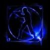
However, now I've got it. I think I've nailed it. Check this out:


^Needs moar brightness, I know.
They don't waste space and they look gorgeous ingame. I'm replacing all of the old "saturn" lights with lights like this.
However, now I've got it. I think I've nailed it. Check this out:


^Needs moar brightness, I know.
They don't waste space and they look gorgeous ingame. I'm replacing all of the old "saturn" lights with lights like this.
You must be logged in to post a response.