Zeromancer
 HLDM
HLDM
Zeromancer
by
Hugh
Posted 20 years ago2004-06-24 19:53:30 UTC •
Completed •
Half-Life: Deathmatch
- Name
- Zeromancer
- By
-
 Hugh
Hugh - Type
- Map
- Engine
- Goldsource
- Game
- Half-Life: Deathmatch
- Category
- Completed
- Included
- BSP
- Created
- 20 years ago2004-06-24 19:53:30 UTC
- Updated
- 19 years ago2005-11-10 03:13:19 UTC
- Views
- 3603
- Downloads
- 927
- Comments
- 10
- Rating
- 4.50 (2)
- Reviews
- 0
I finished it and stuff, tell me what you think. 
November 9 - The download link works again, sorry for the 10 of you that might have wanted it.

November 9 - The download link works again, sorry for the 10 of you that might have wanted it.

10 Comments
You must log in to post a comment. You can login or register a new account.


Where is hugh_issues.wad?
2. It doesn't actually use any textures from it so you can just make a blank hugh_issues.wad. Sorriez about leaving it in, though.
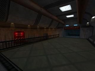
Anyway, on to the map. The lighting was the first thing that caught my attention. I don't really like it. The different colors on those sections make it look so unnatural. Especially the yellow lights.
Texture usage is good except for the groun on the screenshot, that's a specific ceiling texture and doesn't look well on a floor.
Architecture is decent but for a storage area it looks too curved. Some straight supporting beams and such would make it look better.
The overall map has a strange connection of styles, of area's. A storage facility and a sort of reception area? Doesn't really fit together in my opinion.
Overall, it shows potential, you do pay attention on details now and then, but the map needs some more coherent style.
This map is an amazing display of all the fundamentals, that many mappers routinely miss up, as well as, the little details which almost EVERY mapper misses.
Varied and inventive use of textlights, sprites, ambients, and detail brushes make this a beautiful map in it's own right. I cannot recall a map I've ever seen that nail the small details as well as this one.
The little details give things a better, truly 3D quality, makes them real, and Zeromancer achieves this beautifully. Other small things like removing a tile here, adding a grate there--which most anyone else wouldn't bother--, really make this map. Also doing anything to break up the perfect symmetrical design--which Zero most definitely does--that Hammer makes so easy for us, makes everything seem more real.
Relief in the level is highly varied and most excellently done. Nice portions from the subterranean to the open ceilings are all well-construckted and placed.
Weapon placement is fine, for this size of a map, and some nice HL-style hidden rooms with goodies.
Icing on the cake is a nice little vista where you can see outside, but the player cannon access...Always a nice touch.
Simply perfect small-sized HLDM map.
5 stars.