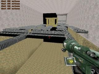
Siege
 HLDM
HLDM
Siege
by
wilsonscastaway
Posted 20 years ago2004-06-28 22:05:29 UTC •
Unfinished •
Half-Life: Deathmatch
- Name
- Siege
- By
-
 wilsonscastaway
 - Type
- Map
- Engine
- Goldsource
- Game
- Half-Life: Deathmatch
- Category
- Unfinished
- Included
- BSP
- Created
- 20 years ago2004-06-28 22:05:29 UTC
- Updated
- 15 years ago2009-01-13 06:45:02 UTC
- Views
- 2993
- Downloads
- 636
- Comments
- 2
Hey, this is an old map I made.
Ok, maybe I am not very good at making maps, but I have fun making them anyways.
Let me know how I can make them better.
Ok, maybe I am not very good at making maps, but I have fun making them anyways.
Let me know how I can make them better.
2 Comments
You must log in to post a comment. You can login or register a new account.


And remember... it's better to come with a few stunning maps than with an overload of crap things. Not all maps have to be released, and it's not advisable to be too quick with a release.
i think captain p summarized everything.
firstly, there is no way you can look and see an open map with half it not there and realize that something during your mapping process has gone terribly wrong.
secondly, if i were to turn my flashlight on, would i be able to tell that it is, in fact, shining light? try putting light in the map.
thirdly, sit down and read every damn tutorial on this site.