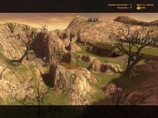
cs_retreat

Counter-Strike: Source CSS
cs_retreat by Xj2
Posted 19 years ago2005-04-18 19:12:50 UTC • Completed • Counter-Strike: Source
Loading...
Screenshot Thumbnail
Name
cs_retreat
By
Xj2 Xj2
Type
Map
Engine
Source
Game
Counter-Strike: Source
Category
Completed
Included
BSP
Created
19 years ago2005-04-18 19:12:50 UTC
Updated
19 years ago2005-07-16 08:22:53 UTC
Views
2270
Downloads
818
Comments
22
Reviews
0
Download (2.94mb)

A large outdoor hostage rescue map. Any feedback would be great, cheers.

22 Comments

Commented 19 years ago2005-04-18 19:52:04 UTC Comment #6838
holy friggin crap. that looks awesome beyond awesome...
I want source so I can dl it and play it :~(
Commented 19 years ago2005-04-19 01:22:06 UTC Comment #6843
Someone pick my jaw off the floor.
Commented 19 years ago2005-04-19 03:27:37 UTC Comment #6847
in the words of my german mate:
"this is nice..."
Commented 19 years ago2005-04-19 04:12:46 UTC Comment #6850
Looks very nice
I'll take a look at it when I get back from college
I hope huge size wont mean tiny framerates ;)
Commented 19 years ago2005-04-19 04:41:57 UTC Comment #6851
Glad you all like the look of it :)
Framerate is not to bad - about the same as the official maps.
Commented 19 years ago2005-04-19 08:49:20 UTC Comment #6852
Thats what i've been waitin for! HURRAH!
Commented 19 years ago2005-04-19 12:16:30 UTC Comment #6857
Ok well I had a go on it and the gameplay was great, the layout was great but... The mountains textures were really stretched!!!

I felt as though I was playing the old cs all over again because of the huge stretched textures. Also the bit under the electrical bit seemed like the old cs cause the water looked cheap (maybe on purpose I don't know)
The sun is great, the house is ok and the computer prop (silver one) well if you shoot it you will notice it has no bottom :/

Not bad so far, it is a great map but could be improved greatly. Consider this on your next beta.
Commented 19 years ago2005-04-19 17:26:57 UTC Comment #6869
Thanks Habboi

A lot of people have mentioned the stretched textures and I shall fix the worst areas. The textures are scaled up quite a lot (about 1.45 I think). The problem is if I scale it down to a reasonable size it looks very tiled, especially the grass (its an alpha blend texture aye). But I can definitely fix the really stretched bits on the tall mountain faces.

Can I ask, did you think it looked stretched everywhere, or just on certain bits?

The water under the 'electrical bit' (yes that is its official name) is expensive, I am actually lowering that to cheap so brace yourself!

So far everyone appreciates the layout as ok which is great, means I can just get on with fixing the easy bits. :D
Commented 19 years ago2005-04-20 01:15:49 UTC Comment #6881
you scaled up textures on CS:Source!? for terrain textures you should shrink the to about 0.5 so it looks ok and runs smooth
Commented 19 years ago2005-04-20 01:17:35 UTC Comment #6882
you can use the blend to hide the scaling if you do very faint amounts everywhere
Commented 19 years ago2005-04-20 11:41:49 UTC Comment #6896
Yes use the blend texture...
It looked stretched on most of the mountains but thats not your fault really because displacements can really make a map look bad if used wrongly!
Make sure you change that computer model so that it has a bottom to it ;)

And just make the detail slightly better. That is all!
Commented 19 years ago2005-04-20 18:54:43 UTC Comment #6918
Yes yes I am already using a blend texture obviously. I wouldn't say I have used displacements wrongly - but as you might have guessed the reason some areas look stretched is because the faces of the displacements themselves are stretched. I am going to edit the displacements to smooth them off and reduce the length of the problem faces and also fiddle around with texture scale (I am thinking of creating a custom blend texture to allow a good low scale without to much of a tiling effect).

I will change the computer prop no problem as yes it does look pretty weird :S

And to better the detail? Do you mean more? or improve on whats there? Any suggestions?
Commented 19 years ago2005-04-21 13:13:37 UTC Comment #6930
Just add more trees etc...
Oh and displacements can be made wrong as yours are stretched a lot. If you look at other maps with displacements such as the map on this site called dm_lakeside I think.
Commented 19 years ago2005-04-21 20:48:44 UTC Comment #6940
I thought this map was pretty good. The only thing is the texture usage. The cliff texturing in some spots was just awful. Other than that, this was a really good map. I think if you just didn't stretch those textures so much it would be quite impressive. - HeAdCrAb KILLA
Commented 19 years ago2005-04-22 09:11:55 UTC Comment #6949
Positive.
Commented 19 years ago2005-04-26 09:58:14 UTC Comment #7009
holy SHIT!!
Commented 19 years ago2005-04-27 09:27:06 UTC Comment #7019
Fix the detail in and around the house it looks sort of bare and out of scale and it should be much better
Commented 19 years ago2005-05-06 12:36:04 UTC Comment #7162
:o blinded of the beutiful screenie sits motionless for 10 mins B-E-A-U-T-I-F-U-L. Dam I wish i had CS:S :(
Commented 19 years ago2005-06-14 16:05:19 UTC Comment #7755
=O
Commented 19 years ago2005-06-14 16:05:56 UTC Comment #7756
Amazing. Keep it up! Very good work. Better than most source maps for sure
Commented 15 years ago2009-02-15 15:26:04 UTC Comment #17288
link is broken :(
Commented 2 years ago2022-01-03 19:44:43 UTC Comment #103958
link was broken ;)

You must log in to post a comment. You can login or register a new account.