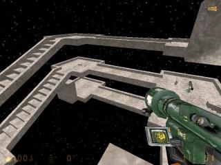
Arcane
 HLDM
HLDM
Arcane
by
CapnCrunch
Posted 19 years ago2005-09-12 21:48:24 UTC •
Completed •
Half-Life: Deathmatch
- Name
- Arcane
- By
-
 CapnCrunch
 - Type
- Map
- Engine
- Goldsource
- Game
- Half-Life: Deathmatch
- Category
- Completed
- Included
- BSP
- Created
- 19 years ago2005-09-12 21:48:24 UTC
- Updated
- 19 years ago2005-09-12 21:48:24 UTC
- Views
- 1513
- Downloads
- 576
- Comments
- 13
- Rating
- 3.25 (4)
- Reviews
- 0
What is this place?
13 Comments
You must log in to post a comment. You can login or register a new account.


anyway d/ls ill review in a min
Its very VERY good for a first map. seriously!
I tested it with my sister (booya! a sister who plays online games! yas!) and gameplay was very funny... but it also lacked a lot..
As far as i could see, the whole map was made out of no more than 3 textures but i believe only 1.
..it just seemed.. empty.. even with gibbed player model's guts flying around
so.. yeah.. good, could be a lot better. but an extremely good start.
BRING OUT ARCANE II
single texture! YAY!
it's nice. I dunno though, lack of cover? mehbeh
There's some problems to this style of maps though, and players will either like it or hate it: falling off the ledges is very easy and draws away attention from combat. I think somewhat wider paths would be good to make the map more playable. Pushing an opponent off the ridge could be a nice gimmick, bytheway. How about user-triggered pushers?
Weapon placement and layout was rather simple and there's not a lot of thought behind it. The map is linear so I don't think it'll stay interesting for long. Give players more choices, more routes. Area's can be made interesting by putting goodies in them (strong goodies put in dangerous places can work well). Cover spots will also enhance the gameplay as these give players an opportunity to improve their chances.
Yeah, texturing and lighting is simple too. Give the map a more distinct style, give the map 'character'.
All in all, a good start, but it could do with some improvements. Keep it up.
-gets boring after a while
-major lack of detail
-easy to fall off the edge when trying to kill some one so I end up looking where i`m going instead of makeing kills.
-very small serlection of textures.
good things
-I beat my friend on it.(not rateing on this)
-seems origenal
-I didn`t get stuck so i couldn`t move
Skillfully constructed stairs and walkways.
One thin you might try is when you fall off the platform in the middle, teleport the fallen to the top of the map, so they're falling continually until shot!
nice job.