dm_rusty
 HL2DM
HL2DM
dm_rusty
by
cybox
Posted 19 years ago2005-11-09 18:21:18 UTC •
Completed •
Half-Life 2: Deathmatch
Loading...
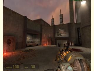


final version of dm_rusty. A beta version has been released already. Small deathmatch map / up to 6 players. Simply map, simply skybox, have fun 
3 Comments
You must log in to post a comment. You can login or register a new account.
Connectivity could be a bit better: since the map is small I dont know if it's a wise idea to make players go into crawlspaces...
Texturing is good, and so is prop placement. I didnt find any phys objects blocking my path at any time, which is good since the map is small
For future maps, you might want to disable the shadows of the prop_static trash groups. The default shadow just tends to look wrong imo.
4.6 stars in my opinion. Keep up the good work!
Put the sky brushes somewhat higher though. Explosive barrels explode almost immediatyl when you throw em up. I also think a more distinct theme would do your map good, right now it's really generic (I can't see what this area is supposed to be, actually). Wider paths provide some more room to dodge fire, too, so that's something you could improve on as well. Oh, and that fire wood looked odd. Too flat I think, not really burnt either. Oh well...
However, there's some nice touches to this map like the hidden vent route and the stunstick that lies around. And indeed, props don't block movement which is a good thing as well.
All in all, a nice map with some nice touches, but little too small and cramped for me.
...............................................................................................
I found the architecture very nice with all the arches, the map was very smooth, the map had a sort of quakish style, wich I personaly like a lot.
The lay-out was also nicely done and easy to understand and learn.
I'd think the gameplay would be very fast with even 6 poeple because the map is very small and there aren't big open spaces in the map.
The texturing was very nice, they matched correctly, but the stripe texture kinda busts out of the rest imo.
Weapon placements was well... good placed
Lightning was also very nice, some yellowish here, some white spots there..
The Atmosphere was very nice with the lightning and flares.
I must say, that you also did a great job on the ambience, lovely!
I really like the part were you could get the overwatch gun, it remembered me of some classic hldm map..
Anyway, i'm giving this map a well deserved 5 stars!